Dr Mc ninja
polycounter lvl 18
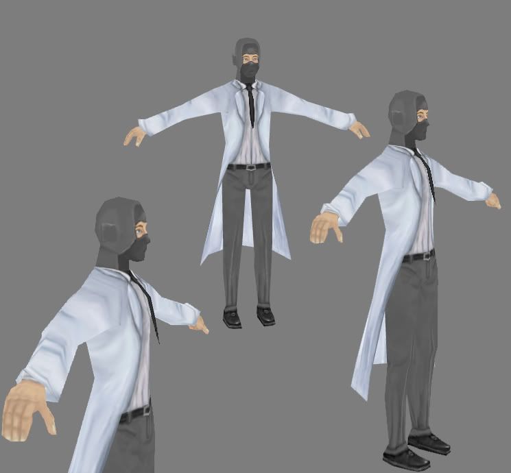
Hey I already have been working on this in my sketchbook, so I dont want people to think im overbumping this or anything, But I want to get alot more crits on this current model ,my goal is to REALLY improve my painting , I still need to fix some minor things that johny and polyhertz told me (fingers/ back)
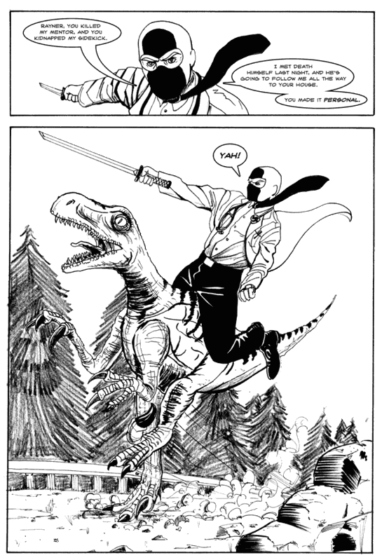
Anyway my goal is to create Dr.Mcninja From the popular webseries
I plan on only keeping his body in a 256 and his little accesorrys in a 128
So so far Ive done my 1st pass at the entire 256 but Im having a VERY difficult time still painting wrinkles and such, and overall Just want some feedback
anyway
What im making
What I got
Replies
For painting the textures I always found it useful to bake some lights in or create an AO. Then you can really get your head into how the lighting hits the wrinkle you want. Secondly find some great reference photographs and steal the unique elements. Like that weird little wrinkle that twists on top of itself as it comes out of the armpit. Those are the details that make it look real.
His eyes may be a touch too close together. The eye brows are very generic too like a flipped smiley
As far as the legs can you give me a example of what you mean by the cuffs?
Revolve site pants - some good reference in here if you sort through the overly metrosexual clothes.
Here's a lighting tutorial bobo made like 6 years ago: http://www.bobotheseal.com/tuts_vertex_bake01.htm
Hopefully it gives you an idea what I'm talking about. Its pretty easy in maya too.
QFT
Its a decent model but it doesnt look like your reference much. You dont have to make mean expressions on all your characters but this particular character has a stern face expression, so make it how you see it. Also his mask doesnt have the same shapes as the comic page shows. Its vital that you get this stuff right as this is a big part of what people interpret as the characters identity. There are more issues but Im sure you can see them if you just work by looking at your reference.
So big issues = Pants/ cloth in general? And facial expression?
www.drmcninja.com (one on the main site)
oh and while we are here, check out his tie it tapers and is quite large and flat your characters tie looks short and pointy.
I noticed with his mask in some comics the front bottom flap extends to his neck others it dosent, Im going based off the main site image for the most part.
Anyway tightened his anger expression some extended his tie a bit, need to paint a HELL of a lot more, I only got to touch it a few minutes today
Here are a few things to get you started...
*strokes are blurry and broad (clean/crisp strokes will really help bring it together)
(The mask was done nicely, try to carry the clean look throughout the entire model)
*address seam showing where neck and torso join
*address seam showing between knott and rest of tie
*address depth between the shirt and lab coat
*address depth between waist of pants and shirt
*belt buckle is currently shaped like a heart
Also accessorys = 128 map (clover/shrinken, hearthearerthingy,sword)
Everything else = 256 stand alone map
There's some good posts already about the texture and how to improve so I'll limit my comments on the texture. The stethoscope looks more like a pocket watch and doesn't read as a stethoscope at all. The tie needs to be reworked since his tie is not that thin.
For the mesh I'm seeing too many anatomical errors. the head looks completely off, too tall and not round enough. The torso is not muscular enough. The legs should not taper off like that at all. I'd say put more polies into the mesh and flesh out the shape. make the coat more modeled and seperate (say up to around the armpit area if the model is to be rigged and posed/animated). Model the pants so they look properly and not look like they were tucked into his socks. Model the stethoscope seperatly and more accuratly.
vig: thank you I knew something still seemed off
johny: Im trying to recreate the style based off the main image of his website which has a kinda paintery feel to it, But Im trying my best. Is there anything you would suggest to avoid the washed out color look?