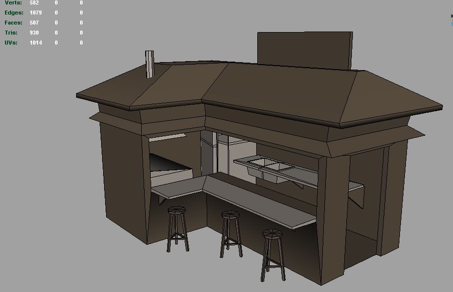
kiosk
been assigned to build a kiosk that can hold a few people in approx. 1500 tris. this is for a texturing class so we've also been assigned to use the following on the model:
Textures 2 x 2048 x 2048 for Color, Bump(normal), and Spec
So this will be a good opportunity to work with map channels and get some serious detail in via textures.
I'll be making my kiosk a small cook hut or taco stand. here is my wip.

Textures 2 x 2048 x 2048 for Color, Bump(normal), and Spec
So this will be a good opportunity to work with map channels and get some serious detail in via textures.
I'll be making my kiosk a small cook hut or taco stand. here is my wip.

Replies
If you build the chairs like this(see picture) it will also save you some tris.
Otherwise, looks like a fine lowpoly model. It will be most interesting to see what you will do with the texture.
Probably just a teachers model he had to rush...I wouldn't worry bout it, since its just a texturing exercise
Thanks for the geometry crits, I'll definitely be going back in and fixing up those pieces.
The reason I have the strange geometry dissecting the fridge was because I was considering modeling and texturing the inside of the fridge as well... since I've been given 2x 2048 maps to make a small hut with. It's probably more work right now than I feel like doing within the next week so I think I'm probably just going to seal up the fridge and keep on moving with the rest of the model.
Cheers!
I'll be using two 2048s for this exercise. Any layout suggestions?
a few more mini props yet to come (register, pot pan etc)
ty!
ADM
I'll run it my my instructor on Sat morning and see if that would be an acceptable alternative option to the 2048s
I've overlapped a many of the UV's in order to save UV space. I really want to learn to do UV layouts the right way.
I realize right now there is some distortion on the gutters, I'll fix those soon.
Suggestions would be awesome! Thanks!
wip
here's some blocked out color to help show how the UV is affected when stacking
Also, here is the finished model with all the props inside... I'll be putting them on a seperate layout... haven't determined whether to give them all individual layouts or all on the same large map.
I'm having some strange rendering issue on the roof tiles... clean in one direction and blurry in the other, depending on camera alignment... odd. 3ds Max 9 sp2
seeking crits.
Thanks for looking!
Did you paint the shadows on the wall? I'd just render an AO map and overlay it on the texture instead.
I also did a render in Maya with some more work on the textures.
I think the normal maps seem a bit off and the walls a bit shiny. Any tips?
Cheers
I'm not sure what the texture on the wall is supposed to be, looks like an amalgamation of brick, plaster and mud. You should define the material better.
Perhaps if I smoothed that wall a bit more it would help the roof seem a bit more dimensional. I'll be sure to strengthen that normal and diffuse channel tomorrow as well.
Thanks again! Keep it comin :P