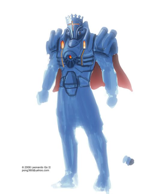
The BRAWL² Tournament Challenge has been announced!
It starts May 12, and ends Oct 17. Let's see what you got!
https://polycount.com/discussion/237047/the-brawl²-tournament
It starts May 12, and ends Oct 17. Let's see what you got!
https://polycount.com/discussion/237047/the-brawl²-tournament


Replies
Here's an updated version. C&C's welcome and appreciated.
rock on
I look forward to seeing more!
And yes, the white is burning my retinas also. Kind of a neat trick if it was on purpose. He's surrounded by white righteous light and it hurts your eyes to look at him.
(psst claim it was on purpose...)
Thanks for the comments guys! I think I'll go with gold as the main color but with reduced godly bloom effects and more detail and shading of course. lol!
Stay tuned, I'll be updating soon.
I'm a fan of long cloaks, capes are for getting sucked into jet engines. A nice long burgundy inner and black outer might look on a long flowing cloak down to the ankle... but that's just me.
Blue trim on Gold looks a whole lot better than Gold on blue, he looks a little evil on the blue version.
sir-knight: Thanks! Glad you liked it. I'm redoing the design except for the helmet. I'm going with the Gold color. I don't think I'll add cloth anymore, it might become problematic to implement in-game.
The cross on the left is kind of looking at the camera a little extra.
King and knights to go with him as a whole faction. Would be kickass.
It looks good so far.
stimpack: Thanks! glad you like it.
SHEPEIRO: Thanks for the kind words.
dejawolf: Thanks man.
Vailias: Yup! I'm planning on doing just that. Thanks for the comments.
glottis8: Thanks! Was that the game based on the King Arthur and the Knights of Justice cartoon? That cartoon was actually the inspiration for this project.