The BRAWL² Tournament Challenge has been announced!
It starts May 12, and ends Oct 17. Let's see what you got!
https://polycount.com/discussion/237047/the-brawl²-tournament
It starts May 12, and ends Oct 17. Let's see what you got!
https://polycount.com/discussion/237047/the-brawl²-tournament


Replies
Alex
The only thing I would suggest is to bevel the edges on the windows, they look really sharp.
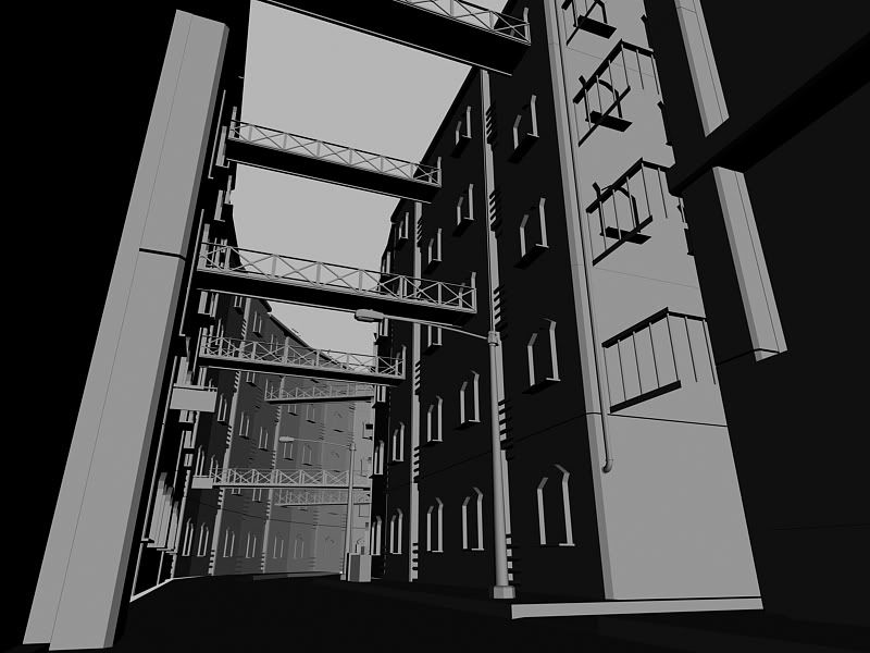
My only crit would be that you had a nice interesting row of curved buildings and at some point that was lost. The building and pieces are ace, but final presentation is kind of a let down considering how you blocked it out and how close to the ref it was.
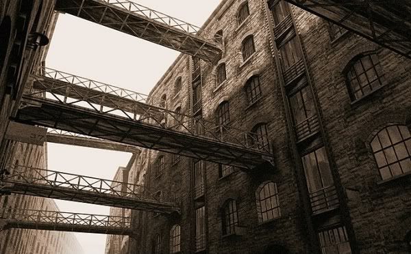
In anyone's interested...I think the reference belongs to Chen Qing Feng, some guy in China...
namely-
- the windows proportions and panellling are wrong and dont look believable
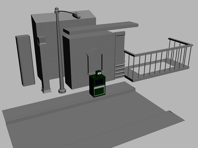
-you have alot of tiling textures that could be handled better to give alot more interest and solidity to the scene, the road for example is one continuous map, it would look so much better if it had gutters and/or the stuff that collects here at the sides of the road, dirt debris etc
also the wall at the end of the road needs water damages etc at the base, all these things adds to the amount of textures you have to make but really help sell a scene
-some issues in the last scene with the brick texture tiling around corners, fix it so it matches
good start, needs some love though