Small Environment *WIP*
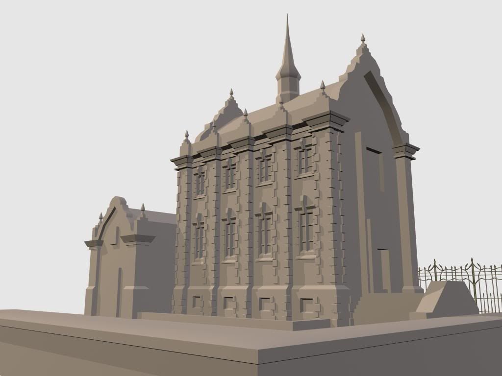
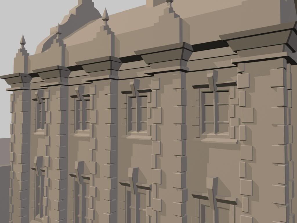
Hey guys, I've been working on a small environment and was wondering if I could get some critiques on it. It will only be seen from one angle so I'm only worrying about what can be seen. So far I have finished a block out of the building and have started to work on the details in the windows and walls.


Any feedback is appreciated.. thanks guys.


Any feedback is appreciated.. thanks guys.
Replies
Looks good.
Alex
I'm trying to go about this using a modular system, here are the pieces that will make up most of the building.
What's the goal of this piece? If its to show of your skills as a modeler, thats fine. But if its to show off your ability to create a convincing environment, you need to push it further and go beyond the building. What I mean start thinking about the atmosphere, engaging camera angles, lighting, and so on.
Basically - and I've said this a lot for many environment posts here - I think you really need to tell a story. I can look at this piece and KNOW you can model, thats easy. I reckon you can texture convincingly enough to sell this as a believable piece of architecture. However, if you'd really like to make this piece interesting and keep the viewer on it for more than a couple of seconds I suggest you read the PDF I've linked and apply that to this WIP you've started.
One thing I find that helps with telling a good story in an environment is thinking up a small back story. This will help drive the story you're telling in the pictures and keep you motivated to finish it. Setup your camera angles ahead of time and make sure everything you model from there on out supports those angles. If you want to do the entire building, work with that and show it off but do it angles and compositions that are attractive.
If you have ideas for what the surrounding environment would be, or smaller objects to support your story, use primitive shapes to help yourself visualize the end result. You'll be surprised how helpful cubes & cylinders are when you're trying to visualize the end product. Especially when you're putting thought in to composition and angles.
I don't want to blabber on any longer, I hope this helps. You can model, we can all see that. Let's see some thought in to this pieces presentation and execution.
Great start!
Ok - Everything below is me nitpicking -
Is it a wall you added in front of the building? I don't think i like it very much (how it looks now anyways) its concealing the whole bottom of your building. What other types of props were you thinking about putting in this scene and Is the wall going to get in their way? The fence you have in the background is so interesting, have you tried putting it in front of your building instead? Are you maybe planning on putting something on top of the solid wall in the front?
Other than that it looks awesome imo.