Plucker - Jack
One of my first actually working from polished concept. critiques welcome and the hair is a separate object, right now I'm need to get a fix for the hood, as I neglected to include the straps that come down off of it. got a tech thread on it here: http://boards.polycount.net/showthread.php?t=53263 and yea I know it's been done, love Brom's art though. If you havent seen it, check it out here: http://www.bromart.com/ here s the concept: and my blocking out in mudbox:
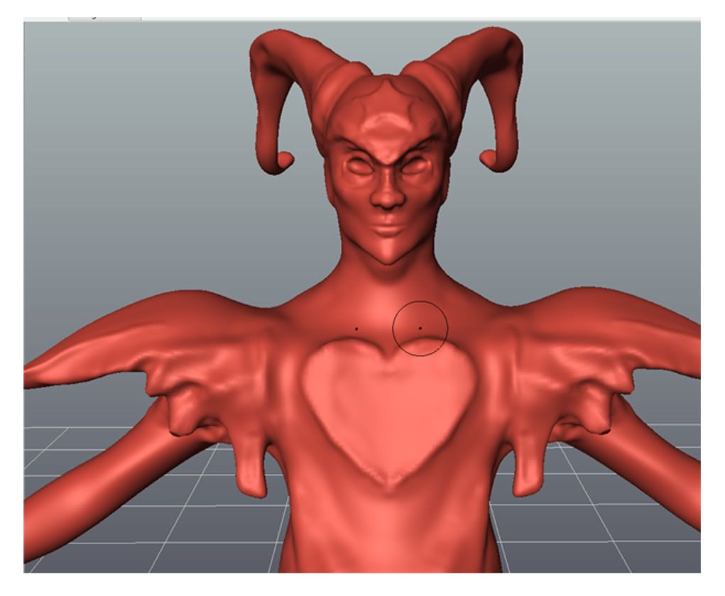
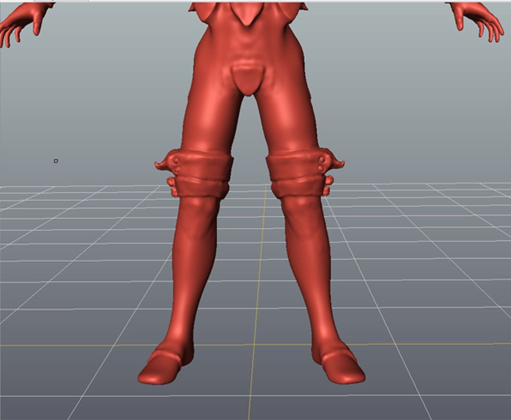
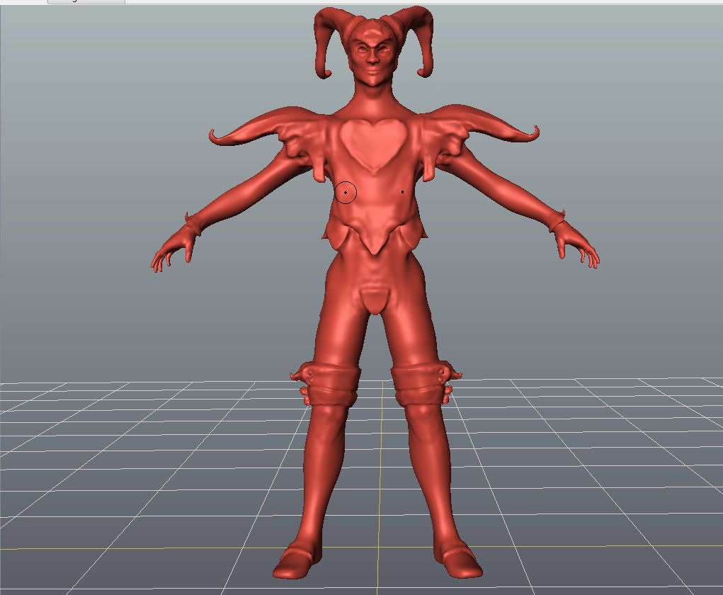
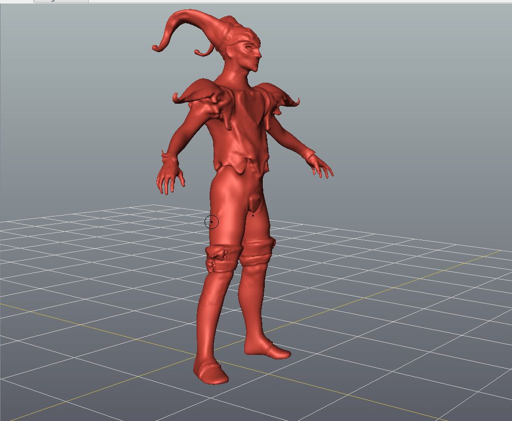
 and my blocking out in mudbox:


Replies
The proportions you've got for the character aren't very true to the original at this stage. You'd be better to use the one on this page: http://www.theplucker.com/goodies.htm
than the reference shown above. It doesn't have the harsh shadows and allows you to better see the shape of Jack's torso and jacket.
Bobo the Seal did a really nice low poly version of Jack a while back. It might be worth hunting down for reference purposes too
critiques welcome as always.
added some tertiary detailing broke the symetry a bit, stiches on body and clothes. I think his epaulets may need a bit of fixing, they're a little longer than the concept, though I did touch up his jacket thing, trying to make it shorter like the concept, and made his... er.... cup a bit larger. Almost ready to start building my lowpoly I think. Any suggestions/fixes anyone wants to make before I do so?
Thanks.
I think you could benefit from sculpting a few separate pieces instead of doing it all from one mesh. Doing a bit of high poly modeling in place of sculpting will help you keep some of your hard edges hard, and not bloby. Also working with separate pieces give you a chance to work on smaller more dense pieces without having the whole model out and visible.
Sculpt to block stuff out.
High poly model to make hard edges hard again.
Sculpt in final details.
guess I'll finish him up then start again, maybe with a different character from the same book? I'll see what I can do, thanks again Vig.
edit: actually, on second thought I think I'll try highpolying jacket and boots. worth the extra time I'd bet.