Keira Knightley WIP : Need Help
Hi,
I am currently making a model of British actress Keira Knightley on my spare time and I need help on giving my mesh recognizable facial features...
Here you can see by yourself...
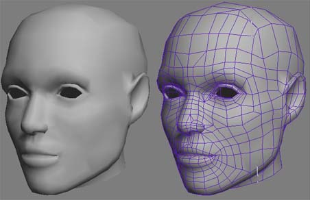
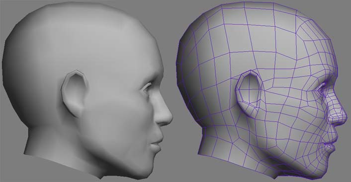
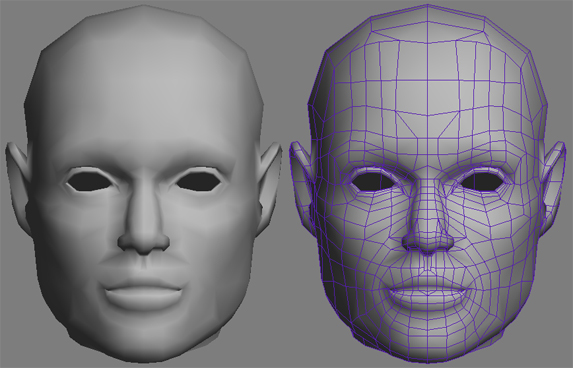
... she looks a bit dudish :poly119:
Here are some reference pics:
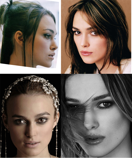
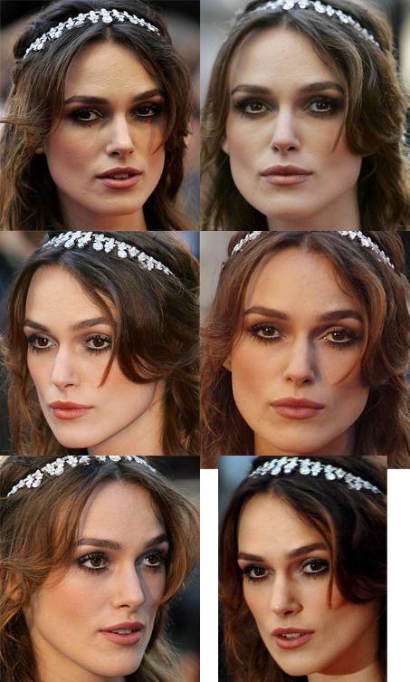
I guess proportions are the most obvious errors but can't find out how to correct them...
Plz leave C&C and of course advices if you feel like it :poly112:
I am currently making a model of British actress Keira Knightley on my spare time and I need help on giving my mesh recognizable facial features...
Here you can see by yourself...


... she looks a bit dudish :poly119:
Here are some reference pics:


I guess proportions are the most obvious errors but can't find out how to correct them...
Plz leave C&C and of course advices if you feel like it :poly112:
Replies
I think its too early to tell its meant to be her, keep at it though you're getting there
It seems too wide to me, and also her chin should go forward a bit, she has a fairly flat front of her face. The chin you have there is too recessed, and probably too "tall" (so to fix it, you should move it upwards a small amount, and forwards a bit).
She does have a very strong jaw, but the jawline you have there is too manly. It shouldn't be so wide, just keep the "square" look to the back corners, and narrow in the front parts. Should get a better look that way.
Instead of looking for just jpgs online, go and rent or buy a DVD, try Pirates of the Caribbean - you'll get a lot more angles and it'll easier to see how her face is shaped.
EDIT : ... and buying DVDs
http://movies.msn.com/celebs/celeb.aspx?c=464857&mp=p
In regards to your model I noticed these things (not listed in order of importance)
1. It looks like you might be a little square in the jaw especially if you compare your current iteration with picture 3.
2. Her real lips (difficult to tell exactly because these actors are masters at presenting their faces the way they wish) look like they are fuller on top than you have represented, or maybe your bottom lip is too full, I'd fix the jaw first and then look at the lips. Her top lip folds under at the corners in a specific way.
3. Her nose seems more slender than what you've depicted, it might be the viewport shading but it seems more rectangular than is represented in the photos. I don't think I'd use photo 3 for nose ref. but it looks good for skull/jaw ref.
Part of the dilemma (I think) in celebrity likeness is finding the balance between their actual untouched reality and the one people perceive which is that of retouched photos and posed shoots so that you can deliver on the expectation people have which is based on the many pictures of her they have seen where she is "perfectly" presented.
If I were you I would focus on getting the skull and jaw construction to be as accurate as possible and then move to the features. Kind of like when you're drawing, you move from general to specific, block forms, consider composition, check proportion of major forms and then move to specific features, more or less. Everybody has their own process
just my 2 cents -and that's all it's worth
good luck!
[mop and vig made some great points about the photo ref, she's also in "The Jacket" if you haven't checked that out yet]
I quickly chucked up some lines over a picture of her then put them over your model to compare and the most obvious things are:
The nose should be a bit longer,
The lips should be a bit lower.
If the picture is to be believed her jaw should be more narrow and angled.
Also, take a look at your first reference pic, her ears are angled back more.
Hope this helps (:
oh and if you want the original pic. http://img261.imageshack.us/img261/3041/knightleyfacexc3.jpg
http://usemycomputer.com/indeximages/women/Keira.Knightley/photoshoot_unknown_217_6/gfpmatrix_keiraknightley_04072004_12.jpg
Lots of great ones on usemycomputer. I think TheSplash has pointed out some good things to work on.
but found some nice profile shots for you.
and again, if quickly compared to your model you can see a few things that need changing.
She has a more upturned nose than you have given her,
Her jaw is super bony and juts out so her neck shouldn't taper into it as gradually.
Eyes and cheeks could go back a little more than they are now.
The area between her mouth and nose (don't know the name) needs to curve inwards.
ok thats enough
Another pitfall of the beauty photo shoot is that they hardly ever take profile shots or perfectly frontal shots. Its normally angled slightly because straight on is often unflattering.
I like MoP's suggestion to fire up a DVD. In some cases you get a nice tween from front to side. And nothing really beats a moving image of someone to help capture their likeness. You also get to see how their face animates, and it will help give you ideas about their underlaying structure(s).
it's been a long time I haven't posted here but had a lot of work and I finally could work a little on my Keira model.
I manage to get a pirate 3 dvd and realized a lot of things that indeed had to be changed, I also took consideration of your advices and...
... it still looks like a men
I corrected a lot of thing but something still must be wrong about props and eyes...
Thanks for your C&C in advance... C ya
my 2 cents
It seems even wider now though. The jaw really needs work.
Some hair would be good to just to help get rid of that bald guy look. I'd just slap a quick hair mesh there that can help you visualize her more as you actually see her in the pics.
In regards to your comments and because of the result at that time, I obviously had to start over and develop another modeling technique, as well as observing technique.
I took as reference a POTCIII dvd and starred alot at the face features and volumes.
Here's the result :
C&C and advices are of course welcome...
EDIT: Worktime so far is ~12h
Glad to see you're still practicing
As with all beautiful women her face is very plain, so if you're off just a little it's a lot more noticeable.
Thank you for your precious advices...
I managed to get hold of some hours to work on my model.
Not much blah-blah, let's have a look at it.
Your C&C are very appreciated, please continue, I want to improve
perhaps the sharp lines should be softened off a little on the neck, she is getting a bit mannequin looking in places
I'm looking at the corners of the mouth and sterno-cleido-mastoidian muscle.
Any comments on the resemblance, props, features, etc ... ?
Indeed there was a big problem about the lips corners. There weren't polygons enough to sculpt a good detailed mouth. I'm still working on it, having selected contrasted pictures of her mouth.
I also worked a little on her eyes' bones and I smoothed her neck muscles also.
Have a look...
Please C&C...
Thanks a lot!
PS: Some little shading artifacts are normal as long as I don't go Super Hi-Def until my props and volumes are perfect.
Any tips/clue/advice about what don't look like the real one in your opinion?
http://imperator.shackspace.com/009-Keira_Knightley-20030101719.jpg
Hi Raphick,
I would have two advices for you to improve your human modeling skills. Study anatomy first.For instance look at your ear, that's not good at all (modeling-wise I mean). And like Lanteri said in one of his book, measure your model. There are some points that help a lot having likeness. And You should first study modelling men instead women. It's easier to see mistakes on women than on men.
I'm still working on this model on my spare time...
As Dedeazar advised me, I bought some book and dvd about human representation and thereby began to measure props, volumes and angles certainly paying much attention to what I saw/decoded from photos and not what I thought I was seeing.
So there is a temporary result, knowing there still is a lot of work to be done, specially on the mouth.
You can possibly find my reference pics over here.
Your precious critics and comment are still very welcome...
Thanks a lot in advance...
You've also still got her nose too wide at the bridge, both the top bone, as well as the fatty tissue on either side. I find when doing likenesses, after I've gotten as much as I can from using the reference planes, I start trying to pay attention to the actual shading of my model. If it's not shading right, I know I've got the anatomy off from theirs. The areas that orthos can't help you with are particularly beneficial to use this. So for the nose, look at how her nose shadows in the reference photos, then try using soft select on verts to narrow her nose till it shades similarly to the ref.
I also find having a montage of images, kind of "fixing" a feature in my mind, then actually tabbing away from it and into the 3d, and modeling using that impression rather than a direct comparison.
There are still a lot of things to do but I was passing by so I post some Wips...
Pleeeeeeeaaaaase comment
Straight away you can see the chin area and jawline, hope it helps
btw the neck scares me!
Still working in my too few spare times, I'd like to ask your feedbacks about the wip so far...
I guess some of the things to be refined are lips (volumes especially), too small ears(?), outer eye bones...
Feel free to criticize and comment... I guess I'm on the good way, even my girlfriend begins to recognize her
I find it easier to model when other elements are apparent, like hair or eyelashes / eyebrows. simple placeholders are fine, and give you a better feel for the progress.
All you can do is collect a ton of ref images from diff angles, preferably as many as you can from the same photoshoot, as some will be of when the person was younger/older and that changes alot too.
Keep it up, and try to have fun, don't let it frustrate you too much. The harder part for me I think, was trying to do good looking hair. I eventually didn't have time to finish it, and also had too frustrated.
worked a couple of hours on it and amongst others:
- changed software (da%n mu$£°x)
- quickly made hair (let's face it, it has to be remeshed and pushed forward)
- reworked some face features
One again please leave comments and feel free to criticize
... Great job.