Home 3D Art Showcase & Critiques

Ok, here I go again: Daredevil

Hi all!

I´m not really new here, been lurking around since Quake 2 days. Anyway, this is my new registered account and this is *finally*, I hope, my first finished model. (lost ALL my old models in my old hard drive... say what, 5 years of data lost? :( )

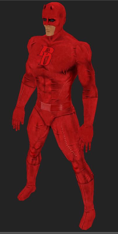
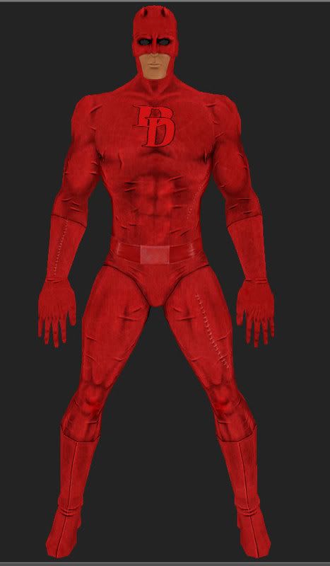
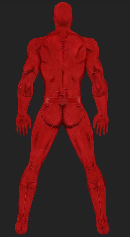
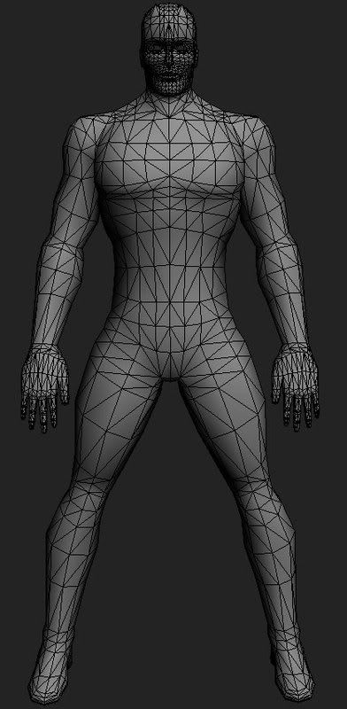
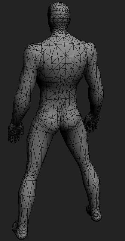
So here it is, texture are almost finished. Dunno about the mesh flow, the face I think is too dense (the mouth is a little weird). Been away from 3d for a while... getting back and still learning. :) Hope I can get things flowing from now on...

Crits please. How can I improve this?

[]s

daredevil_1_4.jpg
daredevil_front.jpg
daredevil_b.jpg
daredevil_wire_front.jpg
daredevil_wire_back.jpg

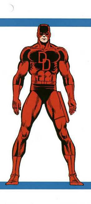
Concept the model is based on:

front.jpg

Replies

  • Eric Chadwick
    Options
    Offline / Send Message
    Hey, looking pretty good! The face is looking pretty dense like you say, would only need this amt for up-close facial animation, but would need more even density across forehead too.

    The jaw could use more widening on the sides. In the first shot there he looks like a Peter Weller when he should be looking more like The Rock.

    Clavicles could be lower on the chest, and less rounded like you have in your texture.

    Fingers look a bit pointy and thin compared to the palm.

    Skin is looking a bit monochromatic. I know, red suit, but could use some more cool colors on undersides, and hue variation here and there. Face skin color is also one-hue, could use subtle stuble (thank me later) and lip vs. cheek vs nose coloring.

    Overall looking good though. Going to stick with unlit?
  • Ged
    Options
    Offline / Send Message
    Ged interpolator
    yeah will this just be fullbright textures or can you have some specular? that would be cool.
  • Baskiat
    Options
    Offline / Send Message
    Eric: Hey, tks man.

    Well, I intend to animate yes, but not the face I guess, just training movements and such.

    Hehe, definitely he looks like Peter Weller :D

    About the clavicles and fingers you´re right. Will fix that. Tks.

    And will follow your advices bout the texture for sure. I´m still very newbie with colors. :/
    Could you elaborate more about this "lip vs cheek vs nose coloring" please?

    And nope, I´m leaving full bright to concentrate just on the texture; shadows, etc. Think its better to paint that way.


    Ged: For sure I´m adding specular. Dunno if it will be just painted or with normals. Never normal mapped a model before, guess its a nice practice. :)
  • Eric Chadwick
    Options
    Offline / Send Message
    Here's a good example of facial color.
    http://www.grimsby3mansquash.co.uk/Gary%20Elliot.jpg
    Notice how the colors change from region to region. Might also help to do a Guassian Blur on this in Photoshop, so you can concentrate on the color changes.
  • notman
    Options
    Offline / Send Message
    notman polycounter lvl 18
    It's a petty good start. Eric already pointed out, the jaw needs some girth to it. As for the texture the shading should be toned down some. It's too harsh right now. Also, reduce the 'pinches' in his clothing, or make more variations, along with reducing the shadowing on them too.
  • Rhinokey
    Options
    Offline / Send Message
    Rhinokey polycounter lvl 18
    your texture could use a lot of work, those little wrinkles do not look god at all. they are randomly located and not well done. the whole texture seems verry dodge and burned. your proportions are off were you using any real anatomy reff or just the pic of daredevil you posted? i would sugest that even when doing a comic character that you use some real ref for anatomy and proportions. as comic artists are not always a reliable source. if you were using it then you missed a bit, look at where the concepts gloves end relative to his belt.
    i would also recomend against the hands facing that way, model in a more relax natural pose

    also check out some models by others on these forums and research poly flown,, now your model seems to be made out of a lot of squares, of rather even size besides the face and hands that are packed with about 10x the amount of polys needed for the actual detail conveyed in the textured piece.

    keep working and practicing its not easy but one day it will just snap and you will get it.
  • Baskiat
    Options
    Offline / Send Message
    Tks for the pic Eric, real good ref.

    notman, as I tuned the levels of the image, maybe that´s why it seems burned. Will manage that too.

    Tks for your crits Rhinokey. In fact I´m not using any refs for anatomy, just memory, but your points make sense, will look into it. Some wrinkles do not look like wrinkles at all haha! Some resembles more like cuts... well...

    I have this "bad habit" of thinking that using refs is a kind of cheat... I know, I know, my mistake. :/

    Ok lets get back to work!!!
  • artstream
    Options
    Offline / Send Message
    artstream polycounter lvl 11
    Like Rhino said, the arms need work. What I usually do if something doesnt look right in a pose, i try to see if I can do it myself. Your bicep can't face forward and your palm face backwards comfortably. His palm should be facing inward, with the thumb facing the viewer.
  • Baskiat
    Options
    Offline / Send Message
    ok, very little face update: some stubble and subtle hue variation in pink. Hehe, well, tks Eric hehe.

    Any better?

    daredevil_face_1.jpg
  • ScoobyDoofus
    Options
    Offline / Send Message
    ScoobyDoofus polycounter lvl 19
    Baskiat: You've got a really nice start. You just need to think about your 3d forms a little bit more when painting. Use some reference and get more color variation in there.

    I did a 5 minute paintover/liquify on your latest image just to give an idea of what Im talking about. I also changed the mask a tiny bit to more closely match your posted concept art.

    All I did was liquify the bottom 1/2 of the head wider add some contrast w/ a levels adjustment on the skin. I painted in a tiny bit more definition in your forms along w/ some stubble.

    Keep it up!

    baskiat_daredevil.gif
  • Baskiat
    Options
    Offline / Send Message
    Baskiat: You've got a really nice start. You just need to think about your 3d forms a little bit more when painting. Use some reference and get more color variation in there.

    I did a 5 minute paintover/liquify on your latest image just to give an idea of what Im talking about. I also changed the mask a tiny bit to more closely match your posted concept art.

    All I did was liquify the bottom 1/2 of the head wider add some contrast w/ a levels adjustment on the skin. I painted in a tiny bit more definition in your forms along w/ some stubble.

    Keep it up!

    baskiat_daredevil.gif

    OMG! heuaehaue 5min only? I hate u hehehehehe Very well done!

    Well I see... will try something more detailed!

    Anyway, the nose and jaw lines I guess will leave that way, otherwise I´ll have to uv layout the model again... I´m trying to concentrate on the texture right now.

    Tks a lot man!
  • Wells
    Options
    Offline / Send Message
    Wells polycounter lvl 18
    moving the verts on the jawline wouldn't force you to redo your uv layout. i think the benefits are worth the effort.

    I agree with everything Rhinokey says.
  • Rhinokey
    Options
    Offline / Send Message
    Rhinokey polycounter lvl 18
    the point here is learning, no need to learn texturing on a bad model, take the time and refine the piece in stages. get it to be a good piece of art overall
  • Baskiat
    Options
    Offline / Send Message
    Yep, learning is my goal. Well, what about redoing all the model, avoiding mistakes you guys pointed out? any good? or just stick with it to the end?
  • ScoobyDoofus
    Options
    Offline / Send Message
    ScoobyDoofus polycounter lvl 19
    I dont think you need to re-start the model. You can just make some fairly simple modifications to the existing model to make it much better.

    Re-read Rhinkeys suggestions above. Clean up your topology to lower your triangle count. That shouldnt affect your UV's too badly if you're using Max. It is pretty good about adjusting the mesh after its been mapped. You can push & pull verts around all you want without adversely affecting your mapping also.

    As for the texture, you need to decided and state up front if you're going for a cartoony /comic look or a stylized realism, or 100% realistic take. That will determine how you proceed there.

    You've got a good start. It just needs some more lovin'
  • Rhinokey
    Options
    Offline / Send Message
    Rhinokey polycounter lvl 18
    you don't need to start over. but actualy i always think starting over is better for learning, especialy after a certain point. if you find you are spending days tweaking a model and can't get it right.. then start over. you lose nothing but gain more experience.

    AND DON"T SHADE WITH BLACK.
    LJ09_red_motorcycle_jacket.jpg
    PMO1490.jpg
    red.jpg
    21220_1_large.jpg

    Jesus christ invented the internet for us artists.. and not using it is spitting in his face
  • steady
    Options
    Offline / Send Message
    steady polycounter lvl 18
    Rhinokey wrote: »
    Jesus crhist invented the internet for us artists.. and not using it is spitting in his face

    LOL
  • Baskiat
    Options
    Offline / Send Message
    Rhinokey wrote: »
    you don't need to start over. but actualy i always think starting over is better for learning, especialy after a certain point. if you find you are spending days tweaking a model and can't get it right.. then start over. you lose nothing but gain more experience.

    AND DON"T SHADE WITH BLACK.
    LJ09_red_motorcycle_jacket.jpg
    PMO1490.jpg
    red.jpg
    21220_1_large.jpg

    Jesus christ invented the internet for us artists.. and not using it is spitting in his face

    hehehe ok... i get it.. :)
Sign In or Register to comment.