Home 3D Art Showcase & Critiques

another futuristic soldier suit

inspired by master chief, and the crysis guy's suit. I started playing around and came up with this:
Untitled-1-4.jpg
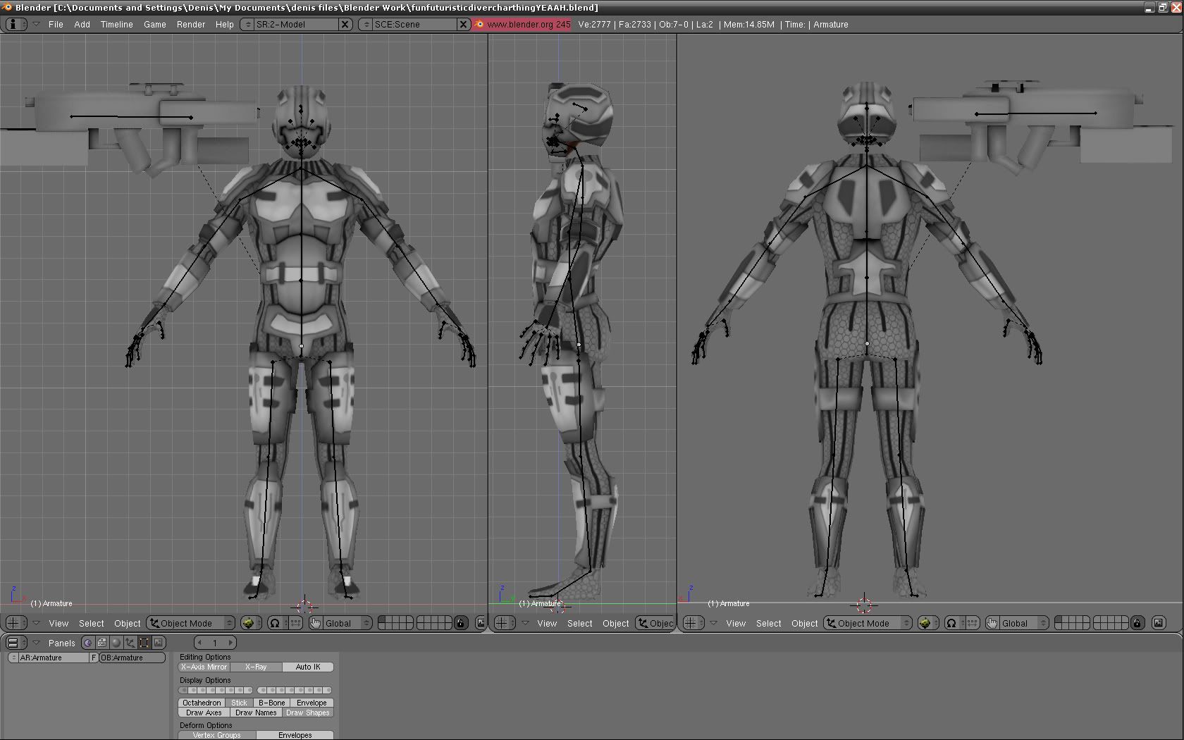
still working on the textures. I think they're too grey at the moment. also the helmet opens up to reveal the face

Replies

  • WipEout
    Options
    Offline / Send Message
    WipEout polycounter lvl 15
    it does look too grey, but that seems more because there is little or no Ambient Occlusion or self-shading done into the texture.

    It's an good start. My suggestions are about the hexagonal weave-- I know that's leaning towards the Crysis suit, but the hexagons aren't interlocking right now, so it just looks like rows of hexagons instead of an interlocking weave. Also make them smaller, I think. I also noticed some stretching in the shoulders (with the weave material)-- the hexagons are significantly larger in places like the shoulders and ankles than they are anywhere else. Try to fix the UVs to prevent that kind of stretching. Also try to follow the muscle masses with the hexagons-- that'll emphasize the muscles more, as well as mimic a body-hugging suit (like a wetsuit or cycling shorts). You'll notice in triathlon wetsuits and expensive bike shorts the number of panels that comprise the whole suit-- these panels are in the shapes of the muscle masses they cover, and that is meant to help with compression so the athlete is less likely to pull a muscle when active. Think of the panels as Ace Bandages. Look up triathlon suits and Sugoi RS Flex biking shorts-- if you look at those closely you'll see what I mean.

    Hope this helps and keep it up!
  • BlackulaDZ
    Options
    Offline / Send Message
    I baked the ambient occlusion and its ontop of everything in the photoshop layer on "overlay" mode so its kinda light but its there, ill adjsut the brightness/contrast a bit. and yeah the hexagon doesnt quite repeat right, i gotta fix that, or i might find a different shape.
    WipEout wrote: »
    it does look too grey, but that seems more because there is little or no Ambient Occlusion or self-shading done into the texture.

    It's an good start. My suggestions are about the hexagonal weave-- I know that's leaning towards the Crysis suit, but the hexagons aren't interlocking right now, so it just looks like rows of hexagons instead of an interlocking weave. Also make them smaller, I think. I also noticed some stretching in the shoulders (with the weave material)-- the hexagons are significantly larger in places like the shoulders and ankles than they are anywhere else. Try to fix the UVs to prevent that kind of stretching. Also try to follow the muscle masses with the hexagons-- that'll emphasize the muscles more, as well as mimic a body-hugging suit (like a wetsuit or cycling shorts). You'll notice in triathlon wetsuits and expensive bike shorts the number of panels that comprise the whole suit-- these panels are in the shapes of the muscle masses they cover, and that is meant to help with compression so the athlete is less likely to pull a muscle when active. Think of the panels as Ace Bandages. Look up triathlon suits and Sugoi RS Flex biking shorts-- if you look at those closely you'll see what I mean.

    Hope this helps and keep it up!
  • BlackulaDZ
    Options
    Offline / Send Message
    I tried to add some color, and fix the hexagon pattern
    Untitled-12.jpg
Sign In or Register to comment.