The BRAWL² Tournament Challenge has been announced!
It starts May 12, and ends Oct 17. Let's see what you got!
https://polycount.com/discussion/237047/the-brawl²-tournament
It starts May 12, and ends Oct 17. Let's see what you got!
https://polycount.com/discussion/237047/the-brawl²-tournament


Replies
Alex
- Whats the goal of making this scene? Is it just porfolio fodder? Personal development?
- What kind of game would it be in?
- What's the story?
- Tell us a bit about what we're seeing here as there's really no focus.
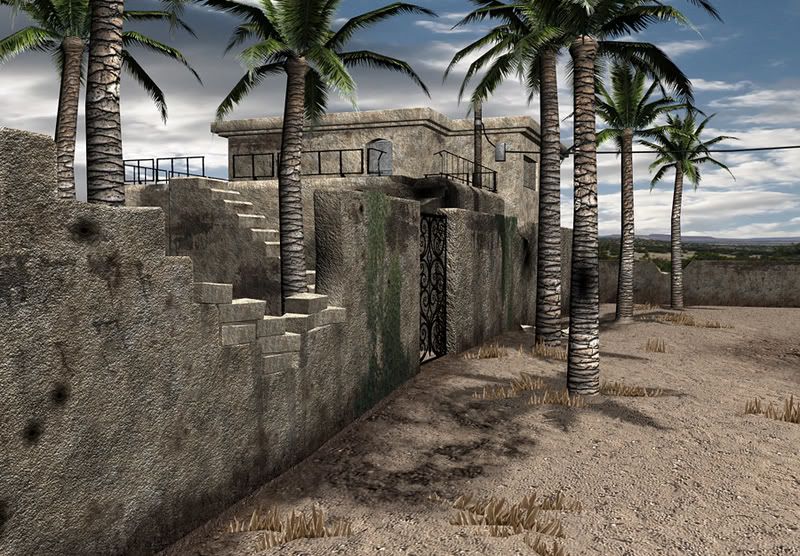
There really isn't much of a scene here really. Just some walls and a few palm tree's. I wouldn't mind learning about this a bit more.I see the point of this looking much nicer than a desert with the sunny and cloudy skies....does remind me of some place like cuba. To be honest...my goal is to make it appear to be a dangerous place...darker than it is now and really a place that was once nice, but was turned into a warzone over some time. Thank you for the comments.
If your going for the warzone effect, it defiantly needs a tune up in the war part. I'm starting to get the hint with the bullet hole wall, but the ground looks like someone just cleaned up the place. Scrap parts, protruding surfaces, or some other thing that add the feel of war would be nice. It would also help break up the flat ground a little.
The trees seem a bit uniform also. That might just be me though.
From texturing and rendering standpoint, I think this is awesome. My first thought was WOW. So good job.
Overall, it's nice, keep at it!
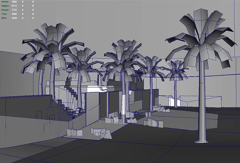
And, look in to setting up a render pass for ambient occlusion that you can composite on to your regular render in Max. Here's a Google search to get you started:
http://www.google.ca/search?q=ambient+occlusion+tutorial+maya&ie=utf-8&oe=utf-8&aq=t&rls=org.mozilla:en-US:official&client=firefox-a
On the subject of lighting, you really need to pick a focus of this scene and use the light to show it. Right now the eye is drawn to the post of the hanging light which is not interesting at all. Not to mention its so far away from the camera. You've got so much wasted space with the open ground area there and all the details are in a back. I suggest you either think of an interesting story to tell in the ground area (crashed satelite, deactivated missle half way in the dirt, remains of the spaghetti monster,... ok maybe not the last one but you get it.)
Good luck, keep us posted with progress.
Do you also have like an asset list of what's really going ot be in the environment as opposed to just buildings, trees, barrels and the usual stuff you'd find ???
Just wondering.
It's important to have that mix and balance.
Here are some refs.
Thank you...I wasn't even thinking about doing the occlusion pass, but I do know how to do it and I think your right on the money that this would bring out detail big time. Yeah I haven't sorted out how to approach the shadows...need to look at some nighttime reference and see how the moon casts shadows. Your right I do need contact shadows on a lot of stuff here. I will work on that aspect definitely.
pliang,
You know I like your idea too...at least have a couple downed palm trees or ones with burnt up vegetation. I kind of envisioned this place as in a war zone, but not really totally destroyed or blasted. I see it as a spot that got some minor mortar and small arms fire. Moreso a place that troops would be unsure if it's a safe spot or if someone is indeed lurking behind one of those walls. I need to enhance that mystery some more in the scene.
jesse,
wow thank you so much for those images...I am going to incorporate some of the details from these images into my scene. I never noticed how much there are actual mounds of dirt pretty much everwhere....but it's clearly there. I love the small dead brush everywhere and I think I will also create some modular assets of that to sprinkle in this scene.
everyone,
I was actually modeling a new US Marine...a new character upgrade from my old demo reel and it was my intention to build an immersive environment around him. It seems though in my approach to build his environment first that I don't have a clear focus in this existing scene. Being at night too I am thinking it might not be the best scene to focus on a character.
In my mind I see a lot of work in After Effects in the comping and edit cuts to first show the full environment...camera moves through it and then to camera center onto the character and subdue the environment. I kind of thought I could put him under a street light and get some dramatic lighting on him too. I may have to do character variations so I could have more than one Marine in the scene...I dunno yet. All things I am considering and contemplating.
So far I am working this environment and modeling out a carbine M4 for him. I have the M9 Beretta from my old demo reel and other assets a Marine would need that can be reusable.
Thank all of you for your help with this.
I'd honestly focus on.. a focus, heh, before continuing.
Small update...got some shadows in there and moved some things around. Still need to add some brush variations and the other critique fixes.
First off I think the shrubs look unrealistic, the leaves are all more or less straight, given the lack of water in an area like this I would expect to see some droopage of the leaves and some dead leaves both on the plants and laying around them.
Next I would seriously tone down the normal map on the trunks of your palm trees, it looks more like layered compacted mud than a date palm trunk. If memory serves date palms have fairly smooth looking trunks with the exception of the rings. Get some good reference shots of palm trunks and try and get closer to the real plant. There are so many types of palm and having a good idea of the location of the scene will help a lot in determining what type of palm to go for. It may seem like a lot of extra work for nothing but at the end of the day it all helps to immerse YOU into the scene thus enabling you to get a better feel for the scene and the story you want to tell with it. Also, again with the dead leaves, add some dead leaves to the palms as well as some browned tips etc.
Getting your assets closer to real will help a lot in making the scene pop. You are doing well so far, keep at it.
Looking good so far. I might suggest a little variance in the ground texture and maybe try and make the buildings and walls look a little damaged and eroded from years of weather damage.
Look forward to working with you soon. :poly004:
(Matt @ Firebrand Games)