The Mastiffs End (WAR building wip)
Ok, shamelessly inspired by the building 5imeon is working on and my continued love of the Mythic concept art I thought it would be fun if I did a building too.
I've had such little time to work on things these days because of a move this has been a nice break so far and I am looking for some early feedback.
Concept: http://mythicmktg.fileburst.net/war/us/home/images/conceptart/CT1207_47.jpg
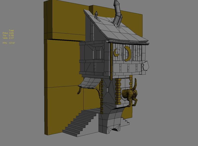
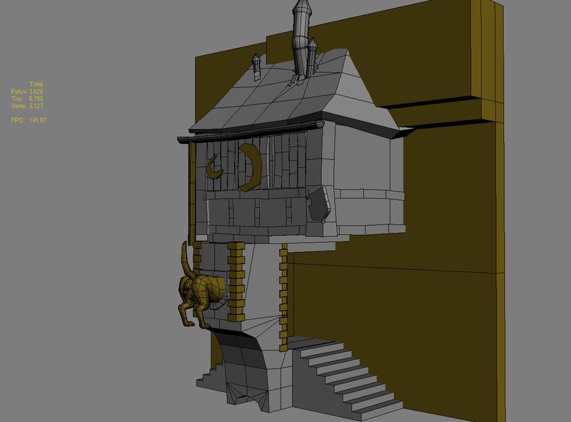
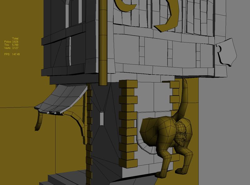
I'm looking for feedback on proportions, polycount, and construction.
Everything in puke yellow is placeholder. The dogs ass is built, but its not tweaked, same with the face.
Still to do:
The background Building and ground/surroundings. (edit, I'm assuming based on the concept this building is supposed to be modular and fit into any background wall section with a door. Which is why I'm considering the background building a separate piece)
Finish the drainpipe with fishhead opening.
Finish the window moon and husk props.
Window and stone trimming.
Front Sign and Lamps.
Smoothing Groups.
I changed the proportions slightly, I made the upper building wider than the concept because I thought based on the sizes and the way it was drawn it would be quite small a building to put a person in. If this is a pub, there would be a table back there. For interest I offset the upper building to the right a bit so I could keep the step-front face true to the concept.
The boards are all basically instances of an original, ie the large cross beams are all the same (rotated for variation). Same with things like the boarded windows. I hope that this is proper form for construction/modeling. There seems to be a lot of geometry buried in each other. It makes sense to me, but I have no idea if thats proper or not.
I also started to think about textures. I plan on having 3 main tileable textures. Stucco, Stone and Shingles. The wood planks will probably go on another texture and then all the details (lamp, sign, windows, ass, face) on another texture. I also hope this is the proper way of thinking.
I've had such little time to work on things these days because of a move this has been a nice break so far and I am looking for some early feedback.
Concept: http://mythicmktg.fileburst.net/war/us/home/images/conceptart/CT1207_47.jpg


I'm looking for feedback on proportions, polycount, and construction.
Everything in puke yellow is placeholder. The dogs ass is built, but its not tweaked, same with the face.
Still to do:
The background Building and ground/surroundings. (edit, I'm assuming based on the concept this building is supposed to be modular and fit into any background wall section with a door. Which is why I'm considering the background building a separate piece)
Finish the drainpipe with fishhead opening.
Finish the window moon and husk props.
Window and stone trimming.
Front Sign and Lamps.
Smoothing Groups.
I changed the proportions slightly, I made the upper building wider than the concept because I thought based on the sizes and the way it was drawn it would be quite small a building to put a person in. If this is a pub, there would be a table back there. For interest I offset the upper building to the right a bit so I could keep the step-front face true to the concept.
The boards are all basically instances of an original, ie the large cross beams are all the same (rotated for variation). Same with things like the boarded windows. I hope that this is proper form for construction/modeling. There seems to be a lot of geometry buried in each other. It makes sense to me, but I have no idea if thats proper or not.
I also started to think about textures. I plan on having 3 main tileable textures. Stucco, Stone and Shingles. The wood planks will probably go on another texture and then all the details (lamp, sign, windows, ass, face) on another texture. I also hope this is the proper way of thinking.
Replies
Also, the pub itself is in the building of the backside, so it doesn't matter that a table could fit there, this is more of an eccentric addition as with empire style.
Anyway it's looking like a good start. Will this be a building featured in the background of this?
http://boards.polycount.net/showthread.php?t=51631
Cheers Chris! I'll widen up the bottom a bit to beef up the stone. The intent is to get it in there. I stepped back from that because it was getting daunting having to high res every asset. So instead of mudboxing stone and brick for 12 years I think I might go with crazybumped painted/referenced textures and decent quality building. Make things with a bit of care rather than pumping out props and assets.
Based on the couple of concepts that are similar to this the idea is to make 2-3 wall sections I'll repeat around the square. And then drop on top these pubs and shops. For the sake of my portfolio though I'd rather work these modular buildings in first and then assemble pieces.
Some updates because I was working on it just now, worked on some drainspouts and I widened the stone and put some detail on the backside.
It's up to 7000 tri's. Theres not much more to add, but I hope that limit is kosher for these types of things.
So just some quick updates before I go to bed. I tweaked the roof a bit to give it some more sag, increased the size of the stone area, tweaked the mastiff ass to give it some character. Put some stone trim around. I have a temp sign holder in there. I think that will end up being the lamp holder because I want to bring in the spikes and warhammer style on to the sign post. The sign and the fishheads are the last things I feel I need to do. (oh and I'm not a fan of that curved husk deco thing, I'm gonna do a little warhammer research and find another deco to put there)
I also started to work on the background cutting in a door and starting to trim. It seems all these medieval style buildings are just endless blocks of trim. Personally I find it fun to do it, but I always have this feeling its not RIGHT. (by floating some box over top of another box)
I also brought in a little colour just to break some elements up to make them easier to critique. I also have no idea what I'm going to do for the stone drain. I think I'm going to add an extra arch trim that I'll unwrap as a seperate object. But I'm not 100% sure yet.
Cut it up please! I'm looking to improve it if I can.
I'm deciding whether to paint the texture or photo-reference them. The photo-reference seems so noisy and not right. But I'm not sure if painting them is going to make it look any better.
The render looks like crap because theres no lighting. Which is probably also killing my motivation a bit.
Here are some of the textures I've been playing with.
Stucco for between the wood, this one is painted (cracks) with a texture photo overlay.
Slate Tiles for the roof
Test Painting of slate tiles for roof
And this is the crappy unlit building with a few photo referenced textures (obviously I've modified the original photo duh).
Working without normal maps and such is a new thing for me. I'm used to either modeling some high polys and baking down, or crazybumping and modifying speculars and normals and then lighting it up to make it look decent. For some reason this just looks like poo.
Continue to focus on your texture painting, and try to rely on photo overlays as little as possible.
You may want to take the time to do some texture painting studies of rough surfaces with lots of colors from odd brushes. That doesn't explain much, but if you get good at it you'll never need a metal/stone/etc photo overlay again because you can paint it. If I get some time tonight, I'll try and go into further detail on this for ya.
When you reach the optimization phase, you can do the moon, shield and any tacked on emblems as alpha planes if you so desire.
Cholden, if you do get a chance to elaborate on more resources for getting that rough surface using painting techniques let me know! I've still used a little photo overlay to get some of the vertical water damage lines and some colour variation. It's also not 100% tileable yet, just have to clean up the horizontal edges a bit.
Lastly, I'm really looking for a good lighting setup to show this off a bit. Having something with shadows and light in a quick scan render keeps my motivation up cause without shadows it seems to look like barf.
if you get the rest of the painted texture work at the quality of the tiles there this thing will be totally bad ass.
However I would suggest you select some tiles and make them a little darker or a little lighter than the other tiles - this should give it a more uneven look.
And where the hell did you find that slate tile picture?!?! I've been looking for something like that for my church. Mind if I grab that beast?
Heres the update on the texture. I'm gonna move on to the next one for now. I think I can get the sharp edges via painting down, but I must now learn how to paint wood, and paint painted wood. And within all this self referencing I will learn.
Definite improvement as far as looks on the building I think. Still looking for a lighting setup, but on to wood for now.
I hope you were able to form an image out of what I was saying, lol. My architect lingo is a little lagging
As for the side of the roof? I believe you're talking about that specific screenshot angle. That is the backside of the roof. I have the roof meeting the side wall on the front side ala the concept, but if you look at the concept the rake of the roof on the other side is much greater suggesting it comes back to create another angled roof section. It also creates a little variety when looking at the building from the 2 sides. And I hope *that* all makes sense haha.