Warhammer building (wip)
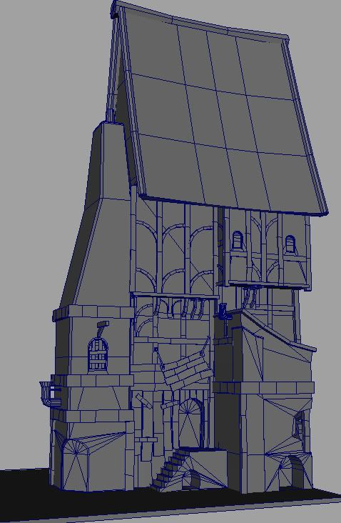
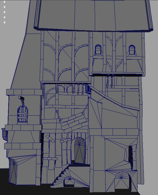
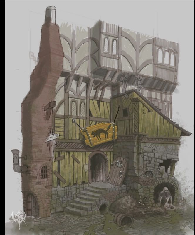
Hello all, found some sweet warhammer concepts from warhammer online so decided to model one to take my mind off texturing road surfaces!
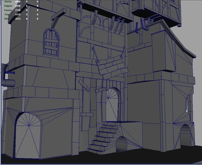
Its quite hi ish poly at the moment but i'll reduce it as i UV/texture it. Anyway, crits and comments are appreciated!
 [/image]
 [/image]
 [/image]
 [/image]
Its quite hi ish poly at the moment but i'll reduce it as i UV/texture it. Anyway, crits and comments are appreciated!
 [/image]
 [/image]
 [/image]
 [/image]
Replies
Good choice, I really like that concept.
You're probably not that high poly, except around some of the pipes.
You've got good warping and distorting of shapes for small detail, but overall you could push the silhouette further. It doesn't seem to be feeling the effects of age, sagging and collapsing so much as the small details do.
i much prefer the concept's chimney-area to yours, though. would have liked a more faithful translation of it.
in fact, overall the proportions are quite off, but i don't think it negatively effects it anywhere else
I could be totally wrong though, and there's a high chance it doesn't even have any effect; I'm a total newb to environment modeling. Which consequently means that I really like your model.
We are making a demo game for a class, and our environment modeler just did the outline of the level with welded planes and that was it. Not a single pillar with more than 4 faces existed, and don't get me started on the walls. Wish we could use something more like your thing
also id suggest loosing a few polys in the pipes that are hiegher up and adding a few nicks and ledges to the brick chimeny, it looks a wee bit regular
ta!
[image]
starting to get near 10000 tri's now so i'll not be adding too many more details. Hopefully later i'll get the chance to look at the roof some more.
Also, don't think you need to model out those brick pieces that high up, either. Could be put to better use, imo.
Someone spent some time drawing a giant pile of poop under the outhouse, which is a comment on the person hanging out in the hole. Which speaks to the story at large. You don't have to model the person, but I would suggest modeling parts of their hovel instead of boarding it up. Hinting that some lives next to a toxic dump is more interesting then boards.
The archway under the stairs looks to be another run off spot, modeling the whole building on a bit of a hill would allow you to put a small trench/depression and turn it from just an arch to a sewer arch with a purpose. You can then also add the broken cobble stones and other interesting ground details.
You put some effort into making boards crooked and slightly miss aligning some things, great stuff I love it. BUT the over all shape of the building, contains too many straight lines. I suggest you put some cuts in and FFD it to a slightly more exaggerated silhouette.
Going back to optimization:
- Instead of making separate boards for the sign, make it one object with a few well placed cuts.
- Removing the boards over the lower right corner hovel will give you a few polys to make a bowl and a small patch of dirty hay.
- The half arches on the side of the building can go, that can be handled easy enough by textures. They are framed by trim and do not stick out or contribute to the silhouette which makes them a perfect candidate for a normal map. I think its a good idea to model them in, and maybe use them to bake the normal map or used as placement holders while you paint the texture, then delete them. But they can go if you're starting to hit your poly limit. Those polys can then be spent to round out the sharp edge on the high traffic steps, you chamfered bricks but didn't round out the steps?
- Pipes, why so round?
Awesome progress so far, keep at it!
keep at it man. It is coming together.
Btw, planks in windows could be done in texture as well.
Awesome work in any case. I'm eager to see ur texturing