The BRAWL² Tournament Challenge has been announced!
It starts May 12, and ends Oct 17. Let's see what you got!
https://polycount.com/discussion/237047/the-brawl²-tournament
It starts May 12, and ends Oct 17. Let's see what you got!
https://polycount.com/discussion/237047/the-brawl²-tournament
Futuristic bounty hunter (Another school project)
Hey all!
After seeing many of my classmates getting awesome critique on their projects I decided to post mine as well (better late than never) to hopefully get some crits and tips for the future.
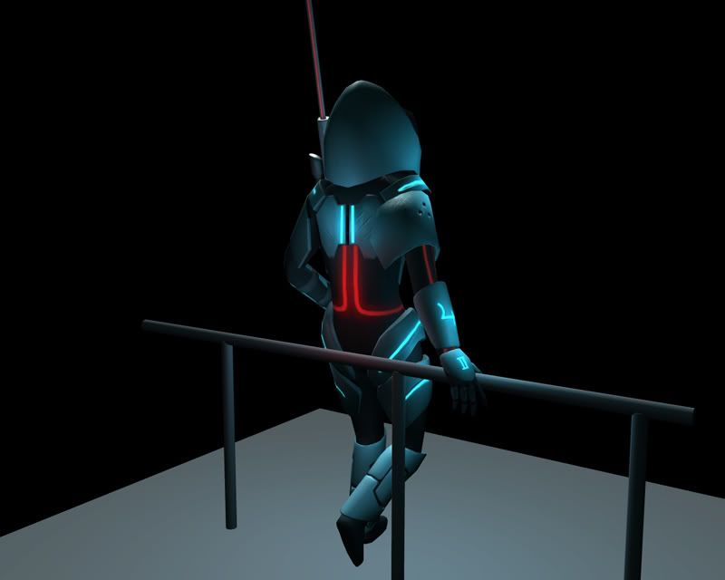
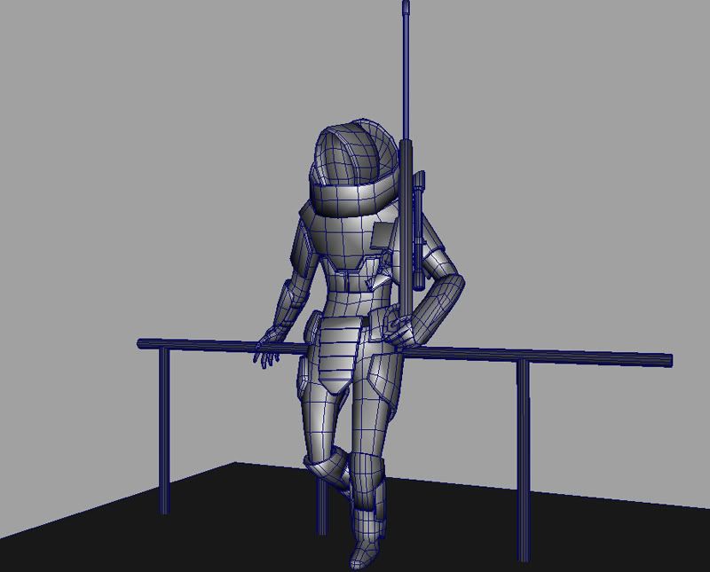
It's finally done after about 5-6 weeks, ended up at 6825 tris (the limit was 7k, character and prop together). He/she is a bounty hunter with a shy guy-ish mask, some kind of power suit and a long ass rifle!
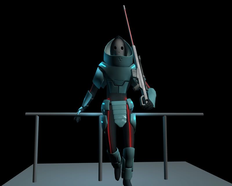
Concept
Close-up 1
Close-up 2
Close-up 3
All comments and crits greatly appreciated
After seeing many of my classmates getting awesome critique on their projects I decided to post mine as well (better late than never) to hopefully get some crits and tips for the future.
It's finally done after about 5-6 weeks, ended up at 6825 tris (the limit was 7k, character and prop together). He/she is a bounty hunter with a shy guy-ish mask, some kind of power suit and a long ass rifle!


Concept
Close-up 1
Close-up 2
Close-up 3
All comments and crits greatly appreciated

Replies
[ QUOTE ]
It's finally done after about 5-6 weeks
[/ QUOTE ]Thats the thing, its never really "done" its just abandoned in a near perfect state. If you let this sit for a week or two and come back to it, you'll find stuff you will want to change.
Mesh:
Could be optimized in a few areas, like behind the head, that cowl could have a quite a few polys removed and still hold its shape. Same goes for the forearm gauntlets. The railing... kind of high poly for something so basic.
Textures:
Where they be? I mostly see large blocks of color and some hints at some spec shine or a spec map on the cod piece.
Showing the texture flats will help us help you with your UV layout and your texturing skill. It looks like you put all your damage detail in the spec and its getting washed out and not really showing up. Some glow detail on each digit of the knuckles would be cool, or maybe just armor for each finger, the all black gloves tend to blend in and get lost.
Lighting:
I like the glow and the colors you chose, the light intensity and direction seems like great choices but, what happened to the shadows? I think you forgot to turn them on? The model and railing should cast at least a soft shadow on the ground. There doesn't seem to be any Ambient Occlusion happening.
perhaps I'm not the best person in the world to give character design tips, considering that I'm not doing it for a living, but meh.. can't help it.
I guess the main question here do you need to look like a christmas tree, and wear silly O_O mask, to be a futuristic bounty hunter? Just because Boba Fett looks like wartorn robocop, doesn't mean you have to try and model your characters same way. Do I make any sense?
The overall design of his.. erm.. armor looks a little bit unpractical. I mean he is glowing. That person should be almost invisible, subtle, stealth.. whatever, but instead he is glowing - hey! i'm a bounty hunter! Next thing - his head armor. Mask is fine, but that huge collar while maybe nice protection, blocks his sight, I mean if he turns his head, he won't see a thing! I guess it's not good for that kind of job.
And Vig already said all the good stuff about mesh, textures and lighting. GL.
Vig:
Now that I look at it, you're absolutely right about the mesh. I guess it's easy to become blind to details like that after staring at the model too much, which is why I probably should've posted it as a WIP here while working on it.
About the scenery, I didn't plan to do it from the beginning but decided to put it in at the last minute and I missed the shadows completely. About them being high poly, I'd have to blame lack of sleep and plain stupidity
Here be textures:
Armor, Armorspec
Body, Bodyspec
Rifle, Riflespec
It's rather simple colors with added dirt (which might not stand out enough. Like I said before, it's easy to stare yourself blind). I really do like your idea about the hands though.
Oleg:
I understand where you're coming from, and I agree that many of the features might not be the most practical. When I designed it I thought more about survival for extended periods in harsh conditions than stealth (I had a small thought about the suit being able to generate power, hence the light and life support system). I also wanted to make something that stood out from the crowd, which is why I sacrificed practicality for the christmas tree look
After seeing all your crits I really feel like revisiting the model to fix it up, but it'll have to wait until after the upcoming game project and modeling contest though. Would love to see more crits, especially on the textures.
These are things I would focus on...though if you absolutely had to follow the concept art Id say youve already succeeded. Do you have to follow it?
perhaps reword some ideas into the concept if you can, before laying them down on textures.
...though if you absolutely had to follow the concept art Id say youve already succeeded. Do you have to follow it?
[/ QUOTE ]
That was the idea for the assignment, but now that it's over, I'm obviously free to do pretty much what I want with it.
I agree about the need of color variation. The idea from the beginning was to somewhat make it look like a brand new armor made of a plastic-like material that had been lightly scratched, dented and dirtied up by city smog throughout the adventures. The dirt might have become too bland though, making it look like a matte finish.