Peyton the Pig-Beast... UT3 problems! Help!
**UPDATE AT BOTTOM**
Hi all. Here's a little something I've been working on the past few weeks for one of my class's UT3 level design project. Hopefully I can get him in engine with little to no problems. High poly is almost done, need some tweaks then I'll tackle the low. Enough text. Hope the images aren't too big? (Photobucket won't let me link to the larger turnaround)
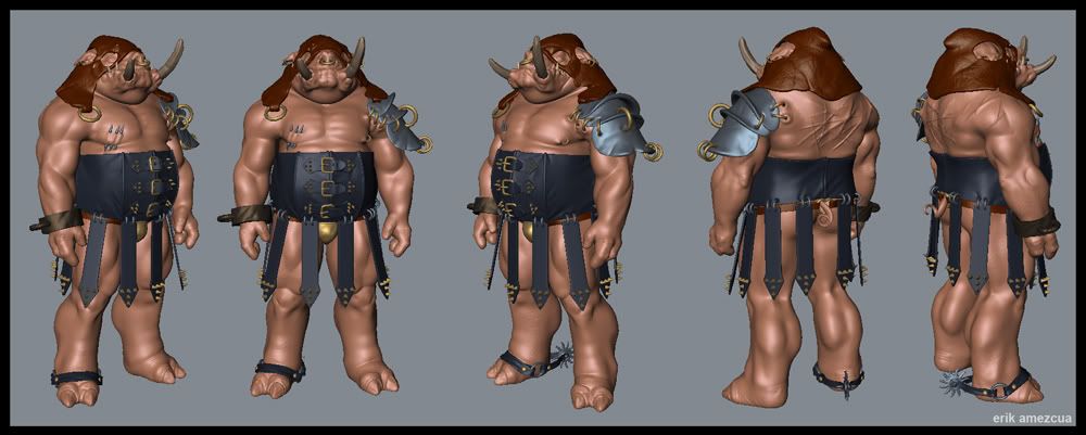
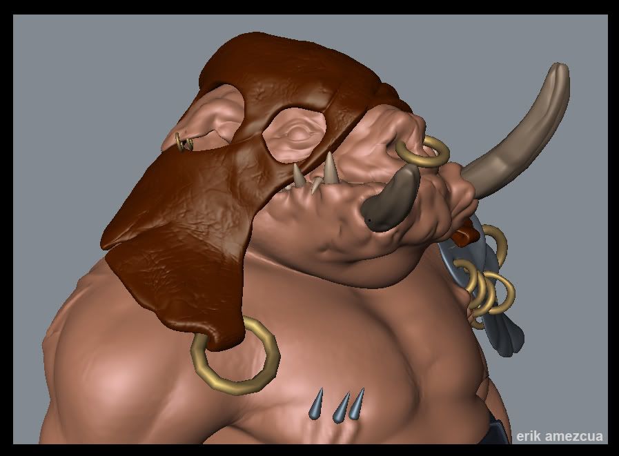
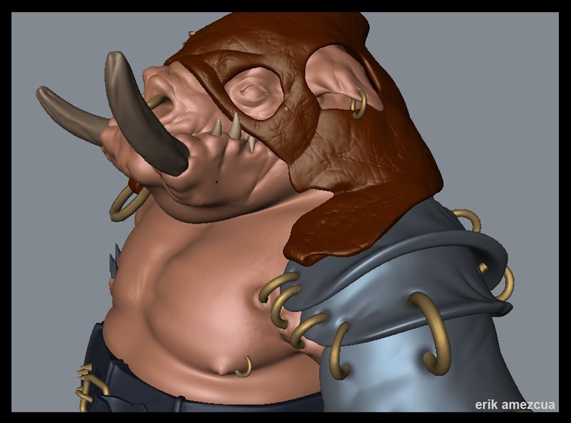
Some sketches if you're up for it:Sketch 1 Sketch 2
I'd appreciate some feedback before I move on to the low. Thanks ladies and gents!
Hi all. Here's a little something I've been working on the past few weeks for one of my class's UT3 level design project. Hopefully I can get him in engine with little to no problems. High poly is almost done, need some tweaks then I'll tackle the low. Enough text. Hope the images aren't too big? (Photobucket won't let me link to the larger turnaround)


Some sketches if you're up for it:Sketch 1 Sketch 2
I'd appreciate some feedback before I move on to the low. Thanks ladies and gents!
Replies
But too shiny.
Tooo shiny!
looks awesome!
As far as the calves go I can see where you're coming from. They could probably be toned down a little.
Ferg Spot on. Great suggestion.
I'll do another pass on this guy and incorporate the feedback as best I can. Thanks guys!
Full body large
The texture is great, makes it look like tasty fatty pig meat.
Would be cool to play with him in UT3.
Rooster: Good eye, forgot about that, easy fix.
SHEPEIRO: I'll put a little more color variation into his mask.
Now, a couple questions for you folks. I got him into Unreal, playable and all that good stuff (though he didn't fit the rig exactly so he deforms awkwardly). The only problem is that is glows like a mofo and he has no smoothing groups. All of the polys have a hard edge. I should note that I used Shakeno's work around to get him it (if that effects anything, I don't know). So, how can I get him to not glow like the sun and be smoothed properly??
As for for glowing in the sun, its likely either a material issue or a map issue. Screenshots and info on what material you are using as a parent might help.
The spurs as rooster pointed out look like they are going to fall off, but even if that was fixed, it doesn't really match the rest of the design and don't really serve any real function.
Have you made a spec map for this guy? Everything at this stage seems to have the same specular level, but oddly enough the metal parts seem to have very little spec or shininess.
Keep it up, mate.
-caseyjones