The BRAWL² Tournament Challenge has been announced!
It starts May 12, and ends Oct 17. Let's see what you got!
https://polycount.com/discussion/237047/the-brawl²-tournament
It starts May 12, and ends Oct 17. Let's see what you got!
https://polycount.com/discussion/237047/the-brawl²-tournament
COD4: "MP_Abandoned" WIP thread
This thread will be for WIP of a COD4 map I just started working on. I'll be continually adding new stuff here as I create new content.
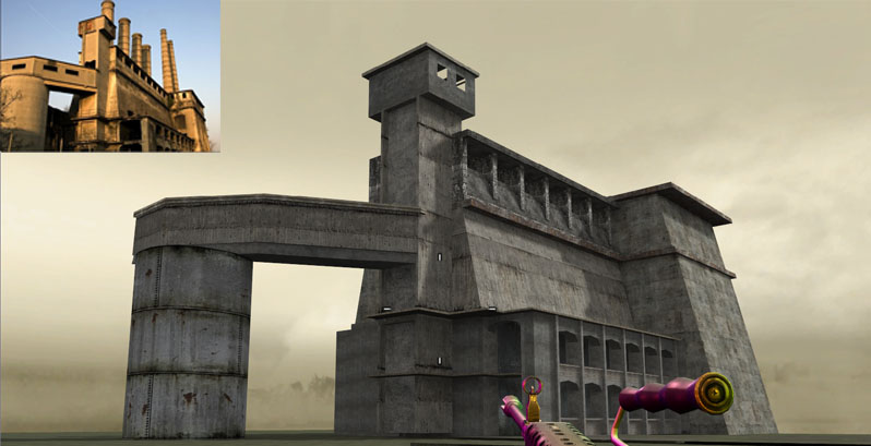
Here's an early start to get comfortable with the tools. Created a silo based off of a photo. This silo will be off in the skybox, so its low detail for that reason. I still need to add some decals and clean it up a little, but for the most part it's done since it's a just a skybox prop. About an hour of work so far

Here's an early start to get comfortable with the tools. Created a silo based off of a photo. This silo will be off in the skybox, so its low detail for that reason. I still need to add some decals and clean it up a little, but for the most part it's done since it's a just a skybox prop. About an hour of work so far

Replies
Good luck, I look forward to seeing more in this thread.
You should consider some strong lighting like in the photo too...I'm probably getting way ahead of the process though.
Nice piece though...making background assets are fun
JZak: Thanks dude. Yeah, with the crash and the increase in scope looks like that done in 2 weeks plan is out the window.
TWilson: The PC version ships with an editor and there's a pretty decent sized community of mappers it seems. Yeah lighting in Radiant is a pain in the ass, so its definitely going to have to be a final pass kind of thing, until then it's ugly placeholder lighting.
MoP: Thanks. The textures are all standard COD. Doing alot of custom texturing is outside of the scope of the project I'm doing, but I imagine I'm going to have to do a handful of custom tex/models for the generators in the power station interior.
Lee3dee: Thanks man, really appreciate it. The cod4 editor is Radiant, so it's mostly BSP brushes with a handful of placed models. The decal/patch system is really really powerful and gives the level designer a ton of choices for texturing surfaces uniquely.
Ott: Thanks for the feedback, I'll definitely add those windows on the walkway.
Here's a building I'm currently working on. It's a coking plant for the skybox, as well. I'm working on the skybox first because I haven't used a BSP-heavy editor in awhile, so it's easier to make mistakes and get the workflow down on eye candy than it is to do so on playable space.
These shots were taken inside the editor, so it's not very close to finalized lighting at all, but gives a rough idea. Compiling lighting is really time consuming and I wanted to get some shots up here since it's been awhile since I've posted.
Another in-editor shot. This shows an idea I'm playing with with for the skybox. Going to have high walls on some sides of the level where you can see overgrown industrial stuff on the other side. The plants look screwy because it's in-editor. Foliage and crane are models, everything else is custom BSP. I placed the crane in to cover up a nasty seam in my skybox
Here's some shots:
looks really nice so far!
only thing that is really kinda bugging me is the railing. I don't really understand how it could have been damaged and bent up like that, let alone along its entire length.
Also added some big god rays of light, cause I'm cheesy like that. It's a dusty place, that's my excuse.
The top walkways will eventually be detailed out and better incorporated into the structure. Running under the shadows of these grated walkways looks really intense so I'm strategically positioning them over choke points to make them more dramatic. The generator is bullshit/placeholder. Just getting shapes and forms laid out at this point.
Some miscellaneous details:
Of course there's always the hay bale.
As an aside, do you know where some documentation/tuts on CoD4 map creation? Infinity Ward's own wiki is still pretty lean on details.
As far as the rest of it, yeah the documentation is really slim. The map is taking me alot longer than I would like because I have to learn alot of undocumented processes. Lighting and FX placement are particularly difficult until you figure out the right workflow.
If you have a particular question I can try and answer it, otherwise I'd say its just a process of trial and error.
As far as the roof, yeah currently its just big holes on a flat surface to let in some natural light. I'll be sure and get to it soon. Alot of work to do!
About the nice cast shadows you have, is that something the engine does dynamically? Or is it some kind of smarter, sharp baked lightmap tech? Looking very good!
The primary lighting of the sky is dope though, dynamic shadow casting on geometry and players + a couple of radiosity bounces baked in during compile time.
Here's an updated contrast shot
alex
BTW - how did you get that third person view on screenshots?
Kuba: In dev mode you can type /cg_ThirdPerson 1 and it will throw you into 3rd person.
Here are some more WIP shots: