Home Contests & Challenges Archives

DWIII - 3D - ChaosEidolon

polycounter lvl 17
Offline / Send Message
ChaosEidolon polycounter lvl 17
Yarrr!

I didn't want to post anything until i had some drawings to get up here. Didn't get a chance to get my thumbs scanned but ive pretty much fixated on this design anyway so i guess this is where things are going. Still thinking about the artifact.
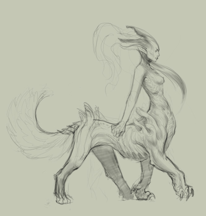
domwarA.jpg

Still deciding if I think this is original enough or if I should push it, so please give me some crits!

Replies

  • r4ptur3
    Offline / Send Message
    r4ptur3 polycounter lvl 10
    i like it quite a bit! will be interesting to see how all that hair turns out smile.gif
  • Spug
    Offline / Send Message
    Spug polycounter lvl 12
    sick...i would suggest working with her proportions, I think if her torso was a LIL tiny bit smaller, it might look better.
    Great work!
  • Jeremy Wright
    Offline / Send Message
    Jeremy Wright polycounter lvl 17
    Very nice.

    I agree with Spug, her upper-half seems a tad larger than it should be. That could be what you're going for, but I think it reads funny.
  • Ferg
    Offline / Send Message
    Ferg polycounter lvl 17
    looks pretty good man, though I gotta say, we're workin on pretty similar designs right now (though yours is better drawn heh)

    we should probably both try and push our designs further...this bare-breasted chick thing seems to be the biggest theme with most of the characters besides the official rules.
  • monkeyboy_garth
    Offline / Send Message
    monkeyboy_garth polycounter lvl 9
    Beautifully drawn, Willem! Agree with others on the proportions though. Having a smaller torso seems like it would be more 'natural' (whatever that means). Hard to give a real crit until artifact and armour/weapons are added.
  • sherrell
    lovely nice proportions. cant wait to see the model done up
  • ChaosEidolon
    Offline / Send Message
    ChaosEidolon polycounter lvl 17
    Thanks guys. Good suggestions on the proportions. I'm kinda seeing that now too. I'll play with it, and perhaps post some new ideas tomorrow.
  • gauss
    Offline / Send Message
    gauss polycounter lvl 18
    that really is a lovely drawing, with all the subtlety that a character like this really benefits from. i think her torso looks good, given that she looks like she's got a tiger or other big cat lower instead of a horse, which would dictate a proportionately smaller upper body.
    on the other hand, it's hard to get excited about another centaur-style creature... i think you can find some way to push or break out from the traditional form of one. richkid's six legged guy from last year (or was that the first year? geez) was a good example of how that could work.
    i think quality of presentation will carry it through at the end of the day, but it'll really help your chances if the underlying concept has something more unusual about it. either that, or you're going to have to detail out her kit in a very surprising manner smile.gif
    any way you shake it looking forward to more drawings and such from you. keep us updated.
  • Neoncypher
    Offline / Send Message
    Neoncypher polycounter lvl 9
    I love the flow of that drawing - caught in mid stride..one of my favourites so far
  • Belltann
    Offline / Send Message
    Belltann polycounter lvl 17
    Divinity and power.
  • Kaej
    Offline / Send Message
    Kaej polycounter lvl 12
    I really like the parts that are skeletal, I think you can make that a strong motif on this chick. can't wait to see her with some armor.
  • Spark
    Offline / Send Message
    Spark polycounter lvl 18
    Really nice and elegant forms man, really like this direction. What were you thinking of for the artifacts? as I am curious how you can make them flow with this character.

    Spark
  • ChaosEidolon
    Offline / Send Message
    ChaosEidolon polycounter lvl 17
    Hey, thanks for the comments guys! The feedback is very encouraging.

    Spark, I have a pretty good idea for the weapons that should flow well with her form. I wanted to get away from her for a bit though, just to make sure I don't have anything else knocking around before committing.

    domwarB.jpg

    I don't think these guys have as much character and star power as the chick though...maybe a little too strange.
    In case it isn't obvious I've been looking at a lot of Barlowe lately :P
  • slosh
    Offline / Send Message
    slosh hero character
    i like the new stuff...seems like the one at the top is peaceful fantasy while these new guys are more combat ready. i dig the sketch on the top right of the page with the crazy long feet...
  • rollin
    Offline / Send Message
    rollin polycounter
    lower right kicks ass!
  • vahl
    Offline / Send Message
    vahl polycounter lvl 18
    I love the stance of the upper right one ! looking forward to it man
  • Jeremy Wright
    Offline / Send Message
    Jeremy Wright polycounter lvl 17
    [ QUOTE ]
    I love the stance of the upper right one ! looking forward to it man

    [/ QUOTE ]

    Yeah, that's a cockstrong walk if ever I've seen one.
  • Wells
    Offline / Send Message
    Wells polycounter lvl 18
    [ QUOTE ]
    I love the stance of the upper right one ! looking forward to it man

    [/ QUOTE ]

    QFT!!!
  • Jaco
    Offline / Send Message
    Jaco polycounter lvl 17
    You’ve got awesome gesture in you 2d stuff, if it translates to 3d (which I'm sure it will smile.gif ) it's going to look pretty damn impressive!
  • ChaosEidolon
    Offline / Send Message
    ChaosEidolon polycounter lvl 17
    Thanks guys. It seems like everyone was feeling the thumbnail! So i did a larger rez version to see what I could get from it. I am still a little torn...I like the design a lot, but i really don't know if it has enough personality for a winning character. I feel like you have to be able to relate to the character. This almost feels more like something you're expected to gun down with a BFG.

    I dunno...maybe I'm being too particular.
    Domwarwalker.jpg
  • Davision3D
    Offline / Send Message
    Davision3D polycounter
    Looks very elegant, i like that a lot. It just need to have huge mental magic power. Could be cool to have a big brain come out of the back of his head.
  • Spug
    Offline / Send Message
    Spug polycounter lvl 12
    sooooo nice. I love the design, kinda reminds me of my character, though this is so much better. Ever heard of carlos huante...he is a master...this reminds me of his work, though it is yours...lol..KEEP IT UP!
  • Jeremy Wright
    Offline / Send Message
    Jeremy Wright polycounter lvl 17
    [ QUOTE ]
    I am still a little torn...I like the design a lot, but i really don't know if it has enough personality for a winning character. I feel like you have to be able to relate to the character.

    [/ QUOTE ]

    I agree and disagee.

    In theory, you're correct about relatable characters having an edge, but if you look at past top placers like Taehhoon and Peppi, they're entries were pretty hard to relate to, but won on awesome factor.

    Honestly, half-cat girl is the safer bet, but also runs the largest risk of being somewhat generic. That's not a dig, either, because I love the way she looks, and hell, I'm just concepting a knight, but that's one of the risks of shooting for the easily readable, relatable category.

    Take a moment away from both concepts, then decide.
  • Joseph Silverman
    Offline / Send Message
    Joseph Silverman polycounter lvl 17
    I disagree wholeheartedly, 8ftspider. Peppi's entry had some of the most readable personality of any of the top ten, and taehoon's was definitely humanlike enough to portray some attitude and even emotion.

    Chaos, you're one of my favorite 2d artists, and all of these concepts are cool, but i think this is looking a little too much like a cannon fodder shooter enemy. The smaller version of it read like it had a more beaklike head/face, to me. I don't know if that would appeal to your ideas for the design, but it's an angle you could explore a bit. smile.gif
  • Jeremy Wright
    Offline / Send Message
    Jeremy Wright polycounter lvl 17
    I hear what you're saying, but I never said Peppi's entry was unreadable: I just don't view it as a hero as much as I do a end-level boss. I do find ChaosEidolon's 2nd concept harder to read than the first, certainly not impossible to read, and certainly one of my favorite things I've seen in anyone's thread. On a human emotional level I see nothing relatable in Taehoon's character. It is imposing, and in all respects incredible, but hard to relate to emotionally.

    I'm going about my thought process as if what we're all more-or-less creating is someting we want to BE in a game and not something we want to BEAT in a game.

    We'll have to disagree, but I am willing to concede to you in an effort to avoid derailment.
  • ChaosEidolon
    Offline / Send Message
    ChaosEidolon polycounter lvl 17
    It's not derailing things at all. I appreciate you guys throwing in on this because I've been having the same dialog in my head.
    I'm still not sure what I am going to do for the final though haha! I'll have to start modeling by the end of this weekend at the latest so hopefully I'll have it figured out by then.

    Thanks for the encouragement!
  • Zwebbie
    Offline / Send Message
    Zwebbie polycounter lvl 18
    I don't think there's a need to compromise between relatability and this design. The power of this character so far, for me, isn't about the details, but it's more about the pose and attitude. I'd say you could easily place a winner's head on this, and as long as you keep the long legs, chest forward, head backward, proud pose, you'll still capture the essence of what he is now.
  • killingpeople
    Offline / Send Message
    killingpeople polycounter lvl 18
    beautiful drawings
  • slosh
    Offline / Send Message
    slosh hero character
    i agree with comradej. posture and how you pose the character can go along way in how he is perceived. sure, he looks like he could be a goon from an FPS but his pose would be hunched over and very attack mode like. i think you could easily spruce this guy up with cool colors and give the right pose, would look regal and heroic. don't give up on this guy yet!
  • stalsby
    That last one is looking peppy!
  • peppi
    Offline / Send Message
    peppi polycounter lvl 18
    Wow man! Hot sketches! Love the last one especially. I wouldn't be too worried about lack of character, right now all he needs is a little context or history of sorts. You could place a few bits of nicely shaped armour on top of that design (without hiding too much of the organic coolness), add some accessoires and an equally pimp looking artefact weapon and it should give him a much bolder personality.

    Really looking forward to this.
  • ChaosEidolon
    Offline / Send Message
    ChaosEidolon polycounter lvl 17
    Man, thanks for the kind words guys.

    So, I was trying my ass off to figure out what to do this weekend...i poured a ton of time into the alien guy, thinking that just a little more work might convince me, but at the end of the day I just couldnt get it to a point where I was feeling it.
    So...a ton of time in the water, but oh well. If I'm not excited about my entry it's not going to happen, so we are back on the chick and chugging along again.

    Getting the colors sorted out...more to come.

    domwarA2.jpg
  • Murdoc
    Offline / Send Message
    Murdoc polycounter lvl 11
    Really nice, alien/fantasy nailed.
  • Belltann
    Offline / Send Message
    Belltann polycounter lvl 17
    I love the linedrawing but the colours makes it look bland. Some more colours/variations would help with the contrast. The eyes arent drawn to the face either, maybe if you make her face very white with sparkling pinkish irises.

    other than that its really impressive smile.gif
  • EnErgEstEr
    shes cool but i really liked the other guy. He was one of the best things ive seen on these threads so far. Theres like 3 girl with creature body concepts on the polycount threads alone.
  • Steve Schulze
    Offline / Send Message
    Steve Schulze polycounter lvl 18
    In all honesty, I thought your other design had more personality. Theres plenty that can be read from his stance, and physique. Shoulders back, chest puffed out. Proud and arrogant. He's a powerful being and he knows it. Its easy to imagine him striding across the battlefield, towering above lowly uunderlings,

    Your centaur is nicely drawn, but by comparrison she's dull as dishwater.
  • okkun
    Offline / Send Message
    okkun polycounter lvl 18
    oh noes, black claws for hands, boobs and red hair, I think I need to think of something else for my entry :P
  • auburenite
    Aw I like the other one... but I totally know the feeling. The other one reminded me of Alien but scarier. This one looks beautiful though. Maybe if the animal body was a bit bigger- not including the legs, the length of her human body is very similar to the length of her animal body. Other than that I'm diggin' the direction the colors are going. smile.gif
  • Davision3D
    Offline / Send Message
    Davision3D polycounter
    I like the concept you did before much more. It has so much style and its very innovative.
    But this one is also very cool, just a lot more generic compared to the one before. Make sure you cover her boobs or you could get disqualified.
  • Soccerman18
    Offline / Send Message
    Soccerman18 polycounter lvl 18
    Some really nice sketches here. The chick is interesting but I think the walker has a lot more character to it.
  • BradMyers82
    Offline / Send Message
    BradMyers82 interpolator
    Hey, I think someone has ripped off your idea with the other guy, (the one everyone seems to love). It’s disturbingly close to your idea. I found this browsing the GameArtisan forums to see what kind of competition we have this year against them.
    Check out this link to see what I mean:

    http://www.gameartisans.org/forums/showthread.php?t=2711

    It was posted after you posted yours, and honestly doesn't look as good either. I guess it could just be a coincidence, but it looks sooo similar and its such a unique design to begin with..
  • ChaosEidolon
    Offline / Send Message
    ChaosEidolon polycounter lvl 17
    haha! man...thanks guys. you guys set me back on track. I've been busy as hell and dealing with girl issues on top of that, but that seems to be at an end, so it's time to get some serious work done.

    ...and if I'm getting that kind of compliments from over at Gameartisans, how can I NOT do the alien? Looks like the choice is made.

    ...for real this time. updates on the way wink.gif
  • Jeremy Wright
    Offline / Send Message
    Jeremy Wright polycounter lvl 17
    That someone would try to pull something like that is surreal/absurd.

    I can't wait to see more from you.
  • ChaosEidolon
    Offline / Send Message
    ChaosEidolon polycounter lvl 17
    lol, honestly I think it's funny more than anything. ah well.

    well I decided to make up for my slacking and put in some proper time tonight and get my 3d base blocked out. I think I've resolved the way the hang works a little better, with a ball joint at the wrist. Tons of tweaking before it's happy though.

    persp_rough.jpg
  • EnErgEstEr
    Glad you went with the strider man. I like the ball joint hands, Ive never used that before.
  • frigi
    Hi,

    I never meant to rip off your concept and I haven't actually even seen it before, so I'm sorry that it resembeled it that much especially when it comes to the legs.
    Since you obviously were the first to come up with that it's up to you to execute it of course and I already have stopped working on it and started over.

    And yes, apparently you can take this as a compliment, apart from the legs I also absolutely dig how its overall flow is like. wink.gif
    After all I actually like the one you have in the lower right corner of your second image even more, it just has this extra "kick" making it extraordinary. (great flow of shapes in the first place)

    I talked to Fred about this and he was fine with it and I hope so are you. (I'm one of those anti-plagiarism guys myself so in the end I completely see your point.)


    Well, good luck in the war!

    Fabian
  • Davision3D
    Offline / Send Message
    Davision3D polycounter
    Yes, good choice! The Base is allready looking great.
  • BradMyers82
    Offline / Send Message
    BradMyers82 interpolator
    The mesh flow looks really well done, it looks slightly jumbled up on the top center of the head from that image though. regardless, it looks like you could already do a high poly sculpt with this. Nice.
  • ChaosEidolon
    Offline / Send Message
    ChaosEidolon polycounter lvl 17
    little more work on the design tonight...need to get my artifact idea down.

    Corrupted by the power of the Green! I think I've decided he's going to be an Evoker...so perhaps a staff will suit him. He holds things from a distance with his physic alien awesomeness. It's my hack for giving him weird ass hands and realizing he can't actually hold anything.

    strider2.jpg
Sign In or Register to comment.