The BRAWL² Tournament Challenge has been announced!
It starts May 12, and ends Sept 12. Let's see what you got!
https://polycount.com/discussion/237047/the-brawl²-tournament
It starts May 12, and ends Sept 12. Let's see what you got!
https://polycount.com/discussion/237047/the-brawl²-tournament
Barflez - 70 Human Warrior - Bronzbeard
I figure this is far enough along to warrant it's own thread.
I've stopped playing WoW again and what better way to shake it off than to make my character next-gen. Yay!
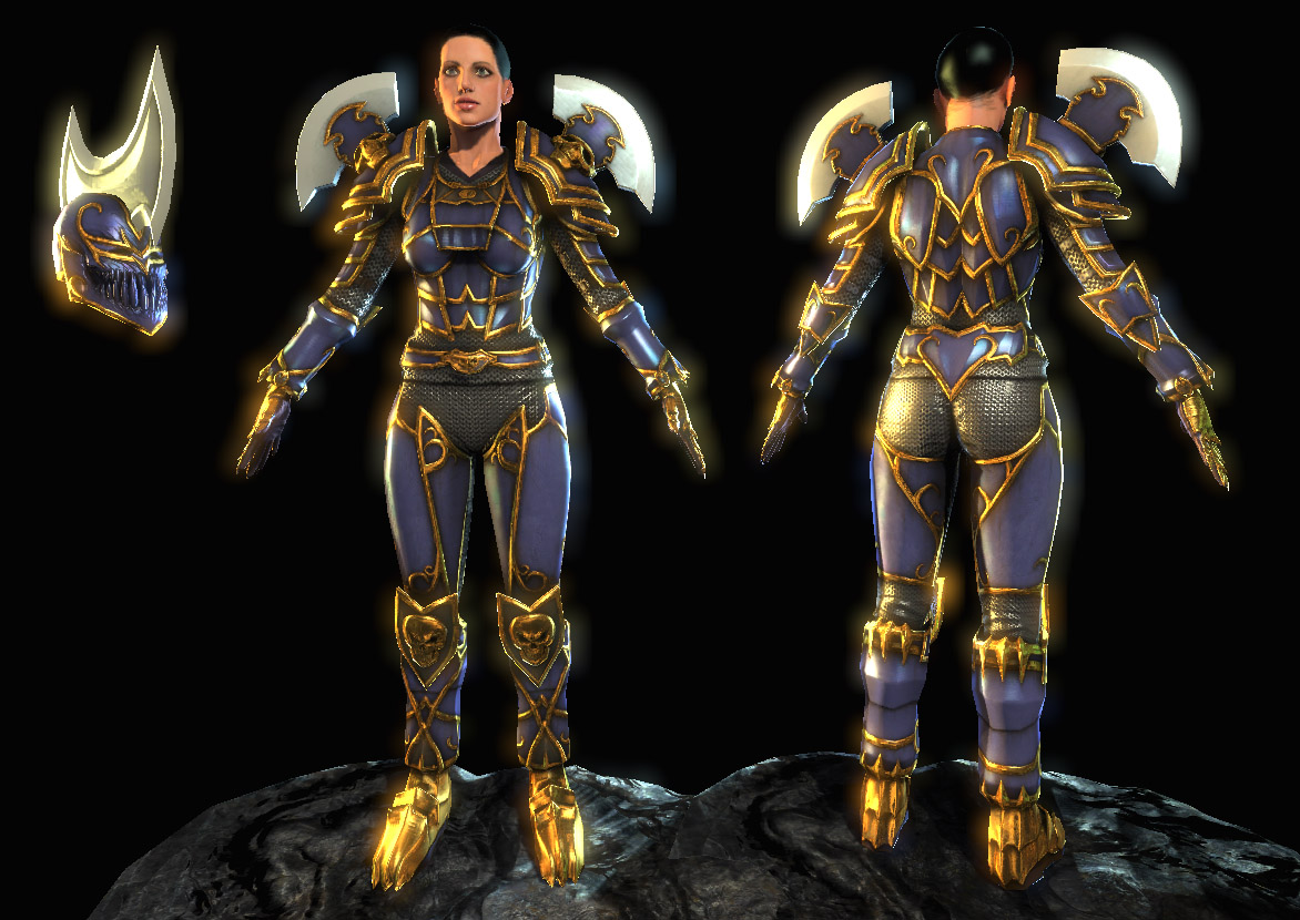
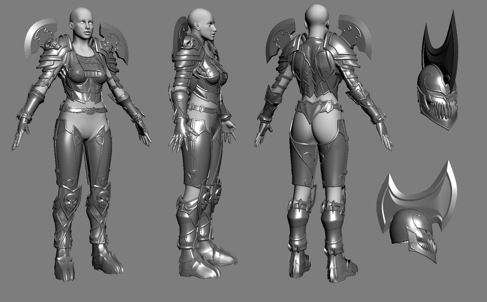
This was actually going to be my blizzard competition entry from 2006. It's based on my WoW character as it was sometime last year (I think?) wearing the Wrath armor set which was the only full set of armor I've gotten in the game, and probably my favorite looking set they've done so far aside from the helm. I always hid my helm anyway.
I still have a good deal of work left on it. Need to figure out how to make hair work since Unreal doens't like anything but 1 bit alpha.
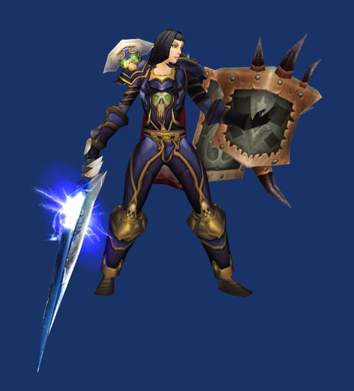
Planned on doing the shield and sword in the reference pic too, but I doubt I can do all of it before DWIII so I'll have to tackle the hair first and hope I can do the others before DW if I have time.
progression - http://www.horribledeath.com/images/wip/Barflez/
I've stopped playing WoW again and what better way to shake it off than to make my character next-gen. Yay!


This was actually going to be my blizzard competition entry from 2006. It's based on my WoW character as it was sometime last year (I think?) wearing the Wrath armor set which was the only full set of armor I've gotten in the game, and probably my favorite looking set they've done so far aside from the helm. I always hid my helm anyway.
I still have a good deal of work left on it. Need to figure out how to make hair work since Unreal doens't like anything but 1 bit alpha.
Planned on doing the shield and sword in the reference pic too, but I doubt I can do all of it before DWIII so I'll have to tackle the hair first and hope I can do the others before DW if I have time.

progression - http://www.horribledeath.com/images/wip/Barflez/
Replies
I would have also loved to see you work in that skull on the chest but what you came up with looks great too.
- BoBo
It's taken nearly 2 years but it's lookin absolutely gorgeous, I concur with bobo's helmet suggestion.
Perhaps make them appear like the metal blade on the head & shoulders. Any chance of those skull eye sockets getting some emissive shader treatment?
Also check the alignment of bottom of skull on the back and the bottom of nose, should align no? the nose feels a ted too long to me.
Now let's see some insane texture work!!
Spark
Congrats on kicking the W.O.W. habit.
WORK IT
Anyway it looks very nicely. Its always nice to c some fancy goth elf armor from U
[ QUOTE ]
We cannot proceed.
The form you have submitted is no longer valid.
Please use your back button to return to the previous page.
[/ QUOTE ]
FUCK YOU POLYCOUNT!!!
I've done dozens of small fixes and changes to the the various maps. I also added the green glow and runes finally and messed with the shader a bit more.
Bobo : I actually wanted to have more skulls on her, but somehow forgot to add them. I originally had the logic of wanting her to not have completely rigid chest peice so I went with the scale idea to make it seem somewhat more mobile, but eh, its big bulky armor so it's not going to be very mobile anyway. oh well.
shotgun : Agreed, but I think I'm far enough along at this point that I dont see myself going back and changing the high poly significantly and then rebaking/fixing all the texture maps. Looking at it now there is a lot with the design I'd like to change but DW is approaching fast.
Good call on the face, something was bugging me about it, and still is for that matter. The normal is kind of messy on it, so I'm likely going to rezbrush/project it since I dont see a lot of crazy fixes involved with that.
Brett : this is what the diffuse and spec map look like currently -
http://www.horribledeath.com/images/wip/Barflez/barflez_df_10.jpg
http://www.horribledeath.com/images/wip/Barflez/barflez_sp_10.JPG
The gold effect is an environment map I baked out from one of the UT3 levels plugged into a few other shader components to modify its intensity and color within unreal.
http://www.horribledeath.com/images/wip/Barflez/barflez_gold.jpg
Onelung : I'm thinking I'll change the shoes to some sort of brassy or coppery type metal, I put some dirt on them to try to drown out the gold a bit. Changing the metal type to something else should work better in addition to the dirt I think.
Soulstice : The gold, and with this update, the shoulder/helm blades are more shader driven. The blueish purple metal is just diffuse and spec.
Iron : I've been thinking about it and I think I'll have to do a combo between sculpted lit hair with 1 bit alpha and then do strands with the full range of transparency but unlit. Luckily her hair is black so it should be easier to get away with.
Thanks for the feed, always helpful to get others' eyes on this stuff to help me see what I can't on my own anymore.
- BoBo