The BRAWL² Tournament Challenge has been announced!
It starts May 12, and ends Oct 17. Let's see what you got!
https://polycount.com/discussion/237047/the-brawl²-tournament
It starts May 12, and ends Oct 17. Let's see what you got!
https://polycount.com/discussion/237047/the-brawl²-tournament
Ayl, character model
This is a warmup project for upcoming dominance war.
I lack the knowledge on certain areas which is vital for the competition... if I want to make any good results at all.
This is my very first human model, and first 3d sculpting as well. Not to mention I have never baked any normal maps before. I'm learning quite much here.
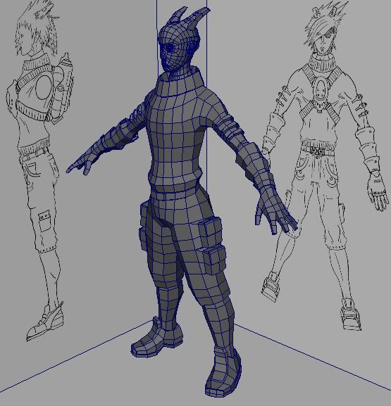
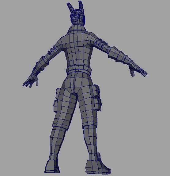
For modeling the base mesh I used a reference model to get proportions right and the Joan of Arc tutorial on 3d-total for making the head.
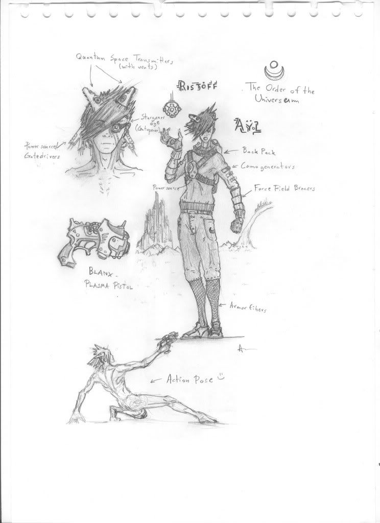
This is my own concept which remain as a sketch in the mean time.
Basemech
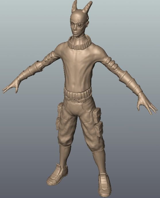
Mudbox model
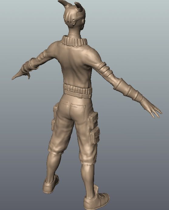
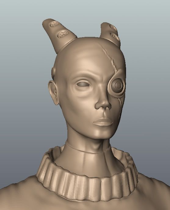
I lack the knowledge on certain areas which is vital for the competition... if I want to make any good results at all.
This is my very first human model, and first 3d sculpting as well. Not to mention I have never baked any normal maps before. I'm learning quite much here.

For modeling the base mesh I used a reference model to get proportions right and the Joan of Arc tutorial on 3d-total for making the head.
This is my own concept which remain as a sketch in the mean time.

Basemech


Mudbox model


Replies
I dig the concept and the base mesh, but the sculpt could use quite a bit more work. The anatomy is way off, and he's lost the youthful look of the concept. There's a general lack of detail everywhere, and where there is detail, it's blobby and unfocused -- the cloth folds seem completely random. It looks like you have a solid start, but all i can really say is to get (a lot) more ref and take the sculpt a lot more seriously.
[/ QUOTE ]
Doing the best I can on the sculpting at the moment. True, I have to look up some more cloth reference.
What part of the anatomy do you think is wrong? The whole thing?
What part of the anatomy do you think is wrong? The whole thing?
[/ QUOTE ]
Face and hands -- like i said, I like the base, just not your detailing. The brow's wrong, the ear is too thin and too high, the orbit is freakily defined and he has no cheekbones to speak of, and there's a weird inconsistency between areas of strange musclature, like the brow, and places that don't seem to have any fat/muscle at all, like right around the eye.
Just google image of flickr search for male faces, you should see a lot of what's wrong. Youthful faces are actually rather subtle.
(hands don't have near as many issues, they just seem too simple -- look at your own hands, there are a lot of muscles and tendons and pads to get in there, just start with the simple/bigger forms and refine.)
[ QUOTE ]
What part of the anatomy do you think is wrong? The whole thing?
[/ QUOTE ]
Face and hands -- like i said, I like the base, just not your detailing. The brow's wrong, the ear is too thin and too high, the orbit is freakily defined and he has no cheekbones to speak of, and there's a weird inconsistency between areas of strange musclature, like the brow, and places that don't seem to have any fat/muscle at all, like right around the eye.
Just google image of flickr search for male faces, you should see a lot of what's wrong. Youthful faces are actually rather subtle.
(hands don't have near as many issues, they just seem too simple -- look at your own hands, there are a lot of muscles and tendons and pads to get in there, just start with the simple/bigger forms and refine.)
[/ QUOTE ]
Okay. I'll see what I can do.
Sculpt is done, lowpoly done, tested making normal maps in maya, edited them in crazy bump and made a rough base for the textures. Got one for the body and one for the head.
Right now I can't seem to get transparency to work on the hair. I've tried both having an alpha channel in the diffuse file and assigning a separate map to the material's transparency channel. Anyone have a clue what might be wrong?
I could also take the opportunity to make clear that this is mainly a practice project. It's far from perfect and I've hastened some things up so I can "finish" it before Dominance War III. Don't let this stop you from criting though. Crit even harder I say. Just don't say I haven't been serious enough or something like that. If this would be a portfolio piece I would give it lot more time and love.
Anyways, here's a bunch of pics. See ya on the battlefield!
Lowpoly
Wireframe
Sculpt