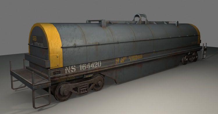
Railroad steel coil car
Here's a coil car made for an environment prop. I'm pretty much almost done with but i'd like to ask for some critique on the textures, or tips to watch out for next model.
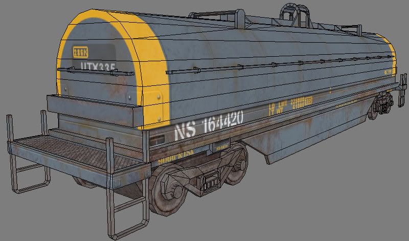
It's currently at 3177 tris, with two 1024x512 maps (top and bottom maps are separated so I can slap something else on top of the carriage and save time)
With normal and spec:

Wires:

I'll glady post the textures if anyone wants to see them.
Thanks
It's currently at 3177 tris, with two 1024x512 maps (top and bottom maps are separated so I can slap something else on top of the carriage and save time)
With normal and spec:

Wires:

I'll glady post the textures if anyone wants to see them.
Thanks

Replies
looks like you made one huge texture for the length of the car? i probably would have split the mesh along the metal seams you created and made two or three panel textures, flipping and rotating the uvs would have been enough to ensure no noticeable repeating.
looks good, though!
I would like to see the texture(s).
[ QUOTE ]
What'll this be used for?
[/ QUOTE ]
A demo reel.
Here it is with cleaner wheels, and with the paint scratched out slightly:
And the diffuses:
Top:
Carriage:
Thanks again
Did you create the normals from your diffuse textures (of variations of)?
And I noticed in your model you tended to keep things as all one mesh, specifically the parts on the top of the cargo containers. Was that your own decision or a general modeling convention? I'm generally used to modeling with floating parts and I was just curious to that particular aspect of your model.
I think it this looks really great, simple and quite inspiring for me to find something simple and effective to model for my portfolio. Thanks!
http://flickr.com/photo_zoom.gne?id=6726355&size=l
i think i could get the same look with half the texture space ie 512* for each bit, the key would be to add some extra loops so that you can re-use sections of the texture remembering that a 512* or 256x1024 will tile sideways nicely .
looking at your flats most of the texture is very similar, make the most of this by using the same bit of texture for several parts.
I think put a dark light to it will look better.
keep it up!
Are you going to just pimp this thing as it or build something for it to lay naturally in?
[/ QUOTE ]
I'm already building a train depot environment and this is just a prop for the scene, but it's nowhere near finished enough to pimp it here
I agree that for future referrence, you probably should have done a couple of segments of the tank, and then used geo to mirror/flip them around to stop the tiling, rather than 1 huge texture for it. I do think you made a smart move by splitting the carriage out of it.
Nice work.
Good peace, it needs more wear though. And show me a train car that doesn't have graffiti on it and I'd be one surprised monkey!
if this is for a FPS then i think it would be important to add eye level details like this
Also, i may not have mentioned, but yeah I was going for a next-gen prop so I gave myself some leeway with the triangle count. The lower level of detail is a good idea though!
I added more sections to the wheels like Shepeiro said and removed some from the smaller cylinder jutting out of it (it really didn't need that much) to compensate and ended up lowering the tricount.
So here it is with better wheels, more structural wear, and graffiti!
Anything else?
really looks great though
also sectaurs makes a very good point about making a panel texture and flip it around a bit. Smaller texture and higher resolution, what else can a man ask for?