Mini-Project : Slurp the alien
Slurp the alien, a fairly unintelligent creature who uses his penis-like forearms to feed, mate and even fight ( Cock slap!)
I started with a ZSphere concept (after doing some thumbnails in Photoshop), did some sculpting on the result and then used the topology tool to get a better base mesh.
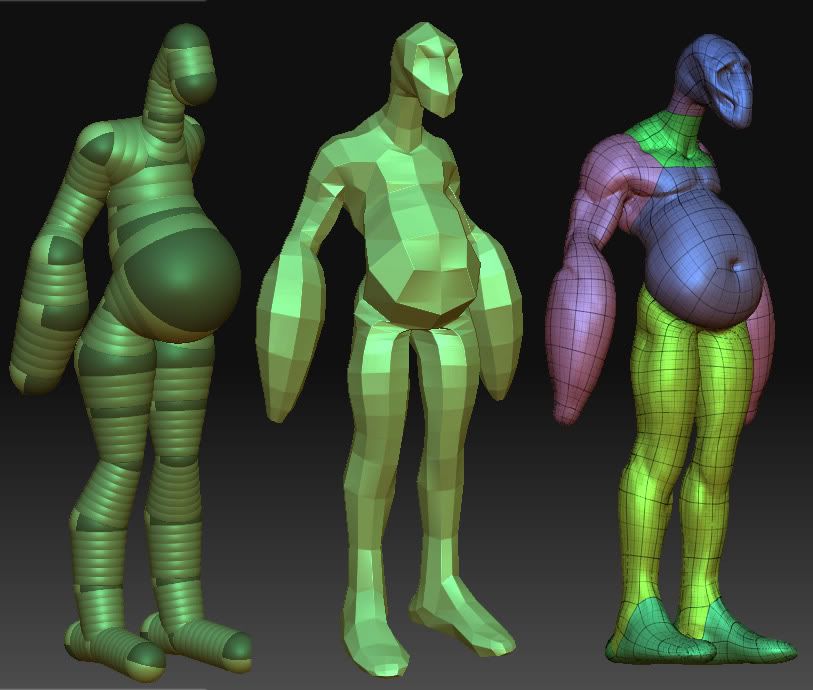
Wip sculpting so far, havent really touched the legs:
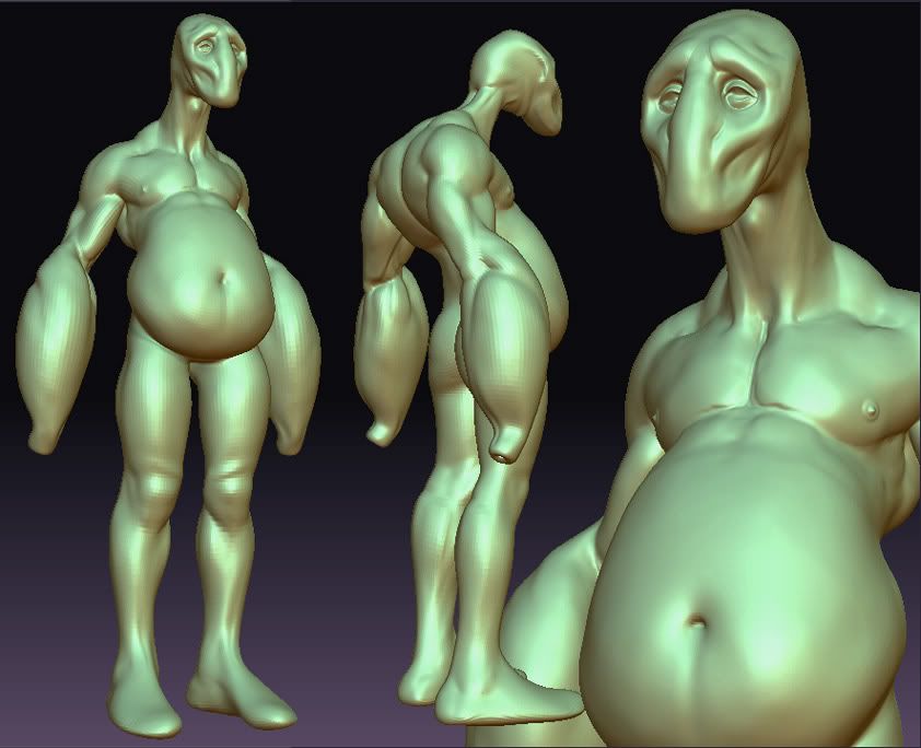
I started with a ZSphere concept (after doing some thumbnails in Photoshop), did some sculpting on the result and then used the topology tool to get a better base mesh.


Wip sculpting so far, havent really touched the legs:

Replies
kaoticvisions: Indeed
MAUL0r:
kaoticvisions: Agreed, crotch added
Update:
I might still change some of his proportions and add some small details but the sculpt is pretty much finished.
"penis-like forearms"
It reminds me a little bit of the Goon from PopEye.
hahaha kidding.
Beautiful anatomy work though.
needs a couple of straws for his hand-mouths
Anyway looks cool, what material are you using in last render?
Zspheres arent impossible to use, they just take some getting used to. I find that previewing by pressing A, and then sculpting on the preview whilst Im still busy working with the zspheres helps.
Piotr you can find the material here (second post, attachment)
Yeah notmans right, he feeds through his arms, acid dissolves the food (this same acid can be squirted at enemies) and the liquefied food is then transported to his enlarged stomach area where it is stored. After the stored food has been used he obviously poops it out.
As for why he has an adams apple and apparently useless muscles on his forearms A)evolution fucked up
Toomas youre right. It does make some sense though, the brachioradialis , extensors and flexors in his forearms can be used to move the tip of his feeder around, although it isnt the most effective way of doing it (The muscle structure of a snakes body, or an elephants trunk would probably have been a better choice)
Thanks for the paint-over wake, I hear what youre saying. I actually like the contrast between the big soft belly and the sharp/defined legs. ( the same contrast is happening with the forearms and upper arm). The fat on his belly isnt from too many beers, its more like the hump on a camels back, thats why the rest of his body is skinny.
I like the proportions of your paintover though, I'll change the low poly accordingly.
I'm busy with the low poly, I'll post it soon.
although it does not hurt to provide feedback, I just think the feedback should be a bit more measured.
i think this model is beautiful, and you're doing a great job. i love the way you're treating the anatomy, but i agree with wake to the extent that the legs could be a bit shorter than they are now.. at the moment something is feeling uncomfortable about the front views. the back isn't as bad in this respect though. i think that if you did shorten the legs, you'd certainly have to raise the ass. the length of the torso in wake's paint over is too long in contrast to the short legs.. imo.
Warner, you're right about the proportions bit. That edit was to illustrate the general idea rather than its precise execution.
and PeterK, what you said would be right if I was telling Jaco to work directly off of the image I provided. The quick photoshop I did was just to give an idea of what it would look like if the legs were shortened, and not to be used as reference, which I think Jaco understood.
I've started painting the texture on the high poly, it will be baked with the normal maps later.
This is still very wip, just some quick painting with the alpha brushes. I like the arms and torso so far, the rest still needs some love. C&C will be much appreciated.
Texture WIP
You don't wanna know what she has for arms...
[/ QUOTE ]
LOL
Edit: The colours aren't showing up nicely in zbrush, so here's a shot with 100% self illumination to see the colours properly:
this guy is pretty sweet. I'd love to see a fine-detail pass on him.
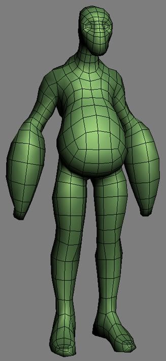
Started the low-poly:
I'll do most of it with the topo-tool, and then make it prettier in max.
It's 3 in the morning here and I'm going to bed
Great modeling dude.
Xaltar:
Low-poly with normal map + diffuse. This is the first time I've tried painting my maps in zbrush. Some of it came out okay but his back looks like shit. Luckily it's pretty easy to repaint in zbrush and then rebake in xnormal again.
C&C on the texture so far would be much appreciated.
As far as crits for the texture... Have some boldness with color and values. You really don't have any contrast going on. The smooth transition of color you have now is nice, but I see such things as freckles and whatnot that seem to be culled back a lot. It can help to add a little detail, but if you never get some hard edged contrast, the end result will be murky and generally hard to read.