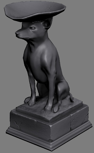
I'm planning on making a complete level later so I'm leaving it untextured so I can work on all the textures at once. I'll add new assets here as I make them.
Haha, wow. Its quite well made but I can just imagine my self walking around that level, then taking a closer look at the statue and thinking... WTF? Its a dog with a bowl on its head!
Yeah, better make it some generic shirtless homoerotic muscular guy holding the bowl, because that's so much more what people here like to see over and over.
Wow man! Really nice wall segments. Could we some some normal flats, please? Also, would you mind givin some tips on your sculpting techniques? Whenever I try to do sculpts of brick and wall segments they end up looking blobby and gross, and I can't get those nice cracks and what-not. Are you using mudbox or zbrush? Sorry for all the questions. Trying to learn.
[ QUOTE ]
Also, would you mind givin some tips on your sculpting techniques?
[/ QUOTE ]
The rough edges are made up of lots of rock models which I assembled. And here's a quick explanation I've written up about making rock in general: making rock using mudbox
nice, could you show wires and the normal(s) map for the brick walls? I have the same problem as cody...:( so please help o and I would like to see the base mesh before sculpting it (with wires)
Nice... it's always a good thing to build meshes based on modular level design. I remember someone at epic said they have been doing their levels like that since ut2k3, and they also said it's probably the best and most efficient way to do it.
I have level design this quarter so hopefully i can throw some cool stuff out there finally.
Great work, sprung. I see you have a lot of shading errors on the walls though. You might want to try adding in some more polys to the low res mesh, or use object space normal maps instead. Since these walls aren't going to deform (I assume) that would likely be the best option.
Object space normal maps don't rely on the normals and smoothing groups of the low res mesh, meaning you get lighting that's EXACTLY the same as the high res. Sadly, you just can't edit object space maps in post, like you can with tangent.
[ QUOTE ]
Great work, sprung. I see you have a lot of shading errors on the walls though. You might want to try adding in some more polys to the low res mesh, or use object space normal maps instead. Since these walls aren't going to deform (I assume) that would likely be the best option.
Object space normal maps don't rely on the normals and smoothing groups of the low res mesh, meaning you get lighting that's EXACTLY the same as the high res. Sadly, you just can't edit object space maps in post, like you can with tangent.
If you look at the last screen shot (above) close to the crosshair there's two dog bowls at the end of the corridor. They're acting as fonts either side of the door.
hmm, how long did it take to create each of these assets? just curious cause I'm always too afraid to start on something that'll take me more than a day, heh.
I'm not logging my time as strictly as I would at work so I have no accurate record and I'm also not working continously all day like I would at work.
However in my general working process I will batch objects into 'sets' that take about 2-3 days. So for example all the broken wall sections were done as one task. This prevents task fragmentation and helps to make sure that you don't get carried away with polishing one asset when you've got many others to do.
A friend of mine works in the movie industry and he spent 6 months working on one cliff model. It's a sobering thought ;-)
this is really looking tasty now, lots of good colour and detail, are you still working on lighting? I think it could have more dramatic lighting just to add highlights and shadows.
Yes the lighting is pretty basic at the moment as I haven't been concentrating on that. Thanks for the feedback - I'll jushe it up a bit ;-)
sprunghunt, is that a play on pitchtent?
I still appreciate those first wall peices you've made, they add a lot to the scene. They have an intersting texture quality when lit and make great silhouettes for your scene.
I really thought the ground texture pulled things together and helped the environment.
I like the forms in the corner piece at the bend in the hall, nice texture work as well.
I like the lighting that's nicking the dog statue's face at the entrance.
Looking better and better, sprunghut. Nice job. (lets see pic sizes that are 200% what you're showing. Maybe it looks so good because I can't see anything
I really like your ground detail. This is going to be sweet when you are done. You could try adding some color into those gray walls. You could also add some dirt buildup to to the walls where they meet the ground, also on the dog sculpture bases and the pillar bases.
foliage covers up the harsh edge between wall and floor in the light area whereas you don't need as much foliage in the dark area since the edge isn't as bad there. very nicely done
Really, people? I personally preferred the grittier brown wall textures. Would blend much better with the dirt floor, right now the slate blue is too contrasting and IMO makes the color composition not matching with the geometry's styling.
Yeah, like it.... For my own twisted reasons, I would want the green intensity of the plants by the corner toned down just a little bit, but it looks good overall.
looks great, i would maybe desatureate it by 5-10% but thats just a super minor thing. also might be cool to add some atmosphere in the air with some blowing leaf particles or dust/a low fog/mist
Replies
nice work.
i'll be watching this thread.
[ QUOTE ]
ok... I thought I was going to see a model of this when I clicked this thread. Good surprise :P
[/ QUOTE ]
Here's some more bits I've made for this level. It's a set of vine covered stone pillars and trims including some broken sections.
I may rework the sunburst motif on the crosspiece later...
It's all looking pretty good so far.
With pictures:
These are some wall sections. The place is not in good repair.
Also, would you mind givin some tips on your sculpting techniques?
[/ QUOTE ]
The rough edges are made up of lots of rock models which I assembled. And here's a quick explanation I've written up about making rock in general:
making rock using mudbox
sweet stuff
I made some placeholder meshes to fill in the assets I haven't made yet.
I have level design this quarter so hopefully i can throw some cool stuff out there finally.
nice, could you show wires and the normal(s) map for the brick walls?
[/ QUOTE ]
Here are the cage models and the normalmap for this asset. I think I'll re-bake the model onto several individual maps later.
Object space normal maps don't rely on the normals and smoothing groups of the low res mesh, meaning you get lighting that's EXACTLY the same as the high res. Sadly, you just can't edit object space maps in post, like you can with tangent.
Great work, sprung. I see you have a lot of shading errors on the walls though. You might want to try adding in some more polys to the low res mesh, or use object space normal maps instead. Since these walls aren't going to deform (I assume) that would likely be the best option.
Object space normal maps don't rely on the normals and smoothing groups of the low res mesh, meaning you get lighting that's EXACTLY the same as the high res. Sadly, you just can't edit object space maps in post, like you can with tangent.
[/ QUOTE ]
does unreal suport OBJSPACE normals?
I've made a few more objects such as the tree and the vines.
I've also splashed a bit of colour around on the textures but none of them are final.
and it looks like this in the level
I've been working on the stone textures but obviously there's still quite a few bits untextured.
C&C?
It'll be awesome when you finish it.
EDIT: WHERE'S THE DOG BOWL??
If you look at the last screen shot (above) close to the crosshair there's two dog bowls at the end of the corridor. They're acting as fonts either side of the door.
hmm, how long did it take to create each of these assets? just curious cause I'm always too afraid to start on something that'll take me more than a day, heh.
I'm not logging my time as strictly as I would at work so I have no accurate record and I'm also not working continously all day like I would at work.
However in my general working process I will batch objects into 'sets' that take about 2-3 days. So for example all the broken wall sections were done as one task. This prevents task fragmentation and helps to make sure that you don't get carried away with polishing one asset when you've got many others to do.
A friend of mine works in the movie industry and he spent 6 months working on one cliff model. It's a sobering thought ;-)
and I believe someone asked for a closeup of the door?
Yes the lighting is pretty basic at the moment as I haven't been concentrating on that. Thanks for the feedback - I'll jushe it up a bit ;-)
I still appreciate those first wall peices you've made, they add a lot to the scene. They have an intersting texture quality when lit and make great silhouettes for your scene.
I really thought the ground texture pulled things together and helped the environment.
I like the forms in the corner piece at the bend in the hall, nice texture work as well.
I like the lighting that's nicking the dog statue's face at the entrance.
Looking better and better, sprunghut. Nice job. (lets see pic sizes that are 200% what you're showing. Maybe it looks so good because I can't see anything
foliage covers up the harsh edge between wall and floor in the light area whereas you don't need as much foliage in the dark area since the edge isn't as bad there. very nicely done
Guess I have a fucked up personal preference.
http://farm4.static.flickr.com/3005/2759505798_51f9f99e04_b.jpg
http://farm4.static.flickr.com/3025/2759507022_d59e15cc4e_b.jpg
I didn't embed them so they wouldn't break the html frame.
Thanks for all the feedback.
Here's a more complete version with mood lighting and a skybox
And here's the same image but in a larger size (on flickr)
http://www.flickr.com/photos/sprunghunt/2958345342/sizes/l/