Home 3D Art Showcase & Critiques

Blue Phoenix WIP Low Poly Jet

well I've been putting off posting on polycount for long enough I suppose. My teacher has been bugging me to put this up so here it is. This is a piece I've worked on here and there. I'm getting close to being done but I know it still needs more. So tell me what you think and any suggestions you might have.
Blue_Phoenix_Front.jpg
Blue_Phoenix_Back.jpg

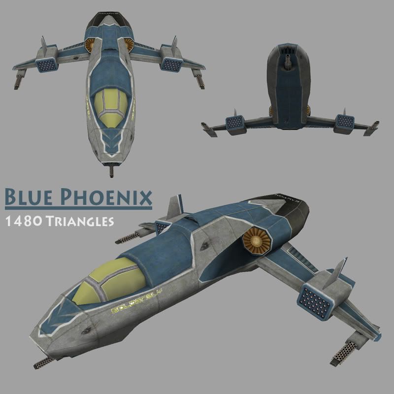
The main map is a 1024x1024 that I'm reworking to fit as many of the misc maps in as I can. I also need to pull all my alphas on a single map. I'll post the maps when im done. The shadows are a mix of an occlusion map with some hand painting. This is my first post so I will be checking back often so if you'd like to see a specific screenshot feel free to ask for it.

Replies

  • fuxer
    Options
    Offline / Send Message
    fuxer polycounter lvl 18
    hey there,i think that 1024 is a bit big for the detail you have right now,also i think you should try to give it a more metal look now that you have the basic texture done.Some highlights can really make this pop.The window doesnt look like glass .The design is nice though,you could post some wires too,i'd like to see what you have done smile.gif
  • Goldensly
    Options
    Offline / Send Message
    Blue_Phoenix_Wireframe.jpg

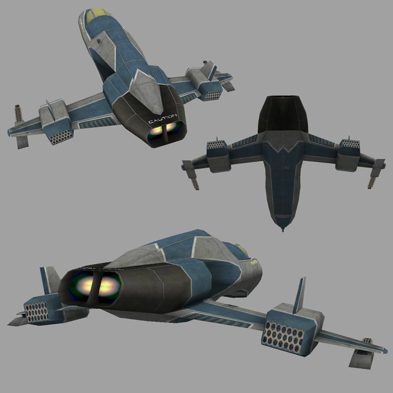
    heres a wireframe for you fuxer. The 1024 map is the map size I use when working on a model. I'm going to downsize it to a 512 map when I'm closer to finished. I was thinking of doing some rust stains to try and give it a more metal feel. As for the window. I originally planned to do a cockpit interior with an electro over shield as the covering but I changed my mind since the time I have to work on this is low right now. When I get the shell done I'll be going back in to do the interior. Thanks for the advice. I'll try pulling the highlights out more to see if I can get it pop.
  • fuxer
    Options
    Offline / Send Message
    fuxer polycounter lvl 18
    the polys look really clean,good job on those
  • Goldensly
    Options
    Offline / Send Message
    thanks. I had an instructor give me some good pointers on optimizing my models. My weak point is texturing, biggest reason this model isn't completed smile.gif. Do you have an suggestions on how to get that metal look on my model better? Other than the rust I've just been stumped on how to work that into my texture.
  • fuxer
    Options
    Offline / Send Message
    fuxer polycounter lvl 18
    i had a nice tutorial,let me find it smile.gif
  • PolyPutty
    Options
    Offline / Send Message
    metal is all about high contrast highlights, usually this can be done on edges and corners of the texture. You can also try to add more color variation, remember even though the metal may not be reflecting a major light source it will be reflecting the colors of it environment. you can hand paint this or you can fake it by making a rainbow cloud by running the cloud filter through each color channel on a layer. You can also achieve shinny appearance by adding more texture to your metal making it so it pick up more high contrasting highlights. adding scratches which also pick up highlights. Metal has lots of variation dark in curtain spots lighter in others. Most of all when you are painting your highlights you got to make sure you keep a virtual light source in your head or it will break the illusion.
  • Goldensly
    Options
    Offline / Send Message
    at one point I was going to add in rivets but when I added them in and down rezed to a 512 map they didn't look right. I was afraid to do much scratching on the plates for the same reason. I'll start with doing the highlights and color variation to see how that make it look then I'll try out some scratching.
  • fuxer
    Options
    Offline / Send Message
    fuxer polycounter lvl 18
    hmm couldnt find the tutorial but Pior has done a simliar model,so all pro's to him smile.gif
    http://pioroberson.com/modelpages/info_fzerochallenge.htm
  • Goldensly
    Options
    Offline / Send Message
    ah normal maps. It would make my model look nicer but I want to do this one without them. Really trying to work on my painting over being able to use all the hardware tricks frown.gif But thats a nice reference, I'll see if I can do that kind of color variation and gloss in my texturing.
  • fuxer
    Options
    Offline / Send Message
    fuxer polycounter lvl 18
    na na,dont look at the normal map,try to get the texture like that,painting it
  • Goldensly
    Options
    Offline / Send Message
    you're refering to the paint blotchs and scratch vartion that he has on there. I'm putting that into account too smile.gif. There's a lot from that model that i can use for reference. thanks smile.gif
  • Slash
    Options
    Offline / Send Message
    Slash polycounter lvl 19
    I like the design. Nice and phallic, as a good ship should be!
  • Goldensly
    Options
    Offline / Send Message
    thanks slash. I also have a matching ground unit that I'll post after I finish this one up.
  • Goldensly
    Options
    Offline / Send Message
    blue_phoenix_uv.jpg
    well here's my main uv layout. I just had to move stuff around so I could fit it all back into one map. I still need to merge my alpha maps into one but that will be a quick chore. now onto the painting. I have a good idea from the suggestions on how to go about it now. thanks. I'll post when i've got something to show.
  • Japhir
    Options
    Offline / Send Message
    Japhir polycounter lvl 16
    I think THIS is the tutorial Fuxer was talking about. might help you.
    looking good! great uv layout. I like working on smaller texture maps myself, i've never actually created a 1024 one tongue.gif
    HERE are some thoughts on painting true sise vs resizing by poopinmymouth (Ben Mathis).
    keep it up!
  • Goldensly
    Options
    Offline / Send Message
    kk thanks Japhir for both links. If this is the tutorial fuxer was thinking then I can see why he was recommending it. smile.gif
  • Baddcog
    Options
    Offline / Send Message
    Baddcog polycounter lvl 9
    you do have some wasted polys. easy ones to see are at the front of the intake and continueing over the hull. They add no detail.

    But it's a nice model and I like it over all.

    fuxor is right about metal highlights and glass.

    I think the wings should be a bit larger, might not be too stable as small as they are.
  • Joseph Silverman
    Options
    Offline / Send Message
    Joseph Silverman polycounter lvl 17
    [ QUOTE ]
    you do have some wasted polys. easy ones to see are at the front of the intake and continueing over the hull. They add no detail.

    [/ QUOTE ]

    They preserve vertex shading, which is just as important in most cases.
  • Goldensly
    Options
    Offline / Send Message
    well after reading your post about possible wasted polys I figured I'd do a quick relook. I did manage to cut out 30 polys but where you were mentioning is all form so I wasnt able to cut from there with out loosing the look I want.
  • SHEPEIRO
    Options
    Offline / Send Message
    SHEPEIRO polycounter lvl 17
    nice design and nice base texture, i find faking metalik like surfaces with diffuse is possible with some oversaturated highlights, try painting in to a overlay layer with colours sampled from the material your highlighting.

    mmmm if your can\allowed add some rim shading (mario galaxy) for some nice cheap bling
  • dabu
    Options
    Offline / Send Message
    dabu polycounter lvl 18
    also, make sure to optimize those wing tips if you haven't already.

    See Carlos? They don't bite +)
  • Goldensly
    Options
    Offline / Send Message
    yea yea, daniel :P The wings were part of the polys I was able to cut down on.
  • WipEout
    Options
    Offline / Send Message
    WipEout polycounter lvl 15
    Dude, it's looking good, but you know I have a couple little crits for you laugh.gif

    I have to agree with Baddcog, the wings are too narrow, especially since there are no rear stabilizers. Look at the Chinese J-10 , The USAF F-35 JSF and the F-22 Raptor for reference-- the longer the wings (not wingspan, but length from nose to tail), the more stability and speed the plane can achieve. I think a cool thing to see would be forward-swept wings, like NASA X-29, or the Sukhoi Su-47 Berkut. The forward-swept wings also promote more maneuverability at high speeds. Either way, all that's just my opinion.

    My actual crit would be the placement of your "caution" decal-- not a very useful spot. Perhaps on the underside of the exhaust nozzles, or more likely on either side of the nozzles. The idea of a warning label is that it should be read from the ground, when the plane is grounded and starting up, you want people to know to get the fuck away from the engines. Also I noticed the rear ports for the rocket pods are cut off in the texture, but that's just a matter of tweaking the UVs.

    So I know most everything I said is basically useless at this point, since you've already modeled it and UV'd, but I thought I'd give you my $.02 anyway :P
  • Goldensly
    Options
    Offline / Send Message
    heh. im doing some changes here and there david so adjustment is still open. As for the grates, I havent gone back and reworked the alphas yet but that was on my list. I'll try moving the caution to the sides of the engine to see how that looks.
  • Goldensly
    Options
    Offline / Send Message
    Well I put some stabilizers/rudders on the original design but then I also did some quick tweaks to give the look of swept back and full body wings. Ignore the textures and the optimization of the polys. Im going back and rearranging my old psd to fit the new uv map still and the polys look funky just because i just pulled the verts to get the wing look.

    withStabs.jpg
    swept_wing.jpg
    body_length.jpg

    I've been doing some metal texture tests and I think im getting close to the look I would like to apply to this model. Next will be the cockpit covering. I wanted to do the electromagnentic look to it but I could use some help on how to get that effect on the texture and make it look good smile.gif so if you have suggestions.
  • HarlequiN
    Options
    Offline / Send Message
    HarlequiN polycounter lvl 18
    Hmmm...

    The real question is whether you want it to look like it would really work, or just look really cool. If the former then Wipeout's right about the wings, and you should probably go with the body length wing in the above set. If you just want it to look cool though your original design gives a much more interesting shape to the aircraft in general (IMO).
    The fact that you *don't see planes like that makes it different and somewhat cool. It would never fly very well (if at all), but unless you're building it to actually fly who gives a shit - certainly your avarage games physics engine won't wink.gif

    That said, if it was me (and it isn't, but if it was), I'd add two small stableisng (sp?) wings coming out from the underside of the nose - A bit like miror images of the tail fins. I'd also put a lot more signage on the thing (and this is talking real instead of cool again, but just an observation), real aircraft are covered in signage of all sizes, and for me it always adds a little extra realism to a texture to see lots of the relevant sorts of signs there.

    I'm not sure what you mean by "electromagnentic look"...
  • super_villain
    Options
    Offline / Send Message
    super_villain polycounter lvl 11
    Nice looking so far, but the texture needs a lot of love. HarlequiN is right about the decals, those always look good. Also, you need a texture that makes is look used or brand new, right now, it's seems pretty uneventful. Good luck.
  • Goldensly
    Options
    Offline / Send Message
    Thanks Harlequin, I'm more on the end of making it look cool over completely functional. As for the front stabs I'm ironically trying that out. I've tried a few things but none have looked just right so I'm not sure if I'll add them. I'm definitely going to add more decals I just want to make sure I get the base texture just right first. The electromagnetic look is like having a star trek forcefield extend over the cockpit.

    heh I was wondering when it was going to be said Caseofchill smile.gif Dabu has been holding that over my head this entire model. It will be dirty, I dont think Dabu will let me have any other way lol.
  • Wells
    Options
    Offline / Send Message
    Wells polycounter lvl 18
    swept wings are cool looking,
    but i like the original best
  • Goldensly
    Options
    Offline / Send Message
    thanks sectaurs. I'm think I'm going to stick with the original. I was happy with the stabilizers I added so I added those to my uv map.

    Right now I've got a decent looking metal texture but the problem im getting is that I just dont have enough pixels per panel for the details to really make any noticeable difference. I'm not sure if there's just a better way for me to unwrap the model or if I'm just not approaching this properly with a 512x512 map.
Sign In or Register to comment.