The BRAWL² Tournament Challenge has been announced!
It starts May 12, and ends Oct 17. Let's see what you got!
https://polycount.com/discussion/237047/the-brawl²-tournament
It starts May 12, and ends Oct 17. Let's see what you got!
https://polycount.com/discussion/237047/the-brawl²-tournament
several months of hard work!
in may 2006 warby and i started a little something. since this autumn we finished this piece of hard work. until christmas i will post some more screenshots to not waste all of our fireworks at one time.
take this small picture as a teaser!

more is about to come soon!
Update1:
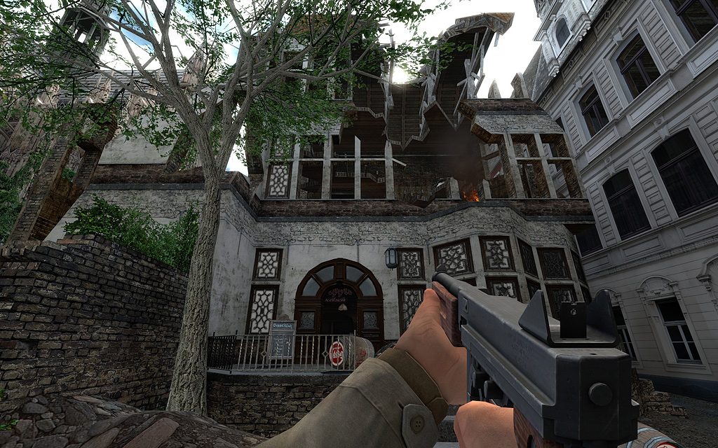
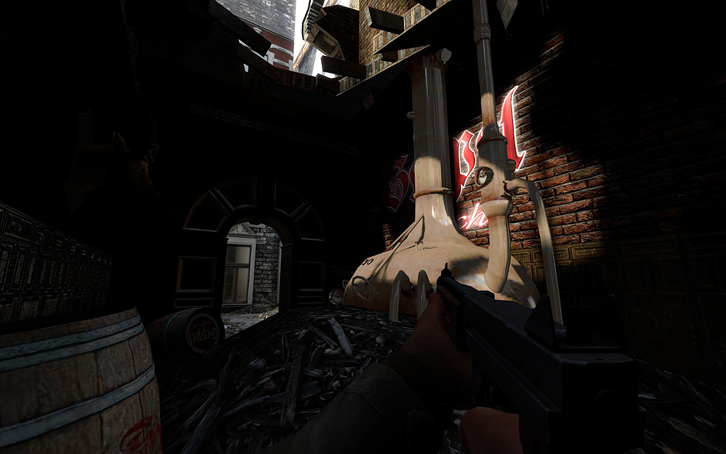
as you might have noticed there is a brewery in the level. the brewery is one of the main hot spots. in the brewery is a flag that can be caputred only by at least 2 players. the consequence is that the brewery is really important for each team to win the map. there are 2 levels in the brewery so defending is a little bit easier than capturing. the use of grenades can eliminate campers from the 2nd level.
Update2:
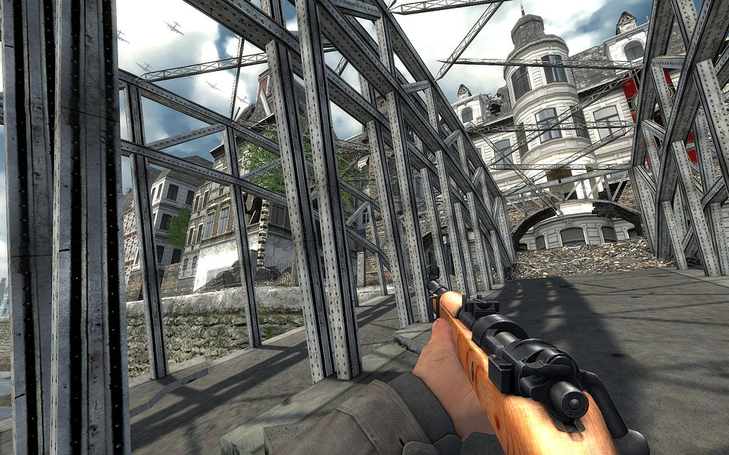
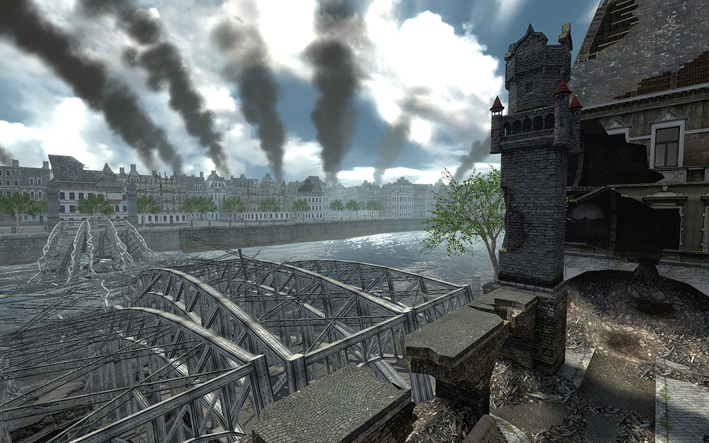
the axis forces start on / near a destroyed bridge. they had been left in the city to defend it againt the allied approach. the spawn area is spawn camp protected. the bridge is a model that was made by warby. the area around the bridge is made of small models in a 3d skybox.
Update3:
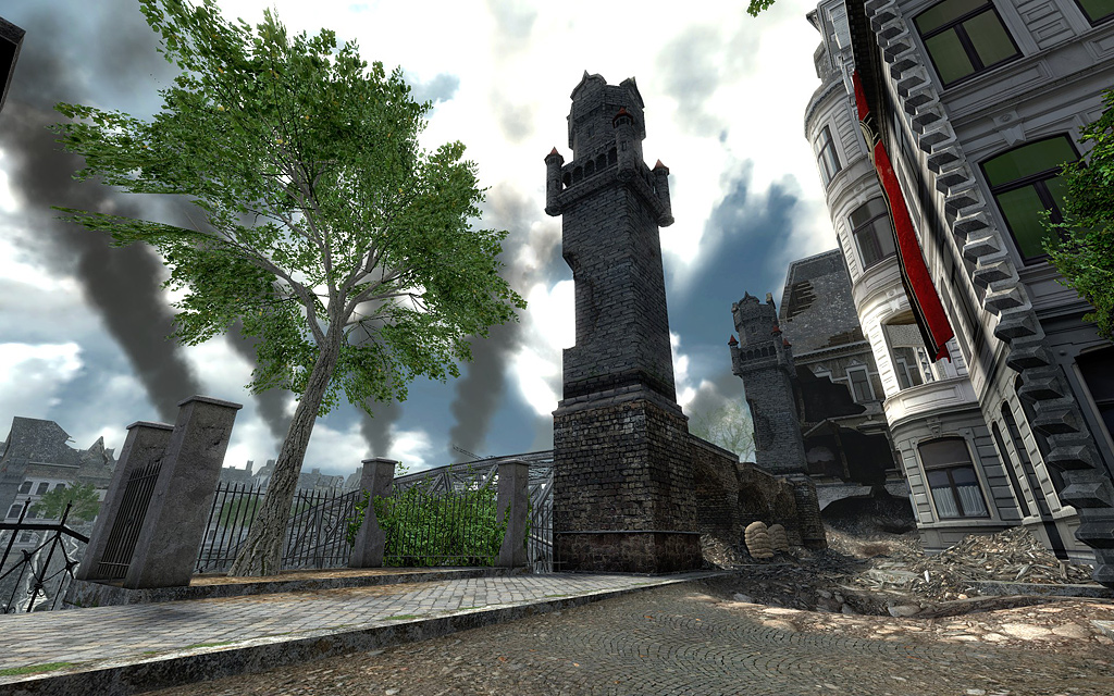
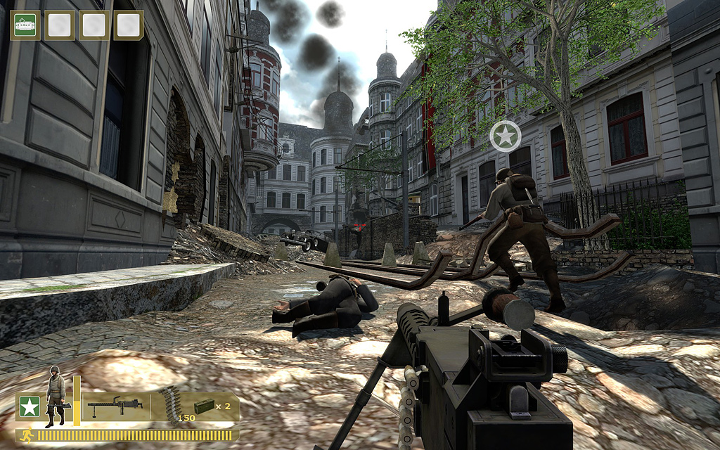
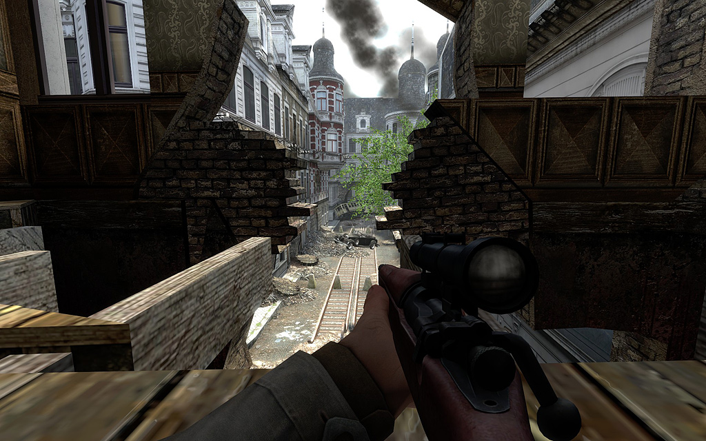
this area is the second hot spot (compared to the brewery): the main street flag can be captured by at least 2 players. snipers and MGs have good places to defend or attack this area. for those players using automatic weapons like STG44 or Thompson we included ways onto the mainstreet from the buildings on the left. rushing out of the broken walls and quickly searching/taking cover allow those classes to capture the main street even if there is a sniper or MG.
Update4:
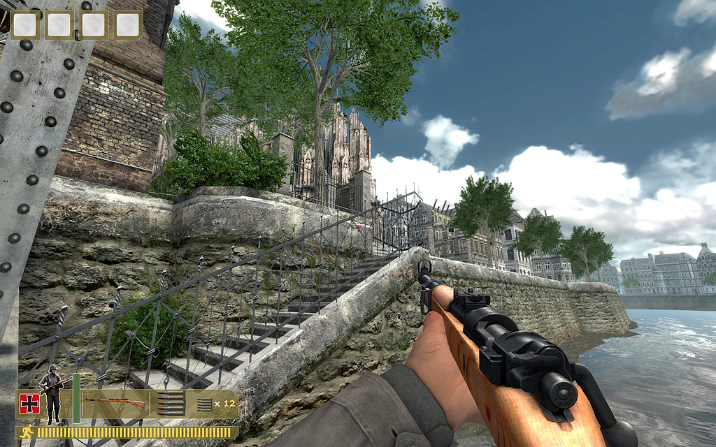
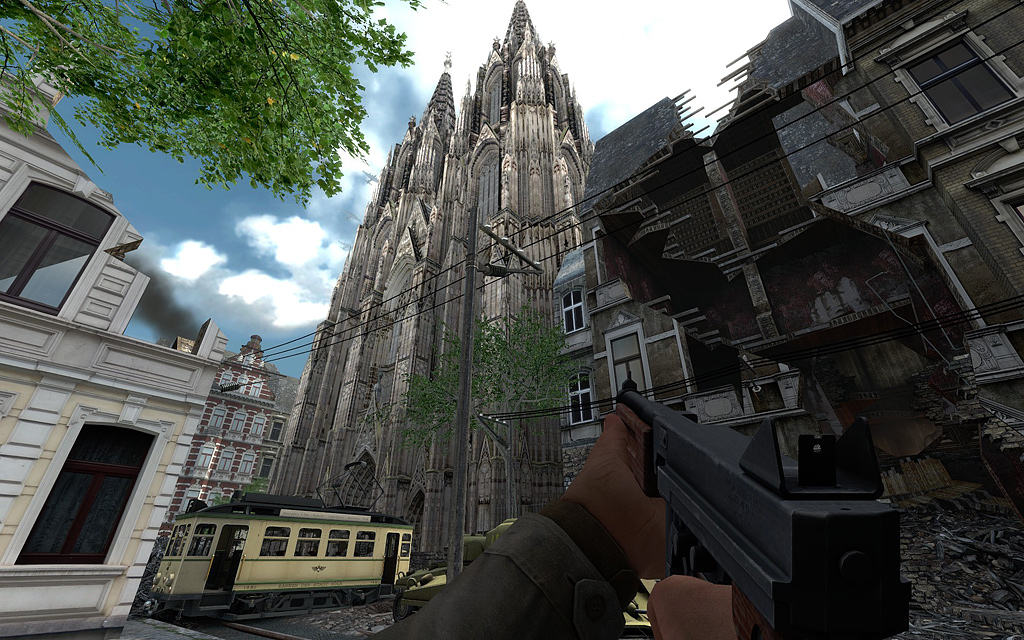
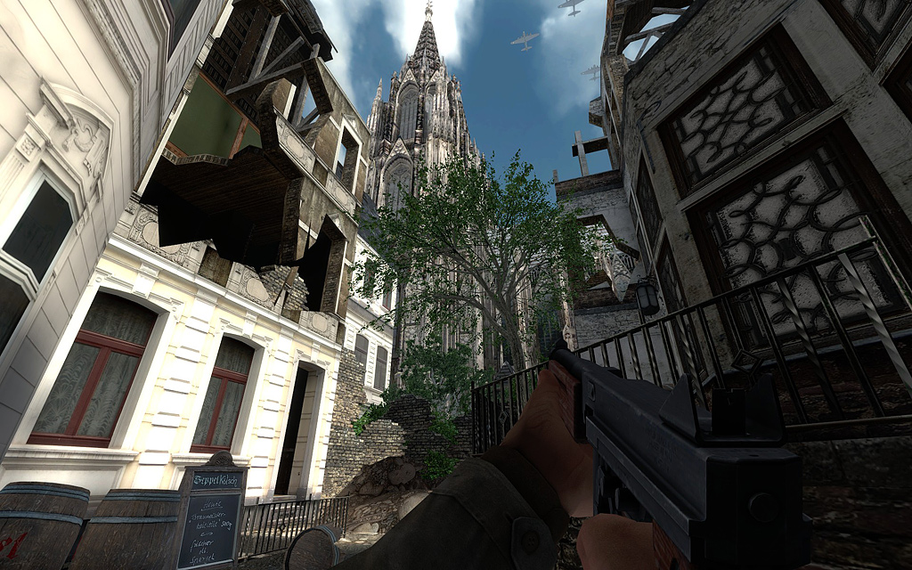
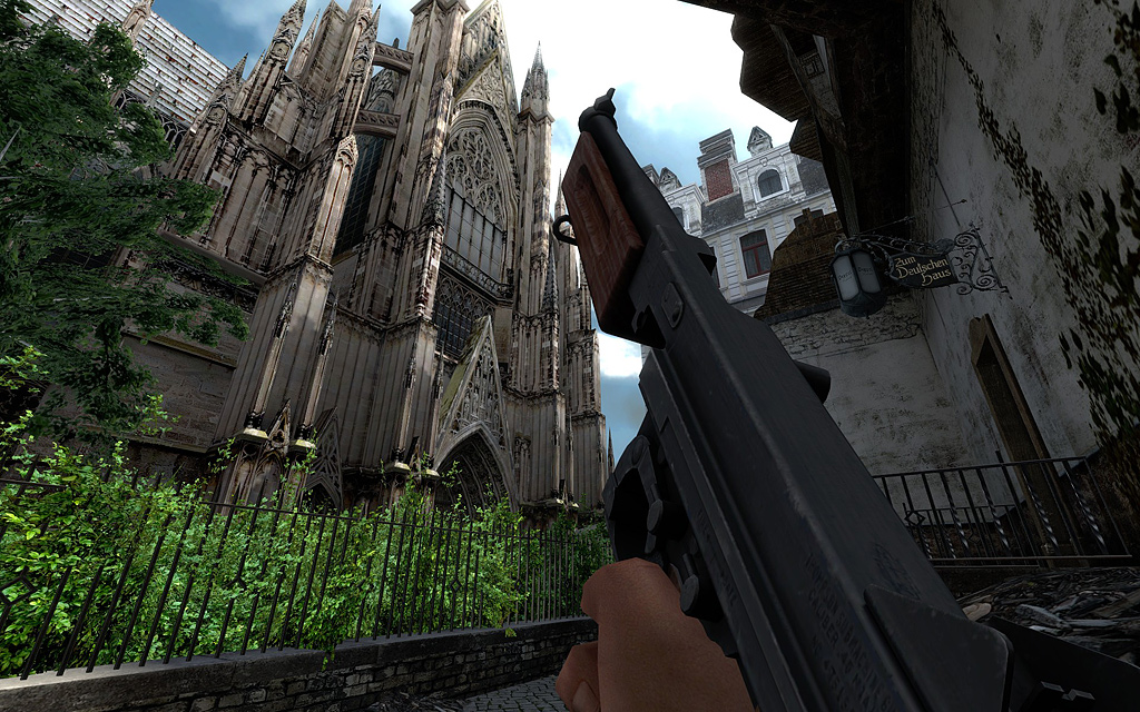
The name of the level hasn't been mentioned yet so let these screenshots denote it: dod_kolsch! Kolsch comes from Cologne's local brew called "Kölsch". The name dod_koln wouldn't be appreciated since people might expect the old koln level for the classic dod. The cathedral has become famous for being one of the only buildings that did survive the heavy bombings of the 4th biggest city of germany. So it was important for us to put something into the level that will make people remember it. The cathedral should be bigger to match its actual size in real world, but since this would screw the layout of the map we scaled it to ~70%.
I wish all of you a merry christmas and hopefully we can all enjoy this fine piece on a DOD:S server
take this small picture as a teaser!

more is about to come soon!
Update1:
as you might have noticed there is a brewery in the level. the brewery is one of the main hot spots. in the brewery is a flag that can be caputred only by at least 2 players. the consequence is that the brewery is really important for each team to win the map. there are 2 levels in the brewery so defending is a little bit easier than capturing. the use of grenades can eliminate campers from the 2nd level.


Update2:
the axis forces start on / near a destroyed bridge. they had been left in the city to defend it againt the allied approach. the spawn area is spawn camp protected. the bridge is a model that was made by warby. the area around the bridge is made of small models in a 3d skybox.


Update3:
this area is the second hot spot (compared to the brewery): the main street flag can be captured by at least 2 players. snipers and MGs have good places to defend or attack this area. for those players using automatic weapons like STG44 or Thompson we included ways onto the mainstreet from the buildings on the left. rushing out of the broken walls and quickly searching/taking cover allow those classes to capture the main street even if there is a sniper or MG.


Update4:
The name of the level hasn't been mentioned yet so let these screenshots denote it: dod_kolsch! Kolsch comes from Cologne's local brew called "Kölsch". The name dod_koln wouldn't be appreciated since people might expect the old koln level for the classic dod. The cathedral has become famous for being one of the only buildings that did survive the heavy bombings of the 4th biggest city of germany. So it was important for us to put something into the level that will make people remember it. The cathedral should be bigger to match its actual size in real world, but since this would screw the layout of the map we scaled it to ~70%.
I wish all of you a merry christmas and hopefully we can all enjoy this fine piece on a DOD:S server


Replies
but anyway, great work, man.
ok, my bad.
I have an issue with the damage to the second floor shown in the middle shot. Concrete floor? It doesn't look to be made out of wood and it isn't sagging? Something like that should be handled as a custom model/prop, where you can really pack in the detail.
Bombed out Building Ref:
http://www.astonbrook-through-astonmanor.co.uk/9b8d5650.jpg
http://www.bbc.co.uk/ww2peopleswar/stories/66/images/112357486812517216918_1.jpg
http://www.v2rocket.com/start/chapters/antwerp-damage-002.jpg
http://www.barking-dagenham.gov.uk/archive-photo/urban/d-bomb-damage2-ww2.jpg
So, more sagging pieces, more loose debris, less clean edges on the broken edges.
I also think you can play around with the color correction and HDR settings that are included in DoD:S to capture a slightly more historical feeling.
Looking great guys, polish up the damage in areas and it will look ace
the thing with the broken floors is correct too. i dont know how much youve worked with the source engine, but i can tell you that displacing things can be a pain in the ass. especially when dealing with complex shapes that cant be built of cuboids. so its not that i disagree on the fact that it could be more realistic, but technically that would mean a lot more work and higher complexity + probably fucked up clipping and light calculation.
probably the upcoming screenshots can make you forget about this minor "bug"
got to sleep now!
Also check this out; http://www.valvesoftware.com/publications/2006/SIGGRAPH06_Course_ShadingInValvesSourceEngine.pdf
Jump down to section 8.3 (World Lighting). Valve has the same concerns and have built in procedures to help us with that very issue. Make sure you have the bounce lighting set high enough 3-7 is a good number. Sure it takes a little while longer to compile but the people playing your map won't care and they'll thank you for providing dark but not too dark areas.
I've made about 7 custom maps for HL1, a CS:S map and I'm working on a TF2 map, yep I know what a pain hammer is to deal with. It's cube or nothing and you better not try anything fancy with that cube. That's why I suggested doing that kind of detail with a custom prop. With the ability to create a custom collision mesh you can pull off a really nice looking prop and not have the collision be all wonky, or have it effect the lighting.
Don't get me wrong I'm not bagging on your work you guys have done some really great stuff here. But don't relay on Hammer too much for everything. It's for building your hull not your details
Update2:
the axis forces start on / near a destroyed bridge. they had been left in the city to defend it againt the allied approach. the spawn area is spawn camp protected. the bridge is a model that was made by warby. the area around the bridge is made of small models in a 3d skybox.
Update4:
The name of the level hasn't been mentioned yet so let these screenshots denote it: dod_kolsch! Kolsch comes from Cologne's local brew called "Kölsch". The name dod_koln wouldn't be appreciated since people might expect the old koln level for the classic dod. The cathedral has become famous for being one of the only buildings that did survive the heavy bombings of the 4th biggest city of germany. So it was important for us to put something into the level that will make people remember it. The cathedral should be bigger to match its actual size in real world, but since this would screw the layout of the map we scaled it to ~70%.
I wish all of you a merry christmas and hopefully we can all enjoy this fine piece on a DOD:S server
though, i think one of the biggest issues is that the building facade textures are too clean. some of the buildings have big holes in them, yet there is no visible damage in the textures. maybe atleast slap some decals on there and add some grunge to the textures.
and i hope you fixed some of the scale issues.
looking forward to more pics
-Buddikaman-
...One thing I noticed would be to mutilate the collapsed roofs some more...like the pristine textures the geometry looks too neatly aligned with each other...when something collapses you fins worn edges and break offs.