Semi-WIP Pipo Walk
http://youtube.com/watch?v=88ywCgvZgAo
I'm posting another character I was working on for school. This was for my 6th Quarter portfolio review. He just uses a simple walk. If you guys give me more suggestions or advice, I'm going to go in and fix a few things.
I really like this character, and I'm probably going to do more animations with him.
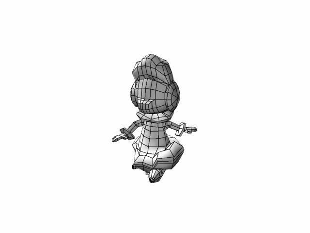
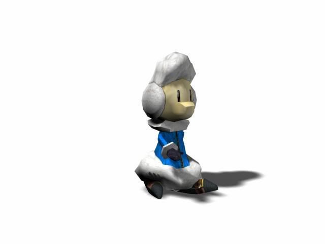
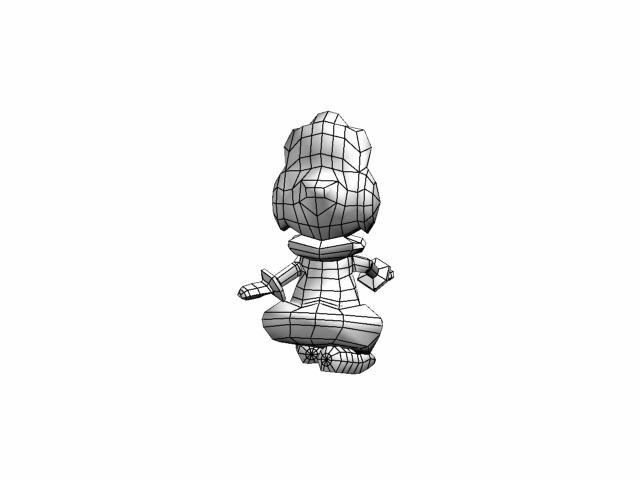
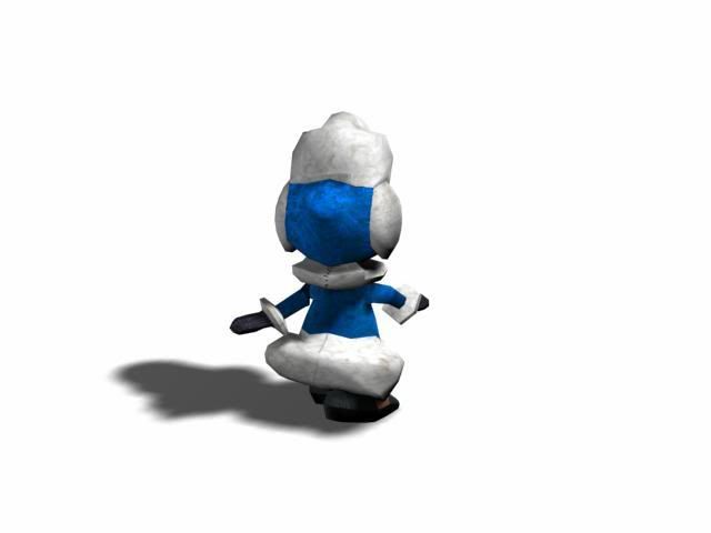
Here's also a few pictures I quickly uploaded just now so you guys can take a look at the polys and flow and give me any suggestions. Currently he's a 788-poly character.


Replies
What I think you can without would be one of them loops on the waistline.
Prolly shift those polygong to make the eyes too.
If you want any decent animation from this project, I suggest the whole thing be remodeled. I understand the idea for this character, and it's cool...but the geometry is complete garbage for someone well into an Art Institute. And your vertex weighting is causing jagged edges on the bottom front of the coat. A character like this should have more bounce or wobble in its movement. The arms have a pause at their extremes. It should be a smooth motion. It's just not right. I apologize if this sounds cruel, and I don't mean to discourage you. I mean for you to try again, and try harder. For a low poly mesh, you have a random mix of soft and hard edges. Either watch your edge placement, or go for more of a traditional high poly for animation. I imagine with a higher density mesh, well rounded shapes, this would deform and animate very well.
[/ QUOTE ] With the assignment I couldn't go higher than 1000 quads. The teachers who were doing the review are anal about keeping as low poly count as possible. So I thought I had a pretty good count for this character for what I had to work with.
I'm going in now as you advised and re-doing the model in a completely new file. I'm going to try to keep it lower than or around 1000 for the low poly practice, since I'm going into Game Design. What I was taught was to keep models as low poly as possible.
I totally see the jagged edges in the video, and I'll see what I can do about the jaggies. While I was making this first model, I was messing around with smoothing groups a bit just to make the textures and smoothness work. I'll post up my new Pipo model when I get done modeling it before I begin unwrapping, texturing and animating before I get my hands too deep to fix my modeling.
Thanks for the advice. I was thinking I had an awesome model with an animation that needed work. But now I really know that I need more work all-around with this character.
The front and back points of the feet have way to much geometry for such a small detail. You probably have a total of 80 polygons or more total surrounding each vertex where all the edges connect. Most of those can be removed and simplified. Along the bottom ring of the coat, you have two edges running along the middle that could just was well be one and not take any defining shape away. If it doesn't change the shape, remove it...OPTIMIZE. Put that geometry where it is needed, like the nose, and the cuff of the sleeves. Keep the shapes of this character smooth and rounded. Hopefully you're able to use your old animation files to save time.
Dolemite> I was already on top of that and modeled the feet from boxes. I read your mind before you posted.
I know the feet need a little more work, I just uploaded for progress just so you guys know I am working on this model, though little at a time. Also I don't want to plunge into it thinking I'm done with optimizing. I want to fix what may be wrong with the model now.
Here are the links:
http://youtube.com/watch?v=VXylDb02xVk
http://youtube.com/watch?v=Ial5BxDGLQs
That stats are currently:
1374 Polys
2748 Tris
After rendering out the YouTube vids, I realized maybe I should pull down the fluff so that it's part of his hood. I *was* having trouble getting the muffs to flow right. I intended to have a hood on this guy, and after really looking at the render it turns out he rather has ear muffs on. I'll have to work the fluff downward towards his chin a little more.
Thanks for the help Elysium.
EDIT: http://youtube.com/watch?v=N72sWqav4NQ
Here's the link to the Wireframe. I essentially changed the ear muffs to fluff around the entire hood, and the shoes are now rounded off. I also got rid of all the polies at the ears that were there in the original vid.