WIP - A first try (sci fi hallway)
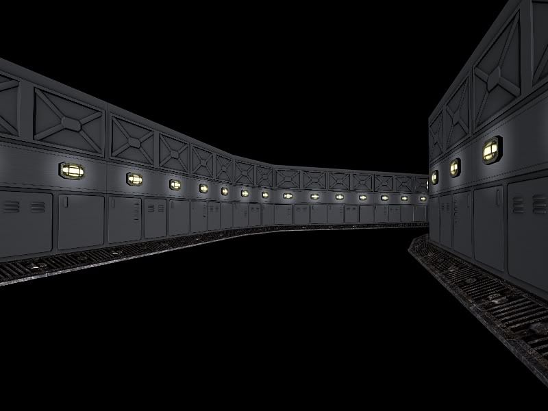
Ok, simple subject here. Just a sci-fi style hallway.
I'm posting this early because I'm curious about feedback. I've almost run out of inspiration to find the story, or something that might make this an interesting piece.
Originally I wanted to cap the hallway with a door that was ajar, busted open perhaps, with some paneling ripped open, exposed wires and the like. Maybe a glow coming from the crack in the door from the room beyond.
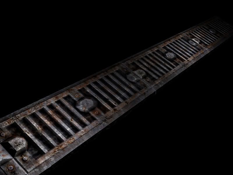
The reason that I'm at a standstill is because the two pieces I've made I think are too grungy and now I have no idea how to follow it up on the wall panel texture such that the whole scene doesn't look one-sided or 'too grungy'.
Obviously I will be making things like bulkheads, overhead lights, pipes and all the lovely standard things that go into making a sci-fi environment. But as I said, I think I need to finish this wall panel to get an idea for how to build up the rest of the scene.
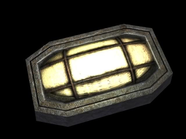
These objects are normal mapped and are done to be put into UT3 and are intended to be modular. It's not the creation of the doo-dads thats bothering me, its coming up with some cohesion that I'm running out of gas on.
Thoughts? (again I know its kinda early in the overall construction)


Replies
I think its not that grungy with just the lights and all, you could soften up the bump and scratches a bit.
As for the wall panels, why not try some variations of them.
Some you can add on facade details like large vents with some decals and chevron on it to make it seem more industrial. On the walls you should also break in some pipe holes so that it looks like some of the pipes would lead to the storm drain...it will also help break up your walls whe nits gets too repetitive.
The lights you already have seem a little too repeated so I'd prolly remove on or tow in between to make them more spaced apart. Not like you'd need lights every two steps.
Once those other objects are added in, it will definitely help break it up and make this simple corridor a lot more balanced.
however dont get caught up in details so early on. block in your shapes (ceiling, floor, doors etc) before detailing anything. even block in some lighting and you will quickly get a good look and feel for your environment before you worry about bump maps n screws n pipes n wahtever else u may be thinking, dont even think about grunge until u have the entire scene blocked out, once u visualize the scene as a whole then the details will come naturally
also do you have any reference material? if uve run out of motivation for a hallway like this.. get tons and tons of images from google or other games, you could easily find stuff like this in doom3 or bioshock, that'll get your creative juices flowin' in no time and get u inspired
anyways that mightve been off topic than what ur looking for lol