The BRAWL² Tournament Challenge has been announced!
It starts May 12, and ends Oct 17. Let's see what you got!
https://polycount.com/discussion/237047/the-brawl²-tournament
It starts May 12, and ends Oct 17. Let's see what you got!
https://polycount.com/discussion/237047/the-brawl²-tournament
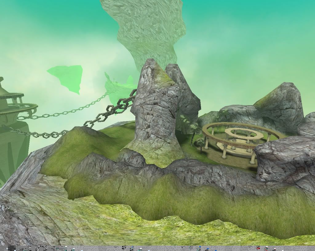
Unreal 2k4 env. -- Floating Islands (Large Images)
Heyya guys... been working on this for my final in Spaces and Worlds for school. Everything in here is my own creation (im using no stock textures or meshes) it's about 75% done.
Currently i'm working on the skybox and the inside of the structure in the middle. Harsh C&C welcome for the outdoor area! wanna do my best to make this a portfolio piece.
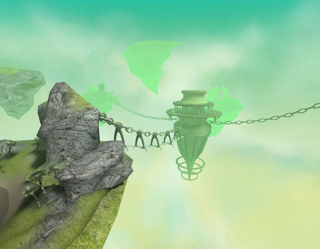
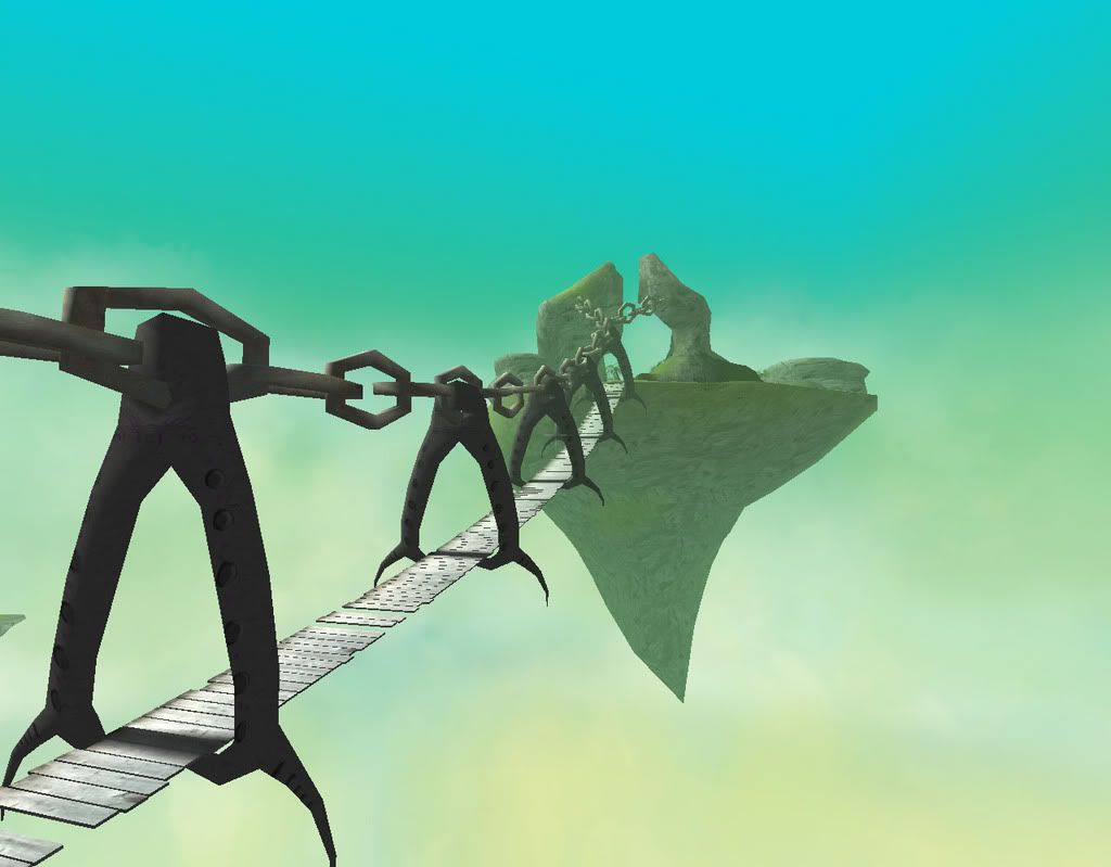
By the way... i got rid of the bridge and supports... kept the chains though... i'm adding stargate like portals from the islands to the center to give it a more technological/advanced civilization feel too it.
Currently i'm working on the skybox and the inside of the structure in the middle. Harsh C&C welcome for the outdoor area! wanna do my best to make this a portfolio piece.


By the way... i got rid of the bridge and supports... kept the chains though... i'm adding stargate like portals from the islands to the center to give it a more technological/advanced civilization feel too it.

Replies
as far as c&c the first thing that stands out are the chains. they could be beefed up with more pollies,
do u have any concept art ? to me it looks like it could be a dark creepy environment but the aqua blue colors make it look too happy, would be awesome if it was dark with bits of light lighting the pathways to each island, im sure ur pressed for time as its a school project, my suggestion is always spend a good chunk of time on lighting especially when it comes to outdoor scenes with alot of tiling textures, be sure to grab tons of refernece images and come up with a solid color pallete
hope you are planning to add more props in there to break up the scene a bit, maybe a couple shots in close would help with the composition
other than that keep it up looks awsome, i love seeing things that are creative and out of this world when it comes to environment art!
Maybe keep the bridges in a 'broken' state with jump pads between the broken sections?
You might want to increase the texture scale on the rock surfaces, as I imagine that'll look pretty harsh at ground level POV.
You might also want to try some more rock / tree meshes around the seams along the island geos to break them up visibly.
A few fountains around the islands wouldn't hurt, with at least one spilling over the edge into the abyss.
If you can afford the time to redo them, up the polycount on the chains, the engine should be able to handle it. Also, add some large eye-loops to the rocks anchoring the chains.
A tunnel or two going through the island might not be bad, maybe from the surface of some of the higher islands to a vantage point underneath, housing a sniper rifle or redeemer.
If you want to make the group of islands seem like part of a much bigger chain, make up some smaller ones and stick them in the sky box.
That's all I can think of at the moment; looking forward to giving this a run-through!
flaagan and iflingpoo, thanks for your imput.. I guess i'm sticking a bit too low on the chain pollies, so yea i will beef them up.. i'm pushing 300fps on my computer when i look at the level from a distance so your right, i guess they can be a bit more detailed.
flaagan - Yea man there will be alot more enviornmental foliage meshes in there like some different species of trees in there... there is currently a spot carved out in the terrain for a lake, but i dont add that untill last... there will be a bit more "ruins" meshes in there if i have time. -- I thought of a tunnel area and that's actually a pretty kick ass idea.... like i said though time is of the essence so i might not be able to implement that by tuesday morning.
I would love to do a waterfall over the edge, but i dont have any idea how to create a source for the "everlasting" waterfall to come from, you know what i mean? Suggestions on this would be helpful!
Let me talk a bit about my motivation for the level
I want it to have a very mystical, fantasy-like feeling to it... I'm not really wanting it to be to ominous. When you tour the enviornment it's more about exploration and giving you the feeling that your in an alien world, and you are intersted in the structures that are around you.
There aren't many places in the enviornment that have strategic value or planning.
The feeling when you walk through this is to get that whole "Myst" experience down, where you need to figure out what does what or why it's there. Currently i took the bridges out and am going to replace the means of transportations between islands with Portals... the portals will be a sphere with an enviornmental map on it so you can kind of see where your going.
Heres an updated Screeny.
BTW - Those flaoting rocks move around and stuff... very cool stuff.
If I were to change anything, it'd be the main "temple" area. The texel density doesn't really seem to fit. The snake carvings on the upper beam are very detailed, but the pillars themselves have a much lower resolution. It becomes pretty obvious to the viewer when they get anywhere close, and it can detract from the gameplay experience.
The texture on the temple also seems flat. It just doesn't fit with the rest of the area, with the foliage and whatnot.
Other than that, it looks really good. Keep working on it, and post your progress. Welcome to Polycount.
No need to stop working on it after the class is done.
As far the waterfall, a combination of a geo with a moving material on it combined with some fx for the spray should handle it. You can break up the edge of the static water and the moving water geos with rocks and fx. One of the existing maps has that setup on it I believe.
Are those flags in that newer shot just planes with alphas or actual karma flags like the ones on the existing forest DM map?
Movers for the rocks, huzzah!
The portals can always have a rendered-to-texture-from-camera setup on them so they're 'live' views of what's on the other side.
The banners are xProc meshes with a shader applied to it to emphasize the banners ripple effect. I didn't realize that UT had karma cloth actors... that would be badass if the did though and i'd definitel throw that in there. Your portal idea is exacty what i had in mind.... I would grab a cubemap from the islands and applly it to the portal sphere. All i have to do is make some more meshes and textures to apply...
Nice crit on the borders... i agree really... i just need to learn how to make better textures.
... flying islands with big turbines on the bottoms.. more of a tech-based society setup than this mystical one.
[/ QUOTE ]
hahah, same here. That's where my difference was from this one. I wanted to supply a reason how the chunks of earth were up staying up there, so I was going to have giant engines/turbines attached to it.
This red light will mix in with the green and hopefully give it some interesting effects... i'm going to do some work on it later tonite... i've been realy busy with my character modeling and animation class... i was gunna post those models later tonight for critiques.
I do have some concept work but dont have access to a scanner at the moment.
Added a planet to the skybox to contrast all the cool colors, and also changed the sky lighting a bit (Added redness)
Secondly, finshed the emitter for the lift volume, still working on the interior though.
I would add that in the area near the lake one may see very evident pattern in ground texture. I would suggest adding more details into ground and make less tiles.
Sometimes UE generates not really good MIP maps, e.g. it may create harsh patterns. I suggest to use nVidia photoshop plugin (download from nvidia website) that enables to save DDS format directly from PS - it gives much better results in terms of MIP map generation than UE.
Keep it up, I love it!
Btw, check The Chronicles of SpellBorn that may inspire u for similar kind of environments:
http://www.gamespot.com/pages/image_viewer/frame_lead.php?pid=929341&img=2&sid=undefined
http://www.youtube.com/watch?v=9fyotnVosn4
LoL at 2:40.
Got a question:
1) Are all those flying stones individual movers with manual animation for each one?
2) I saw some nice shadow maps from palm trees and architecture (pillars/circles). R they casted on Terrain or 1 BSP? Cause in my vertion of UE2 Terrain has only vertex color shadows; It looks like UT2K4 allows actual shadow maps on Terrain...
Remarque:
Inner pillars in main temple (around magic circles) seem to be too thin; in reality they would not support all what they do now.
Great job man, inspiring stuff.
Those stones flying around are mesh emitters, and the editor makes a shadow map for terrain each time you build... and you can get super detailed shadows on bps by going int the surface properties and changing the light map resolution to 1. This might solve your problem in your little shack if you remake it in bsp, matro. I remember reading that you were having problems with shadows
[/ QUOTE ]
UT2003/UT2004 also has the option of allowing you to make a pre-rendered lightmap with a second set of UVW's for all static mesh actors.
So you could make one rock mesh, place it at different angles in max, and render our several different lighting overlays.
I'd definitely recommend baking lightmaps for the chains.
A great example of lightmaps well done, is the stock map CTF-Citadel.
youtube flythrough (Updated)
http://www.youtube.com/watch?v=I_WI53RffRs
Some screenies
Some things that u may think about in the future are:
1) more accurate mapping (rocks, especially statues have many stretches and seams)
2) a bit more correct lighting/shadowing (kinda temple with teleport in the middle on one of seconadry islands has very bright lighting in the center, but shadows r casted on the side).
Anyways, well done job! Congrats