Props Thread for "The Travel"
Props from the game I'm working on, heres the first one. It's a cubicle dividers but waist height. The old office I worked in had these exact ones, and since the game takes place in hell, I though it be appropriate for me to recreate my hell.
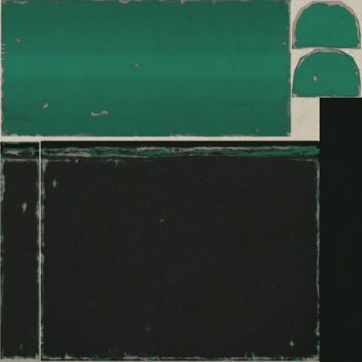
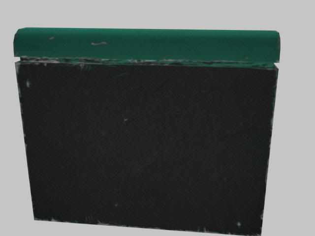
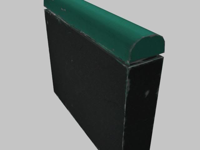
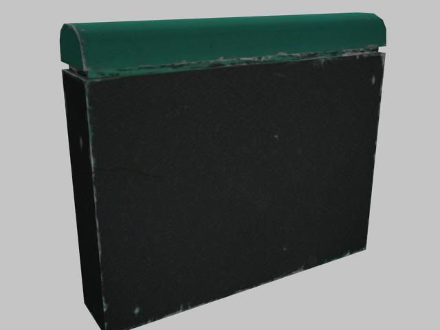
And a Painting! Still a wip. I'm trying to break away from doing my perspective shit too clean, because it always comes out too clean... Anyways.
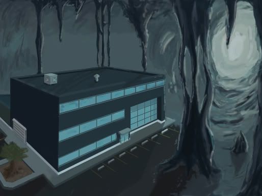


And a Painting! Still a wip. I'm trying to break away from doing my perspective shit too clean, because it always comes out too clean... Anyways.

Replies
Legos together
Nowthat I look at it, does anyone else think the black parts on the long divider look a tad bit noisy?
I'd be interested to see when you've spent more time on this, plus I'm actually sure that your boxes there have very little to do with time travel
And the cubicle can use a little bit of research since it looks more like something broken off a dumpster when I looked at it.
Anyways, my point is the piece can use a little but redefine and perhaps some color values than the green you got there...
Plus if theres a spot I should be posting this stuff other then in pimpin and previews please let me know.
I spent about an hour on this skin, I'm not too terribly pleased with it, but don't know what else to do with it. When I get to that point I usually start adding arbitrary details that end up muddying things. Is there something I am missing?
In the level
http://www.louisefoxprotocolsolutions.com/ProtocolPower/images/pp1.9/cubicle%20dwellers.jpg
Adding in the brackets, end caps and base running kick boards will go a long way in selling the cube wall look.
The cabinets look good. You might want to add some sort of dent/ding look to them, just because I haven't seen one that hasn't been bumped somehow. The downside to that is that it would appear to repetitive in your arrangement. You'd need to make several variations. Also, the cabinet should have the little nameplate square under each handle.
http://www.flickr.com/photos/writesmith/651489594/
http://www.flickr.com/photos/writesmith/651482930/
http://www.flickr.com/photos/damienjones/377273705/
The cabinet looks good but the problem I keep on seeing is that you tend to just use one color variation as if you used one color fill for the whole thing...one hting a lot of people so when the ymake something like street lamps is that they make it one color.
If you take a closer look objects tend to have little bits of discoloration or worn to it.
@pliang: I've taken your advice and I have used alot more colors in this next texture. Let me know what you think. I have some green, purple, blue, and grays.
Here's a desk.
Skin
EDIT: The scene so far, just basic lighting to show the scene.
I've always hated being the anal nazi about theory on unwrapping but it's such an overlooked process it drives me batshit.
Obviously there's far more important things to pay attention to that are more art related, but it still effects the overall quality of the piece, especially when presenting it to a studio you may be applying to.
From the looks of it, you could easily cut most of your map's textures in half or have a much higher resolution piece using the same map sizes.
Onto pulling examples:
The corner cement pieces - There's really no need to have every single face of that corner on one map... stack things! You could take two or even all of the sides and place them onto one face of the pillar, and just make sure the texture tiles itself. Players will more likely notice the general blurriness of the texture before they could even notice any repetition in the texture, especially when consideration is taken in avoiding obvious patterns.
File cabinets - As with all these crits, simply ask yourself: Is it really necessary for every single drawer to use up unique texture space? There's really no rhyme or reason with such miniscule scratch differences. Exceptions to this would obviously be something unique on one of the drawers (say it was more techy and had some kind of unique data readout or screen on the top drawer), but even then, spending 2 more polygons to place a plane on top would usually be the wiser decision anywho.
Table - Every face of the legs are taking up unique UV space without justification. These can be easily stacked on each other... the same goes with those squares that are all the same shape. In addition, I only see one truly unique mark on the tabletop, and the Torque ingame shots show that it really doesn't even make sense, especially with so many of those tables lined up alongside each other having the same hulk smash dent in the left side of them. With that in mind, you could have easily spared the extra polygons to just cut that sucker in half and just mirror the UV space.
Again, focus on creating good art regardless of consideration of unwrap theory as it's more important. However, keep this in mind when doing future pieces and you'll dig yourself out of bad habits before they form. I know I suffered from 'unwrap every piece uniquely because it matters' mentality so I think it's very important now that I look at before and after thinking outside the box (I guess?) on unwraps.
A bunch of awesome words
[/ QUOTE ]
@Kovac: I am going to go back and redo those parts of the unwraps to take all that into consideration.
About the blurry-ness that could be due to the jpg compression, because they don't look that bad in engine. I'll take some higher res shots and see if they come out the same way.
Thanks for the comments.
Can anyone tell me if I need to start doing something different with my skins as far as detailing. Everyone of the skins I have done so far feels like it's lacking something, but I don't know what yet. I have to develop my eye for detail sure, but when I fell apprehension like this it usually means something is off. I guess what I am saying is it feels flat.
I think one the different things you can do would be making like a variation with the drawers pulled out and just array it in a way that even with similar textures...the models help make the scene pop because of the variation.
As for the texturing, I think though you added more details to them, try starting a little discoloration on the surfaces and some contact shadows in the bottom areas etc.
That way your cabinet would have little more dimension and less monochrome appearance.