1st Post - Female Anatomy Study
Gday,
Long time lurker of polycount, not so long time modelling though. I often get inspired by the great works here and fire up max. Unfortunately, I just as often realize the model is nowhere near up to scratch and scrap the whole thing. I have decided to enforce a bit of self discipline and actually finish a model. To assist that I have chosen a subject matter of great interest to me...chicks! This is my first attempt at a full human model above about 500 polys. I'm would be most grateful for any crits or advice given.
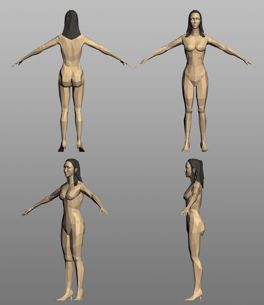
Various views:

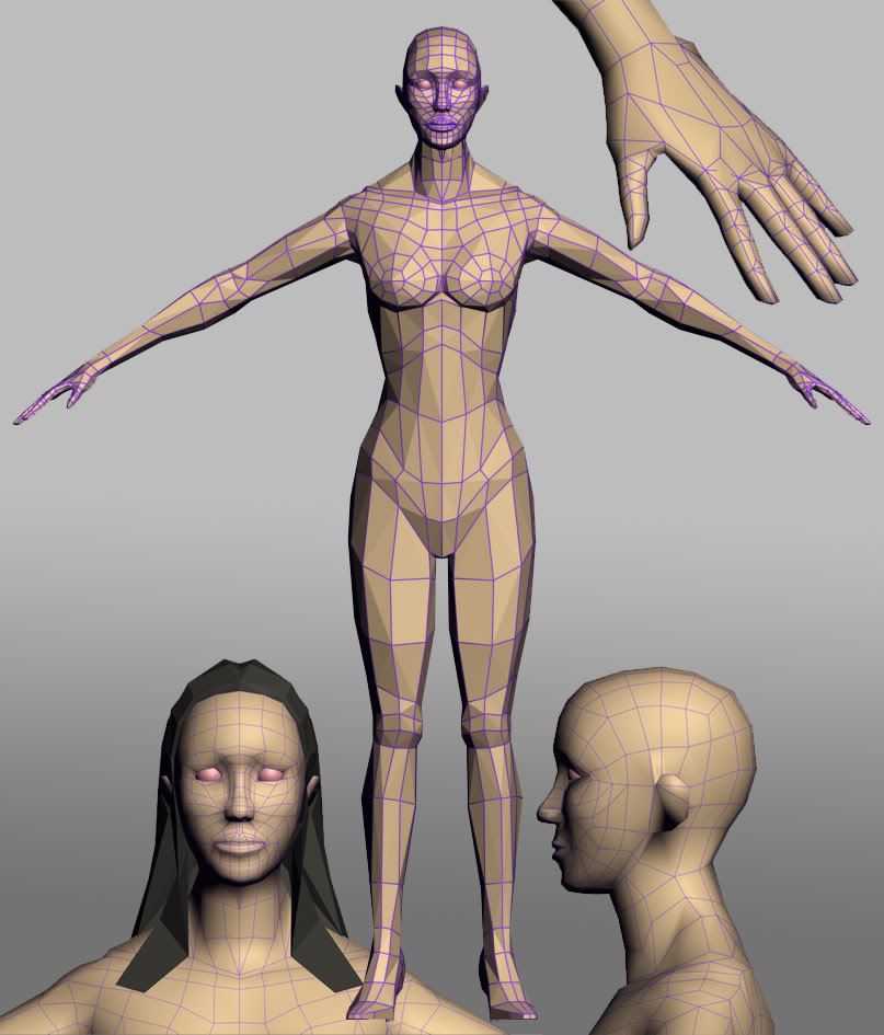
Wires and a few closeups:

I tried to concentrate on anatomy as well as mesh flow/edge loops but not sure how well I accomplished either. There are areas on the face (lips and chin) & shoulder/breast regions I am not happy with. But, I have been looking at the model too long and see right past the solutions to making it look right, so some fresh eyes would help me a great deal.
Thanks!
Long time lurker of polycount, not so long time modelling though. I often get inspired by the great works here and fire up max. Unfortunately, I just as often realize the model is nowhere near up to scratch and scrap the whole thing. I have decided to enforce a bit of self discipline and actually finish a model. To assist that I have chosen a subject matter of great interest to me...chicks! This is my first attempt at a full human model above about 500 polys. I'm would be most grateful for any crits or advice given.
Various views:

Wires and a few closeups:

I tried to concentrate on anatomy as well as mesh flow/edge loops but not sure how well I accomplished either. There are areas on the face (lips and chin) & shoulder/breast regions I am not happy with. But, I have been looking at the model too long and see right past the solutions to making it look right, so some fresh eyes would help me a great deal.
Thanks!
Replies
first off: it looks like your working with an editable mesh (because of the triangles) in stead of an editable poly, while editable polys are just... waay better
second: i like the body/limbs edgeflow but the face loops aren't as good as the rest, maybe study some wireframe views of professional artists and/or read some tutorials on face modeling.
keep it up!
With the model itself - in the front view, there's a lot of mass either side of her neck, which looks odd. Plus her hands are very flat - which makes her fingers look very thin. Try to get a hollowed inner palm, and more of a heel on the base of the thumb. The pose could do with a little more 's' curve in the side view. Otherwise it's certainly a very decent study - well done.
Check out this thread, (started by Stephen Stahlberg) on topology. It's well worth a look.
Japhir: Thanks for the welcome and crit. I am working with edit poly, however these pictures are in facet mode which could be why all the triangles are showing up? I am trying to work out actual triangles in the mesh as I go. You were definately right about the face being a mess. So after looking at some other models, I've made a start on correcting the edgeflow. Getting the loops in the face is a lot harder to put into practice than it looks. The new image shows where I'm at with it.
Gmanx: Gday mate, I suppose when I started my only goal was to finish a model. Although it might be interesting to try to rig and animate the model later on. Even more interesting to texture something with the new tablet
I didn't have a poly budget to start with which is probably a bad habit to get into. I think I may have already gone a bit overboard with the polys because it is alot more difficult to work with now than in the blocking out stage.
I've quickly adjusted the traps/neck area so hopefully it doesn't look so off anymore, I haven't finished with that area yet though. I also had a shot at giving some volume to the hand but atm it's looking like a latex glove full of water...difficult buggers them hands.
Danpants:
Thanks for the kind words and the awesome image, it's really helping alot.
Anyway here is the update head with the new edgeflows. I will mention that the lip area is doing my head in...I can't seem to stop her looking like a goldfish.
There's a ring of muscle around the lips which lets us pout. It's usually visible as a little bump at either side of the mouth.
Japhir: Thanks again
Hawken: I can only aspire to that sort of quality at the moment.
Gmanx: I've reworked the face structure a fair bit and attempted to add some pinch to the corners of the mouth. I think it's looking better but I still need to do a bit of work on it. I've also 'plumped' the hands up a little bit.
Small updates as mentioned, as well as reworked the neck/traps/shoulders concentrating a bit more on edgeloops using the same method as the face. The areas near the triceps, rear delts and top of the lats are a bit messy at the moment, I am trying to figure out the best way to get rid of those tris. As always crits and suggestions will be most helpful.
Cheeseontoast: That is a good point. I had just figured that out too after feeling the transition of my own lower lip into my chin, it seems to be a similar situation at the corners of the top lip as well. I attempted to remedy it in the last update, here is a closer shot of the lips...hopefully the screenshot is clear enough as to the contours of that area.