The BRAWL² Tournament Challenge has been announced!
It starts May 12, and ends Oct 17. Let's see what you got!
https://polycount.com/discussion/237047/the-brawl²-tournament
It starts May 12, and ends Oct 17. Let's see what you got!
https://polycount.com/discussion/237047/the-brawl²-tournament
Player Character for Ultra-Real Game
I'm working on the player character for a game my friend and I are working on. It's going to be an ultra-real first person shooter, and the character is going to be a semi-melancholy mechanic. The game begins at his house (thus why he's not in his outfit), but he's wearing his comfortable clothes. I haven't got stains and such on him yet, so his clothes look pretty pristine for such a character, but I'm working on him. I'm also making him for a class so it all has to be done by Monday.
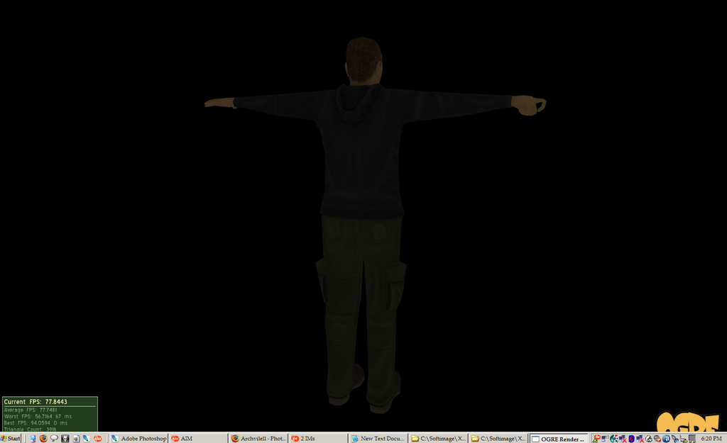
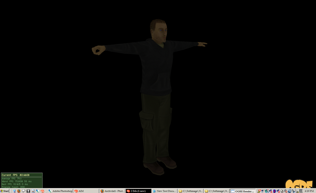
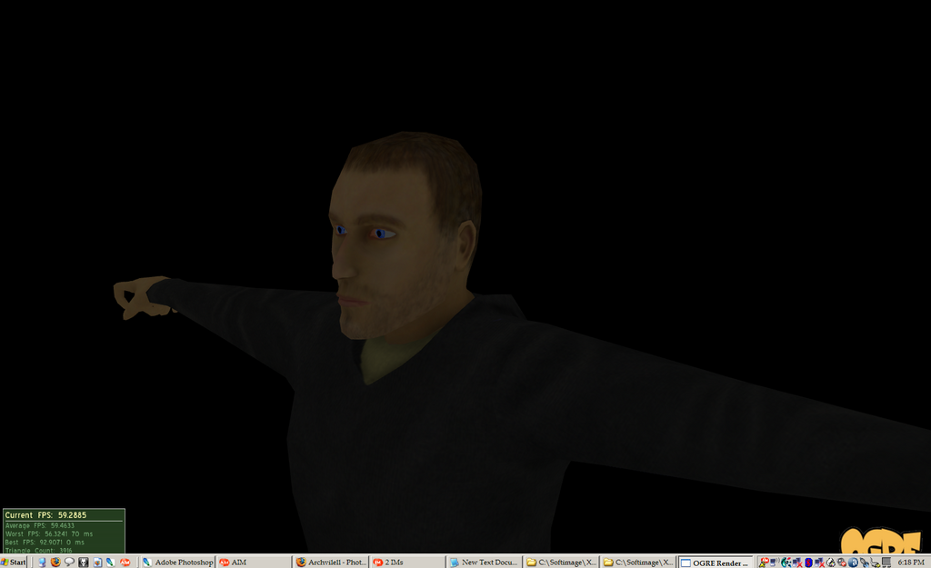
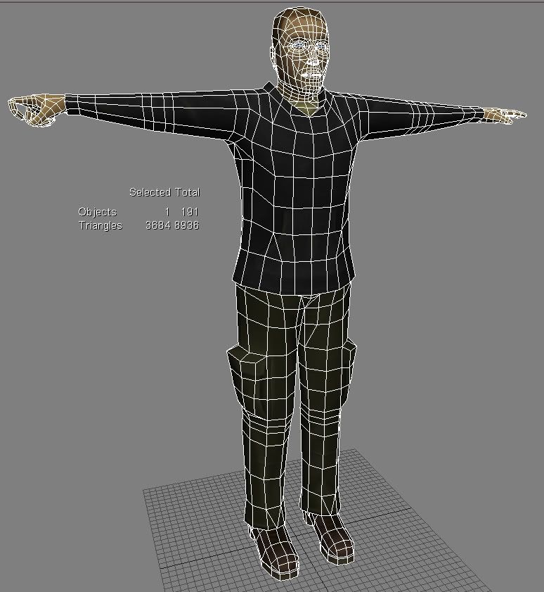
The first three are diffuse only on the model. It's rendered using a program my friend quickly wrote so we artists could see exactly how the diffuse looked ingame. I have a spec map and normal map created for him, but I haven't had the time to figure out how to get XSI to use those in its material system and render it. The character is due Monday in class (I'm working on my game in class for credit, it's awesome), but I can tweak him anytime after that.
Any crits for him thus far?
Thanks,
Ben
Replies
As for the character, first, what do you mean by "ultra-real?" You're still pretty inexperienced, so focus on the basics and fundamentals before trying something too challenging. Second, without normals it doesn't make sense to crit the texture since it (should) be very important to the look. As far as topology/geo goes, for starters just go through the posts in this forum. The design is really simple and generic so there will be plenty of examples. Its not a bad start, and sorry I don't have time to be more helpful, but I needed to respond to Genjix's idiotic comment and didn't want to be completely OT.
Thanks again. And Genjix, if you're not going to offer any worthy advice and post simply to shoot someone else down, please don't even post.
Which version of XSI are you using?
I know I shouldn't call it ultra-realistic, but it gives me something to shoot for. I would rather call it that and have people say "That sucks. That's not real at all; it's too *such and such*." Then I can learn to avoid that in the future.
For clarification, the ultra-real part of it was terms of gunplay, but I'm striving for realistic graphics as well. Again, I know I fail miserably but it's a goal. I'm hoping the next character I model will be that much better. I've alread learned a lot from this one.
And yes, the index finger is pretty bad. It's because his fingers are too low-poly for the kind of deformation I have him in. I haven't much experience in enveloping either, so that doesn't help. The rest of his body is enveloped decently, but his fingers are pretty screwy. I'm hoping that the stuff he holds on to covers up the screw-ups, since it really only loks bad on the inside of his hand. It's slightly noticeable from the sides, but from the outside of his finger it looks alright.
Thanks for the tips so far.
http://www.ofusiontechnologies.com/
As with materials, I suggest you hit up the Ogre Wiki, as they have some pretty detailed descriptions of how to do shit. Thats what I do when I dont know whats going on.
Anyway, keep plugging, it is a good start, especially for someone as inexperienced as you. It sure kicks the shit out of the defult ogre models (robot, ect)
what you've got is pretty decent
it looks as if you could benefit from a deeper understanding of what you're making, especially if your goal is realism. id ont know if you've heard this before, but everyone has a tendency, when doing art, to create what we think something is, as opposed to what is actually there. the difficulty here is that one needs to consciously break apart un-conscious assumptions of what's being done and do some research.
it would help you to look at some more faces. our friend here as a sharp, pointy chin, a narrow face, lips that pertrude out too far, overly saturate and unrealistic eyes, and a face that is, imo, too thin.
the general proportions need some deeper observation as well. his torso maayybee a bit long, i think his arms are too short (might be just the torso) and his feet are too big. this ties in with artistic appeal, of course... but if you're going for realism.. so be it.
the details are simplistic, and i think that most importantly, studying fabric and folds would help a lot.. which was like hell for me to get started with... but it's worth it, believe me.
above all, he needs silhouette work.. he kinda seems like a big flat tube, ascetically speaking.
oh, and of course, a brighter render would help. don't hide your work! if it sucks, you'll feel 500% better when you fix it and it's awesome.
I've got oFusion, but for some reason it doesn't render anything right - it's all messed up in the viewport. I know it works because it works on my buddy's computer, but I haven't had time to work on it.
As for this character, I'm going to have to rerig his arms. He has horrible deformation at the wrists. I forgot to make his forearm into two/three bones, but lock in all translations except the Y(?) rotation. That should make it so rotation at the wrist is translated throughout the forearm and not all done at the wrist. Also, I think his hands and fingers need more geometry - the deform something awful. I'll tweak his face like you said - I agree his face needs work but I don't have the experience to determine what needs done.
I admit the folds in his clothes have the shotgun effect - I just drew them on there at random in places I thought may need folds. What is a good way to draw folds and wrinkles in clothes? I modeled them in ZBrush then looked at my normal map and added highlights on the high parts and darker areas in the low parts. It seemed like the way to go at the time, but what does everyone else do?
I've done some considerable work on the texture, but I still haven't got a way to render spec maps and normals. It's pretty high on my to-do list; I was just busy all weekend
Your in game shots are really dark. You might want to upload some brighter ones so that we can give some proper crits.
[/ QUOTE ]There is a character in those shots? I see dark floating fleshy bits on a black background...
Thanks for the tips so far. This is exactly the kind of help I was hoping to get. This is my first character model I've made; mostly I work with weapons and things. I'm going to school as an artist, but I haven't had any life drawing classes yet, but I'm signing up for one today (I can register for classes next semester today).
I've got oFusion, but for some reason it doesn't render anything right - it's all messed up in the viewport. I know it works because it works on my buddy's computer, but I haven't had time to work on it.
As for this character, I'm going to have to rerig his arms. He has horrible deformation at the wrists. I forgot to make his forearm into two/three bones, but lock in all translations except the Y(?) rotation. That should make it so rotation at the wrist is translated throughout the forearm and not all done at the wrist. Also, I think his hands and fingers need more geometry - the deform something awful. I'll tweak his face like you said - I agree his face needs work but I don't have the experience to determine what needs done.
I admit the folds in his clothes have the shotgun effect - I just drew them on there at random in places I thought may need folds. What is a good way to draw folds and wrinkles in clothes? I modeled them in ZBrush then looked at my normal map and added highlights on the high parts and darker areas in the low parts. It seemed like the way to go at the time, but what does everyone else do?
I've done some considerable work on the texture, but I still haven't got a way to render spec maps and normals. It's pretty high on my to-do list; I was just busy all weekend
[/ QUOTE ] For cloth you need to learn about the forms of the body and how cloth interacts with them to know how cloth folds form. For realism the proportions are off, another thing with Realism that I see a lot is it is so generic and unintresting. Try to give more personality to your character than just a generic person look. The form and silhouette of your character is a little lacking and generic. Is the mouth just for looks? if it's supposed to deform it won't animate very well with the edgeflow you got going now.