The BRAWL² Tournament Challenge has been announced!
It starts May 12, and ends Sept 12. Let's see what you got!
https://polycount.com/discussion/237047/the-brawl²-tournament
It starts May 12, and ends Sept 12. Let's see what you got!
https://polycount.com/discussion/237047/the-brawl²-tournament
Shukaku - too late for GameArtisans

Heh, wanted to redesign this guy for The GameArtisans.org Naruto compo. Unfortunately I learned about it too late but I wanted to follow through.
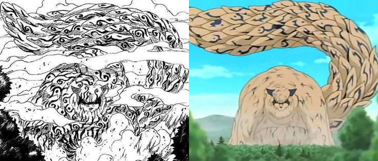
I wasn't a big fan of the design from the Manga/Anime so I wanted to make the Shukaku feel more like Gaara's primal self, reflect his selfish bloodlust, rather than the playful, silly nature of the Tanuki.
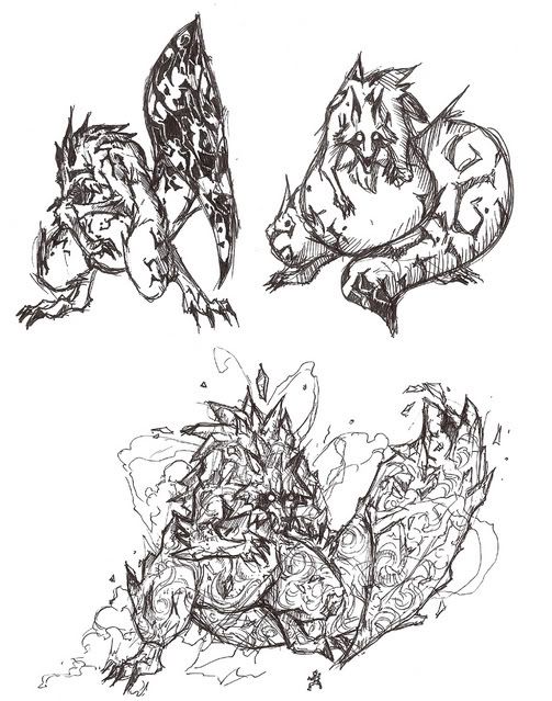
Stuck with the bottom design for the most part:

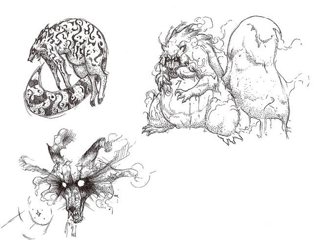
Took some bits from these as well:

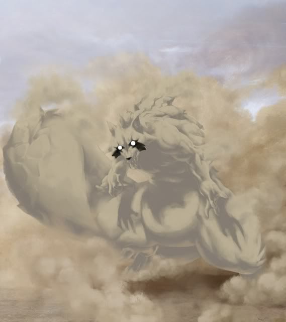
So I've been painting:

Replies
Done I suppose:
Looks really good though! Maybe that's the important thing hehe.
i'd add more contrast too, maybe not that much to keep the sandy feeling but a little anyway.
good luck, too bad you found out so late!
the blue elements could have been blended in better. they're kind of sitting on top of the painting
[ QUOTE ]
the blue elements could have been blended in better. they're kind of sitting on top of the painting
[/ QUOTE ]
Hmm.. I'll see what I can do. I haven't thought of a very good way to blend them yet.
This should be an interesting piece once it's finished!