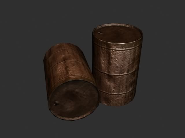
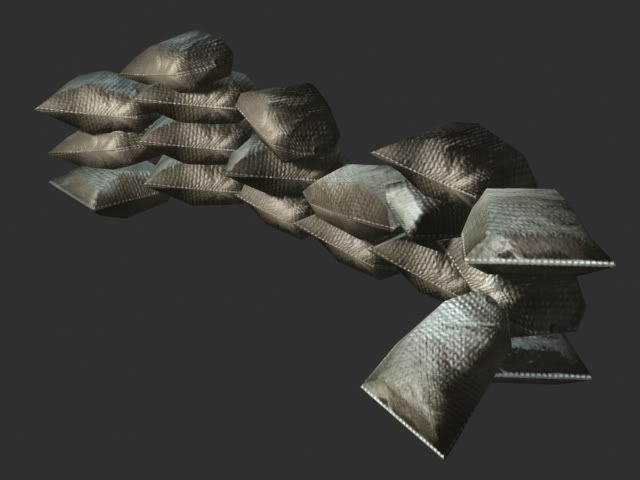
level art Art test
Hey guys i got an art test recently and i have 3 weeks to complete it i have to complete 4 models 3 small ones and 1 big one i started working on the 3 small ones as they do not take that long to do. here are the rules of the test for each model.
Oil drum:

300 Triangles total.
1 Diffuse Map at 256x256
1 Specular Map at 128x128
1 Normal Map at 128x128
1 Transparency Map at 128x128 (optional)
The oil drum should be modeled with the idea that it has been lying around for a long time.
It should not look pristine or new in any fashion.This is a set piece that will be used for cover points for the player
character.
Sandbags:

30 Triangles per Sand Bag.
Maximum usage of 20 Sand bags to make bunker stack, totaling 600 Triangles.
1 Diffuse Map at 128x128
1 Specular Map at 64x64
1 Normal Map at 64x64
The sand bags should be modeled as separate elements that can stand alone and be used as modular pieces
then also put together to form one bunker set piece that would be used as cover points in the game.
and the last one is the ammo box i have yet to finis the low-poly model so i dont have an imge yet:
350 Triangles
1 Diffuse Map at 512x512
1 Specular Map at 256x256
1 Normal Map at 256x256
1 Transparency Map at 256 x 256 (optional)
The Ammo Box needs to be functionally modeled so that the top latching can be opened up.
On the interior of the box, have an unused ammo belt containing 7.62MM shells.
the last big model is a BSG-108E GUNNER ZEPPLIN i have yet to model it yet but here are the requirements:
2 Diffuse Maps, 1 at 1024x1024 (for the hull, cabin and wings)
1 at 512x512 (for details like gun turrets, propellers etc.)
2 Specular Maps, 1 at 512x512 and 1 at 256x256
2 Normal Maps, 1 at 512x512 and 1 at 256x256
2 Transparency Maps, 1 at 512x512 and 1 at 256x256
1 Emissive (self-illumination) Map at 256x256
i just need some crits.
Oil drum:

300 Triangles total.
1 Diffuse Map at 256x256
1 Specular Map at 128x128
1 Normal Map at 128x128
1 Transparency Map at 128x128 (optional)
The oil drum should be modeled with the idea that it has been lying around for a long time.
It should not look pristine or new in any fashion.This is a set piece that will be used for cover points for the player
character.
Sandbags:

30 Triangles per Sand Bag.
Maximum usage of 20 Sand bags to make bunker stack, totaling 600 Triangles.
1 Diffuse Map at 128x128
1 Specular Map at 64x64
1 Normal Map at 64x64
The sand bags should be modeled as separate elements that can stand alone and be used as modular pieces
then also put together to form one bunker set piece that would be used as cover points in the game.
and the last one is the ammo box i have yet to finis the low-poly model so i dont have an imge yet:
350 Triangles
1 Diffuse Map at 512x512
1 Specular Map at 256x256
1 Normal Map at 256x256
1 Transparency Map at 256 x 256 (optional)
The Ammo Box needs to be functionally modeled so that the top latching can be opened up.
On the interior of the box, have an unused ammo belt containing 7.62MM shells.
the last big model is a BSG-108E GUNNER ZEPPLIN i have yet to model it yet but here are the requirements:
2 Diffuse Maps, 1 at 1024x1024 (for the hull, cabin and wings)
1 at 512x512 (for details like gun turrets, propellers etc.)
2 Specular Maps, 1 at 512x512 and 1 at 256x256
2 Normal Maps, 1 at 512x512 and 1 at 256x256
2 Transparency Maps, 1 at 512x512 and 1 at 256x256
1 Emissive (self-illumination) Map at 256x256
i just need some crits.
Replies
Well the oil drum should have more grime to it and some chipped paint and rust wouldn't hurt. The sandbag's sort of look like pillows ATM decrease the height from the top and bottom ends a bit.
As for actual critiques: The barrel is quite plain and boring looking to me. There is no contrast in it too (which I think is the biggest problem at this point). Add a label or two, some oil stains, dents, whatever. Just to make it a bit more interesting. Just not a whole lot going on right now. I would also question whether or not to put metal blemishes/chips in the normal map. With the texture being 256, and the normal being half that, it's not looking all that great having the chips in the normal map. Just kinda makes it look noisy with no real clear reason to what the noise is. Model looks solid.
Sandbags: Model again looks solid. Not much you can do with 30 triangles, but it seems like you got the shape you need, so nice work. The diffuse doesn't seem too bad. But damn, those are some low limitations. Did they say anything about tiling textures? Because, that is some ridiculously low resolution on those suckers. Perhaps unwrap the diffuse and spec, and tile the normal on UV channel 2? Did they make any comments about not doing that? Also, the spec makes those bags feel like grocery bags. Sandbags are usually made of a fabric material. They would not reflect light all that much. So I would make the spec map for that a considerably darker grey.
Looks like you are off to a good start. Oh, and as I have told you a hundred times, don't fear using photos (unless they specifically told you not to use them). I'm not saying use a photo as your entire texture, but it's common practice in the industry today to use photos at least as a base. It's not uncommon to even find a texture that is made up entirely of photos, and the artist merely did the blending/masking. The key is to have the best end results in the time frame you need it done by. If you can hand paint and get photorealistic results in the same time frame, more power to ya, and let me in on your secret.
All in all you are off to a good start. I gotta say though, that's some tough limitations. The type of games that would have those kind of requirements (as far as I know) would be an RTS, handheld, or a low end open world game. And since the barrels can be used as cover points for the player, I'm gonna assume that it is indeed not being used for an RTS. Weird.
Well good luck, keep us posted. I hope you found my crits constructive, and not offensive.
Also I think the barell would not be so shiny with all that rust. even if the oil causes that, it can`t cover it uniformly.
If the goal was to make a sand bag and do something with it then you pulled it off, if the goal was to make a sandbag wall I think you fell short.
The disadvantage of doing the solid wall method means you have a bigger custom texture. But even then you can make the most of it by adding dirt/dust/grime/plant life/water stains to the bottom and fading out the top to mimic sun damage. Maybe even split one of the bags open or add bullet holes. At some point they might ask for a sandbag wall too high and too long for you to do with individual sandbags and at that point you have a difference in detail.
I think you could use what you have started as a base for a high poly mesh, saving yourself from having to start from scratch. You could more than likely even bake the sandbags defuse on to the low poly to get your low poly texture started.
Showing that you can make a solid piece of low poly geometry that has a great normal map that mimics a sandbag wall speaks louder to me then one sandbag copied a few times.
[ QUOTE ]
The sand bags should be modeled as separate elements that can stand alone and be used as modular pieces
then also put together to form one bunker set piece that would be used as cover points in the game.
[/ QUOTE ]
You make a great point, but it doesn't help him with his art test at all. It specified that he has to make the bags separate.
But that would be a question I would have for them in the interview. "what 4 u do things wierdo?"
Since he's restricted to using one bag, I think he might be able to model in some sag/gravity to the base mesh and pull off a more convincing pile? He might also want to stack them up like bricks instead of on top of each other. If he did that he might not need to model in the sag/gravity, the bags would dove tail into each other.
I've seen your stuff around forums on the web. Thought I'd give some crits. Overall, the models aren't too bad, restrictions considered. Nonetheless, w/ such low tri counts, you really need to focus on the silhouette. Render it out and show just the alpha mask. Can you make out what it is? Second are the textures and materials overall. I can see that you can use color, spec and normal, but I can't see that you can use all three together to create convincing materials. Your color map should be all about re-use and tiling w/ such low resolutions. Your spec should show nice highlights and break up the surface quality, and the normal should do all the shadowing.
Sandbags: everyone touched on the model. Needs to be thinner, needs a nice slight downward curve and the affects of gravity. It should also be more generic, eg don't taper the ends, keep them as wide and broad on both sides. The color map and normal isn't too bad. The spec however doesn't quite work. The spec makes the surface look smooth, maybe even silky or wet. I would expect little to no shine, and the surface to be broken up nicely w/ the spec.
The Barrel: The proportions look fine, however the model itself is boring. Dent up the rim to break up the silhouette. As well, the normal is too much. The surface wouldn't be dented so much and I doubt that much gunk and debris would stick to the metal surface. Same issues here w/ the spec - I can't tell whats what. Old metal would have little to no shine. Liquids, oil, etc, if fresh would have some shine. The color map is a waste. I see a lot of opportunity for a repeating texture here that would allow you to up the res on the texture. You need to add some structure, to show the lid can be removed or was welded on, that liquid comes out of the hole on top (formation of dried liqiod around the mouth), and you need to blend the base w/ the ground better. For something that stands up a lot, I would expect the base to be dirtier. Get some photo ref for the model, as the loading rings (the outdents on the sides) don't look right.
Ammo box: This prop is looking the best. Same issues though as above - use your spec map more. The gray areas around the lip of the lid, the area that gets the most use and abuse, up the spec to show the unpainted metal underneath more. With such a nice model and box, the ammo looks unrealistic and low-res. I'd suggest getting some better photo ref for the texture and model of the ammo (right now they look like flat pencils
Overall, I think if you focus on the materials / surfaces of the props, fix the model issues w/ the sand bag, texture issues w/ the barrel, and fix the ammo rounds you'll be ok. And again, if they have been given you 3 weeks to do this, take your time and do it right, don't rush it.
Best of luck!
thanks for the crits guys ill work on the bags and sepc maps
heres what im working on now i got a week to finish it more than enough time:
thanks for all the crits guys
The bags looks like inflated ballons.
The noise pattern in the oildrum is very to pronounced, you can't have that much noise in a normalmap of that size and still keep the sense of scale of the model.
Keep the bigger dents only tone them down a bit.
Remove the useless segments on the top of the model and use this sudden wealth of polies to give the basic shape of the drum some dents.
Paint some color variation in the ammo box diffuse texture and add some wear and tear to the text.
I'm also intersted to see the changes you made to the props that the members here suggested. It does seem that you post WIPs and ask for critiques, but then have a tendency of not posting again with the changes suggested. This is going to sound really jerky, but if you aren't going to take the time to consider these comments that other members make, then you are wasting people's time by asking for feedback. And I am not talking about just acknowledging the comments, but actually following through with some of them.
Good luck, I would like to see some updates on that stuff.
Josh
Due to many people having issues with the sandbag part of our Photo Real test, we've updated/revised the test a bit. The new restrictions are listed on our website. www.bigsandwichgames.com
I'm an old schooler, and the purpose of our test was to see how people could 'think' when handling extremely low poly / texture restrictions.
In most games, people tend to blow their budgets and go crazy with texture sizes and poly counts because they get into the 'We're working in Next Gen!' frame of mind. When you add up AI algorithms, Animation Data, FX, Particles, Physics etc... The art work usually needs a good cleaning up to get the games running at a decent frame rate. What we were trying to see is how well someone can show their art work with 'optimized' restrictions. What I usually do is paint my source at 2x the asked size and then scale it accordingly. So if I need to do a 512, I paint it at 1024. In photoshop, when down rez'ing images, I find a Bi-Linear filter works really well, and then using the Unsharp Mask to clean up any minor bluriness that may occur.
Looking at your models, they are coming along. Here's what I would recommend for revising or improving:
Sandbags: Re-tool them according to the revised test. The limitations are more liberal, so you should have an easier time with the mesh.
Try not to pinch the ends of the sandbags together like they currently are, and also remove the heavy white seam that you've textured on to the end. It makes the bags stand out too much as being a single object that is tiled, rather than a generic bag that can easily blend into one another when stacked to form the bunker.
Take gravity into account and sag the tops of the bags a bit. Currently they look very puffy and rigid, rather than soft and maliable. Also, with the normal map, I'd really tone down the fabric pattern, because that would end up shimmering in the game. Instead, use the NM as a way of adding clumps, buldges, and minor deformations to the bag.
The Barrel: It's on the right track, and is definately improving. First thing I'd change is the logo. Get rid of it. The purpose of the test is to replicate the source material as closely as possible. Instead of having the BSG logo on there, replace it with the text that is printed on the barrel in the photo ref. When it comes to the material of the barrel. It should have a coat of paint on it, that has been withered away over time. Under the paint, show the metal, and have some nice overlays of rust, dirt, graffiti etc. Currently it's all one colour, and doesn't have enough 'punch' to it. If you look at the photo ref, you will see that the barrel is a dark olive colour. Paint it like that, and then flake away the paint and age it. This will give it some good variation and make it more interesting to look at.
Ammo Box: The box itself looks very nice, no real crits there. But the bullets need to change. Currently they don't really look like bullets, they look kind of like large crayons or pencils. Find some references of .80 calibur rounds and use those. Also, having the ammo belt coming out of the box is a nice touch, but with the limited restrictions on polycount, it's really standing out as just a poly plane with a normal map on it. I'd tuck the ammo back into the box and vary the topography of how the ammo belt sits within the box.
Well that's it for my crits. Keep at it, you're definately heading in the right direction with things. Just some tweaks here and there, and I'd say they'd be ready to hand in.
Cheers.
I have included all the reference materials I used in creating my Ammo_Box located >>>here<<< Hopefully no one has a problem with this... will remove if necessary.
The results:
are located >>>here<<< I hope this has helped you at least in one part of the art-test good luck to <u>ANY1</u> doing these tests, hopefully you find yourself in good company with shinobix and his staff.