Street Cone Prop
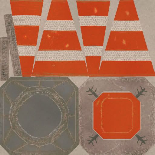
Here is another prop I am working on. It's a street cone, the white tape is supposed to be reflective, and the orange plastic is supposed to have a bit of sheen beneath the dirt, but I have not quite yet grasped specular maps like I want to. Any input on how to improve this spec, diffuse, ect would be immensely helpful and greatly appreciated.
Question: Should I make a self illumination map to show the reflective aspects of the tape, or somehow use the spec map?
Here's the poop:
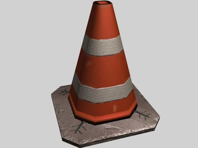
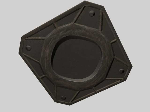
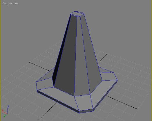
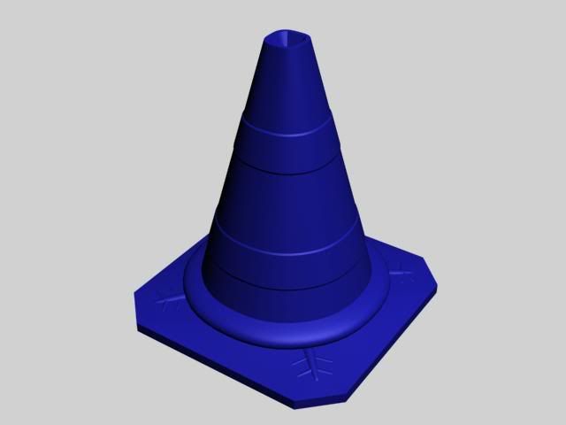
Diffuse:
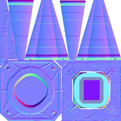
Normal:
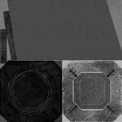
Spec Level:
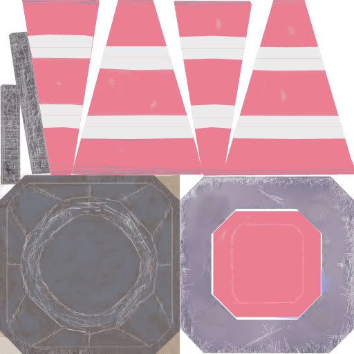
Spec Color:
Question: Should I make a self illumination map to show the reflective aspects of the tape, or somehow use the spec map?
Here's the poop:


Diffuse:

Normal:

Spec Level:

Spec Color:

Replies
Anyway, I'd go color only for spec, way darker on the reflective tape and metals' diffuse, and way brighter on their specular.
Crits:
- The reflective tape should have a higher/different spec then the rest of the cone.
- The bottom part of the orange piece doesn't blend well into flat bottom part. Check the normal map, its casting a really dark shadow when it shouldn't. I suspect it is because you rendered out the base and the orange part separately? Or the ring around the bottom isn't represented properly on the low poly model.
- The top of the cone base has more damage/dirt then the bottom, hows that work? Whats with the little tree branch thingies on the base?
- The color/spec of the base is reading more like metal then plastic/rubber.
Looking good.
Crits:
- The reflective tape should have a higher/different spec then the rest of the cone.
- The bottom part of the orange piece doesn't blend well into flat bottom part. Check the normal map, its casting a really dark shadow when it shouldn't. I suspect it is because you rendered out the base and the orange part separately? Or the ring around the bottom isn't represented properly on the low poly model.
- The top of the cone base has more damage/dirt then the bottom, hows that work? Whats with the little tree branch thingies on the base?
- The color/spec of the base is reading more like metal then plastic/rubber.
[/ QUOTE ]
Thanks for the crits, couple of questions though:
The reflective tape should have a higher/different spec then the rest of the cone. <font color="red">So does that mean the orange part need to be darker/obsorb more light then the tape, and will that help it shine, or do I still need a illumination map? </font>
The color/spec of the base is reading more like metal then plastic/rubber. <font color="red"> Whats the best way to do that? Do I make the spec level darker on the plastic and not point out the scratches? Because I think I have the scratches in a lighter color and it is giving that chipped metal look. Do you agree? </font>
EDIT: Only four crits from Vig
If it hasn't already been mentioned, the pattern on the white is odd, do you have a reference image your working off from?
Good work so far just pimp the new edited version soon
Not really tired, you did a lot right just a few things stick out.
That's pretty accurate to the type of reflective tape they use, well as close as you can get with filters =P The actual pattern is less chaotic. http://www.beseenonabike.com/shopuk/images/983_tape_headlight_anim.gif
[ QUOTE ]
or do I still need a illumination map?
[/ QUOTE ]
illum map on a traffic cone? umm no... if you feel like faking some illum you can paint a slightly whiter spec color on the orange part of the cone right around the tape as well as paint some white in the same place on the defuse. It will look like the tape is glowing, slightly...
Yep its the sharp white scratches/highlights that are making it look like metal. The grey color is pushing it toward a metal look also. I understand why you went with grey, to make it look dirty and faded it was a good call. BUT the rubber started out black and faded. The fade is a nice touch, but its the sun and dirt that does the fading and the bottom of the cone would be less faded then the top. When you get deeper into the rubber (like a scratch would show) its still black, if you did a cross section, only the outer skin would be grey. If you scratch it you won't reveal a lighter color, its going to be darker.
I would also fade the orange part of the cone from the top down to make it look a little sun faded, like this.
http://www.pbase.com/image/28925641/medium.jpg
if you're going to have normals, spec and color spec, you'd best be putting some lights in your render to show that stuff off. lighting is a pain in the ass [for me] but it can make a huge difference when showing off your work. bad lighting can make the best piece look assy.
You could add another 5,000 triangles and it still won't cost as much as having 4 individual texture calls. (Ok, I might be exaggerating the numbers, but I bet I'm not far off.)
It's probably a good bet that any engine that supports those 4 separate independent channels can probably support a lot more triangles. Use em.
Spend some more polies rounding the shape out and smoothing it. It will look much better.
Also your spec is off. Mentioned earlier but dont use color and spec for this. Also the plastic cone area should have different spec than the reflective / shiny tape.
1. Need to work on the diffuse and make sure I clean up the pattern a bit on the tape to make it less chaotic, and more uniform, but still triangular. Add more fading to the plastic in the orange, and get rid of the white scratches in the black rubber.
2. I need to touch up the texture on the cone part of the normal. For some reason there is a line rendered right into it on four different sides. If I can figure that out, I can get rid of the seam.
3. Get rid of the spec level, and just use color. I'll probably put alot more time into the spec then I have previously as my spec always seems to bring my models down a bit.
@jesse: As a rule, I tend to keep smaller less detailed objects as low poly as possible because they are not focal points in a scene. This was primarily due to a recommendation by MoP. Let me know if this logic is flawed at all and I'll revisit it.
Nice though :v
Feels good though I don't like the orange plastics new found gloss. Should I fix it or does it look accurate?
Also messed with the diffuse a bit, took away the white highlights on the faded rubber. Looking a bit better, still a ways to go, also got rid of most of the seams.
The cone is decent if you're a beginner.
Not to toot my own horn, but you may find this useful:
http://www.adambromell.com/?page_id=27
My honest-to-god suggestion for you is to expand yourself technically and artistically and push to do more than just a street cone. Even if you're fresh in to the entire aspect of 3D modeling there are more educating props that can be made than just a cone with a few extrusions.
D'oh... honestly, my one and only critique on this is that its just a street cone.
The cone is decent if you're a beginner.
Not to toot my own horn, but you may find this useful:
http://www.adambromell.com/?page_id=27
My honest-to-god suggestion for you is to expand yourself technically and artistically and push to do more than just a street cone. Even if you're fresh in to the entire aspect of 3D modeling there are more educating props that can be made than just a cone with a few extrusions.
[/ QUOTE ]
Oh I totally understand where you are coming from, I can model pretty well, that's never been a problem, but I am still getting the hang of things like spec, normals, and texturing in general that I thought something small, something that I see everyday (living in California) would help me bring something to life. I feel like it was a good exercise, and I will probably continue to do small things until I run across a really good concept, or I get the inspiration to concept something for myself.
I have been in a severe mental block lately, and I just needed something to break me out of it. So I guess this is where I end it with this one, pretty happy with it. Anyone got some suggestions on the next prop I should do? Maybe it'll get me off my ass. I think I'm going to start a requests thread where people describe something they want to see modeled and people come in and take the assignment and do it. Something for people like me who have no inspiration at the moment to get inspired to work.