The BRAWL² Tournament Challenge has been announced!
It starts May 12, and ends Sept 12. Let's see what you got!
https://polycount.com/discussion/237047/the-brawl²-tournament
It starts May 12, and ends Sept 12. Let's see what you got!
https://polycount.com/discussion/237047/the-brawl²-tournament
silverhawk wip.
Here is a current lil project im working on in my downtime. My buddy wanted a new character to animate, so i volunteered to make it.
This is the main guy from the cartoon silverhawks. If your not familiar with that show, u can watch this and be up to speed http://youtube.com/watch?v=FV8BYu3FhFQ .
thoughts and crits are most wanted!
thx.
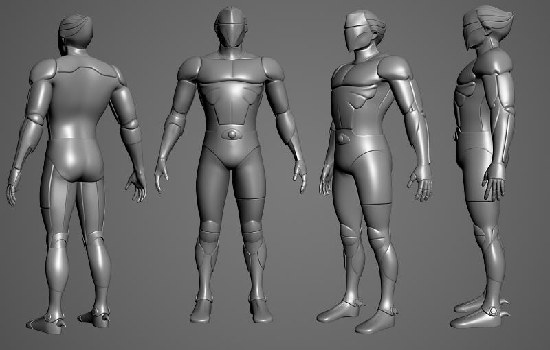
highpoly
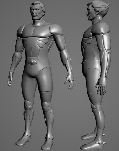
highpoly with face
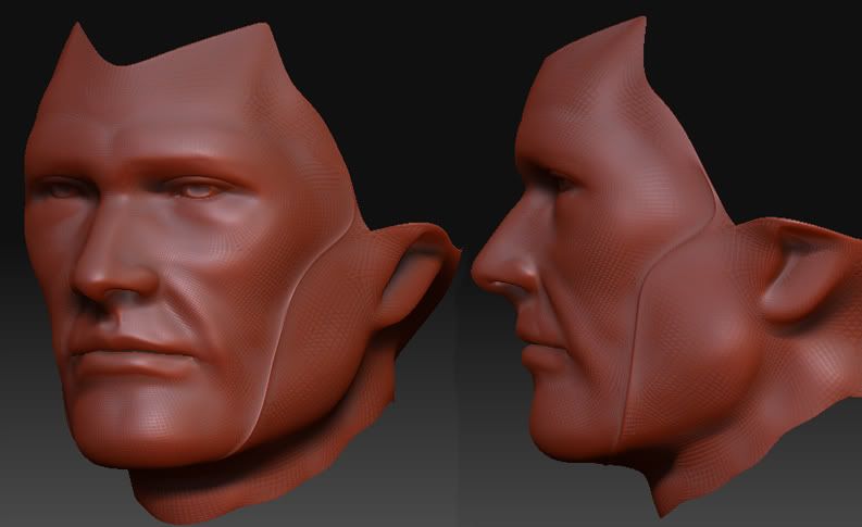
quick face scuplt
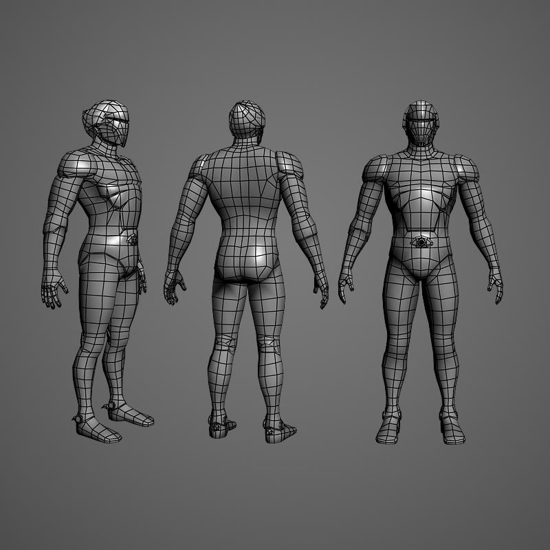
still working on the low poly, here is progress.
lastly, face lowpoly. this is just color ontop of the AO and normal.
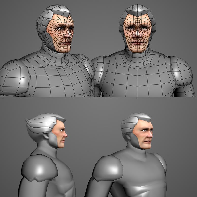
thx for viewn.
This is the main guy from the cartoon silverhawks. If your not familiar with that show, u can watch this and be up to speed http://youtube.com/watch?v=FV8BYu3FhFQ .
thoughts and crits are most wanted!
thx.
highpoly

highpoly with face

quick face scuplt

still working on the low poly, here is progress.

lastly, face lowpoly. this is just color ontop of the AO and normal.

thx for viewn.
Replies
Can't wait for more progress GJ.!
Face looks awesome, good work so far.
edit: wings are in the works
Here is lowpoly with AO and Normal shot onto it. uhhhh ignore the black areas, those are errors i havent painted out yet
cheers.
Have any ideas yet for the silver process yet? & are you going to suprise us with his silver-hawk?
here are flats like you wanted, fore warning, the blank spot is where wings are going to go, and ignore the errors, havent cleaned maps yet
He's looking good thus far. Its been at least 15 years since I've seen Silverhawks but if I remember rightly, don't the face plates slip in to a niche under the hair armour? I remember when they were going into action they'd all pull down their masks in sequence and it'd be all cool and stuff.
Is there any reason given why he's only got a horizontal mould line on his left leg?
Mine was a kind of semihuman girlish character with a golden body and a white face. On of my fav toys as a kid, kinda flimsy tho.
Good progress on yours! Mouth might be a tad wide and you might want to sylize his face a little to convey more of a 'cool leader' look... Just personal taste.
pior: thats the copper kid!!! thats the character i originally wanted to do! im not sure if its a boy or a girl tho, hes just kinda the sidkick i think. thanks for spotn the mouth width. i originally made the eyes too wide and the mouth fit at that time. so ill tinker with the mouth a bit
EDIT: One other thing, I noticed those weird arcs behind the cups in the knees, does that help the deformation of the model?
ps. me and painting skin are not friends! that was much harder than i anticipated....and frustrating too!
@ roolie: uh oh, i been spotted!
@ umbrella man: thank you! i tried to avoid going too over the top with this guy, i wanted a happy medium between cartoon and realish, i hope i hit that mark
thx for viewn!
http://www.t3h-v.com/folio/alien.html
disclaimer: this is model with original AO and normal, not recent maps.
enjoy
Are you going to model in the wings that appeared from his sides to his forearms when he flew?
PS. You can watch the SilverHawks on Winamp if you search through the AOL TV thing-- or one of the TV things on Winamp, anyway...
this is a quick lil work around i did. i just assigned a diff material ball to the skin parts. that worked for the arms, but i cant do that for the face b/c i dont have the mask sectioned off by geometry. so it would have to be an all or nothing kinda deal on the face. Im sure there has to be a blend mode, or something that i can plug in a mask in the material editor....im just not finding it.
thanks in advance!
ps. if my explination was confusing i can take screen shots and illustrate what i mean.
Alex
personaly i think some of the more flexable parts, like along the side of the body could be done with a silver mesh cloth type texture, to add a little variation and pizazz to the character.
[/ QUOTE ]
love that idea
thanks for all the feedback and help guys, really appreciate it =D
@ rhinokey: very good idea! i was lookn into that already. im thinking about making those areas mayb a 10% darker so it helps "pop" the armor pieces a bit more =D
ok, its halloween so i probably wont work much on this today, but more updates to follow in the next few days
thx again!
Here is what im going to call the "finished" product. I could nit pick, and find stuff here and there to tweak, But over all i feel its pretty much as best as my ability can make it go right now. Ofcource if there are valid complaints on things, ill most certainly revisit and fix stuff! so dont hold back on the crits!
thx for viewing. Time to start the next model for portfolioooooo! gdc is looming around the corner, so i gota bust gnar fast!
cheers!