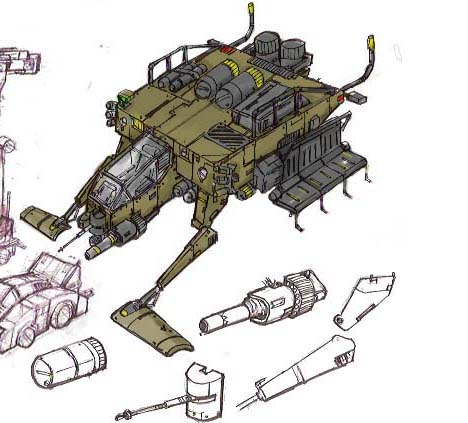
W.I.P concept vehicle by 2000yearsoldman
Hello everybody, I am 2000yearsoldman
This model I been doing for a while now, so far I got to the texturing level.
I got inspirated by somme killzone designs, it supporse to an amor troop hover craft carrier.
I want it to be as brutal as possible, it is not gonna like some shiny 3d model, it will be a dirty war machine.
Hope everyone give some cool comments.
enjoy.
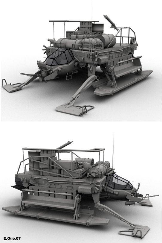
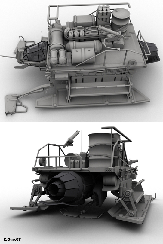


Replies
and with the texture, you probably want to texture it in passes. Right now I see you have parts nearly fully textured out, while other bits and pieces haven't received any treatment whatsoever. Personally, I like texturing a model out so it looks clean like it just came out of the manufacturing plant, This way I can make sure all my materials look good with one another from a very basic standpoint THEN I go in and beat it up. That way I can distribute things like bullet holes in an appropriate manner to where they make sense. You figure those are the kind of details that shouldn't be evenly distributed across the model. Also you might want to desaturated the paint job, the blood, and your logo work a bit-
Cooool design though, keeep goin
The biggest problem that caught my eye almost immediately is the proportion of the body part. In the original concept it looks thick and gives a strong, bulky feel. But yours looks thin and weak.
If you look closely to the concept you'll see that the body isn't just 1 large flat box, but it's broken up into 3 parts. The head isn't just sticking out of the front either but it inserts underneath the blue part.
Another thing are the stuff on top of your vehicle. In the concept, those things look like they are part of the vehicle. Gas, oil tanks, I don't know but they definitely are not just cargo placed on top. The way you put stuff on top of your model is looking more like a cargo ship carrying goods.
And the head. It looks a lot cuter now when you give it all those angles. In the original the head shape is just straight which feels a lot more serious and war-like.
Well I'm not sure how close to the original art you're going for. But since you mentioned you want this piece to "be a dirty war machine" I really think you are not going in the right direction. It's turning out like a UHaul now and not a war machine.
I do notice some odd scale issues. The cockpit strikes me as way to small compared to the seats on the sides and the barrels, jerry cans on top etc. Or vice versa.
Those jerry cans look WAY too big for the pilot to pick up, though sort of manageable for a soldier sitting on the side according to your seat scale.
Definately pay attention to these areas as it makes the diff between awesome and not bad.
ppenguin_Thanks alot. You teally got the good eye man. Yes I did some changes from the original concept. Because when I was modeling, I reallized scales of 2d concept and the 3d model can't well match, so in the end I made the cockpit bigger and thiner body. And one thing, the cockpit is not in some level as the rear body, because I want the window to lift up from front to back.
per128_Thanks for the support.
nealb4me_Thanks. When I was modeling I looked alot tank photos,(Love the WWII tanks
New stuff.
I got the front buttom gas tanks and the side power lines done. Now I am on the side shiled. What your see there is right shield, the center part is done, the whole shield willd done by this week. And the next will be the side seats.
Enjoy
The front legs? could prolly be bulked up first to look like it can support all that weight up there...I wished the model was posted first before you went through the insane unwrapping process.
And yea, blood on objects to to be more burgundy when its oxidized for that long.
Overall its tremendous detailed work.
Side seats are this time, the next one up is the jet engine.
Enjoy.
Also what I'd like to see to the seats would be some actual "seats"...if the soldiers are forced to stand up like in this design with little space and they get hit by a missile...then they'll problems getting out. They might fall over the grip as well since doesn't seem like there's anything to hold them in place.
Add something like that and your side seats will work more efficiently....
I sliced my thumb pretty badly over the weekend (Don't combine building warhammer 40k models and alcohol), I'm pretty familiar with how it looks
Ghostcape_Thanks alot. You are so right on the blood stein, I went back darken it.
Per128_I think the texture I did so far may be little radom, but later they will all come together good.
Konstruct_I only got the back rear and side views today, more will come later.
New stuffs.
Rocket engine is done, the next park will be explosive armors.
Enjoy.
Pliang_I am agree with you, right I really want get the texture down too, and warry the rest later.
New stuff, the pilot seat is done.
At this stage the main body of the vehicle is finished, I think the next one up will be the skir armors around the cockpit and the rocket booster.
enjoy.
Keep it up!
I'd probably dirty up the cock pit more too though, looks like that thing has seen alot of use. Fibers on the seat would probably be splitting, ect... There'd be cracks/wrinkles in it.
Seems like way too much blood though. Why would there be soo much blood on the outside of those panels? The panels would need to be in that position while a soldier got shot and fell back and smeared against them. But then the craft would probably be on the ground and the panles would be underneath it.
I can see some blood on the seats, but still, that would have most likely been cleaned off after battles.
Who would want to sit in a big pile of blood when heading out on a mission? Most likely the military would at least power wash them during maintainance and get stuff like blood and brains off of them. But they wouldn't repaint them all the time.
Maybe multiple skins would be best anyway, just makes more use of the model. A clean new skin, a battle worn but maintained (no blood) skin, and a fresh from battle with blood skin.
This one seems factory fresh to me but just a little tweak and there it'd be better.
The only complaint is lacking in details that allows the separate elements to pop out from the rest of the structure.
In the GL renders you can almost see every nut and bolt yet the texturing that you are applying is masking out a lot of the detail that makes the GL renders interesting in shape.
You have a lot of complementary colors competing for attention and could use some offset colouring to break it up a bit.
Also maybe just me but there seems to be far too much damage and grim. Almost excessive.
the winterlord__ you got some good points man, I will change them later thanks.
baddcog__ I thought the cock pit is covered, so it shall looks clear than outside, or maybe pilot know to clean the seat. I put lot blood stein there, thought the vehicle just finished a critical mission.
pliang__ the seat texture I used is from an old WWII fighter, but I got your point it shall look like more used.
thanks.
Frankie V__ Thanks alot for the support. It is 100% bullet proof.
Got the side skirt armor plates done(stuffs covering the cock pit and engine), now working on the weapons and the sensors. Hope I will get all changes made on the next up, but I still need your guy's support.
enjoy.
this is carrier's naked mode, it can be use as a scout craft.I these two renders I setted the bright lights,tried to simulate the a desert mid day secene.
just curious about texture sizes, love the detail, but.... agh no buts, unless your gonna ut it in a game
New stuffs!
Added a base to the scene, trying to be like a disply sand box, and it will be a desert scene.
Aimming to finish up the whole thing with in the next two weeks.
Enjoy.
in summary I'd like to be able to read the bigger pieces more easily, but it's some sweet work
if you use the cockpit and the gun as reference you can see in my paintover.
Rooster__ Thanks for the support.
Finaly is all done.
With that said, I really like it awesome work, the for sale sign is a good touch
- The texture is a little noisy for my taste which makes it hard for some of the individual shapes to be properly defined.
- The canopy is pristine, and considering if you where trying to take the thing down that would be a major target.
- The damage looks kind of random which can be good since random detail leads people think it happened at different times.
- But I think you could do more to emphasized the nature of the craft by localizing the damage to key areas that would actually take the most damage and shield other areas from taking so much. It seems very localized to each panel, as if each panel was in its own fight. Which tends to happen when you texture each piece a little at a time. Having damage that spans several UV pieces helps sell the damage, and helps the bigger pieces keep their shape.
- Bullet holes are great but bullet hole in every panel just for the sake of having bullet holes starts to look fake. The majority of the bullet holes happen to be in just about the center of every panel and don't bleed over. Bullets don't land on edges? All of the bullet holes look to come from straight on, which is fine if this was a 57 chevy pick up in a red necks backyard. Given this is kind of a drop ship flying in and out of ground combat zones the undercarriage would take quite a bit of hits and the damage would look to come from below.
- Also the damage looks to be all the same Caliber hitting at the same speed from the same distance?
When I first saw the finished piece, I got the feeling of one of those warhammer figurines or something of that nature.
This piece is good but I think if you take the advice already given you will make it great.
rated rrr__ Thanks alot for the support.
Some new renders of the model.
Enjoy.
I personally think you can add some beating and batter to the glass.