The BRAWL² Tournament Challenge has been announced!
It starts May 12, and ends Oct 17. Let's see what you got!
https://polycount.com/discussion/237047/the-brawl²-tournament
It starts May 12, and ends Oct 17. Let's see what you got!
https://polycount.com/discussion/237047/the-brawl²-tournament
Game character
Hi
this is the last character I did. It is about 12800tri for the character and about 2k for the gun. I just started to build my portfolio and this is the first thing I came up with I really do hope you like it :-)
Id like to get some feedback on this because I am still learning and I feel that I could do better than this so please fill free to post any comments on it
I hope i did't messedup anthing this is my 2 post here
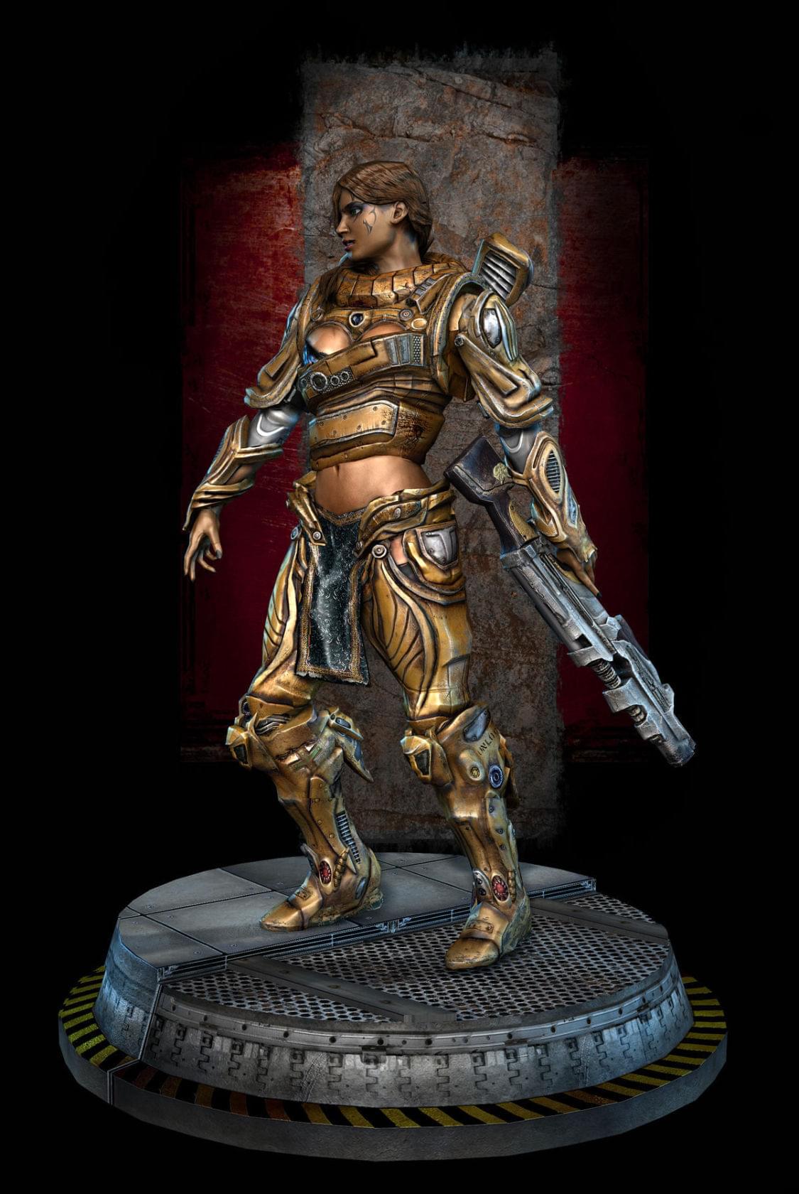
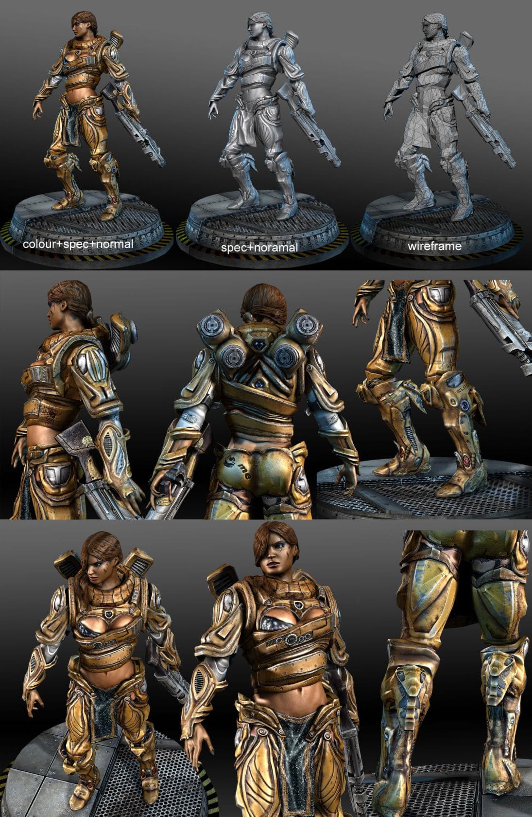
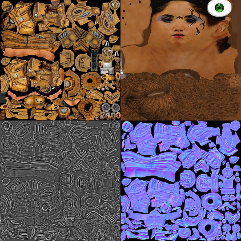
this is the last character I did. It is about 12800tri for the character and about 2k for the gun. I just started to build my portfolio and this is the first thing I came up with
 I really do hope you like it :-)
Id like to get some feedback on this because I am still learning and I feel that I could do better than this

I hope i did't messedup anthing this is my 2 post here


Replies
http://dominancewar.com/1/finals/team_2/7_mrRockstar/4.htm
http://dominancewar.com/1/finals/team_1/21_mrkite/4.htm ) and make one that looks halfway decent, and you're have an awesome portfolio piece.
Some adjustments on the diffuse to be better for this nextgen stuff map, and a real, well made specular map will make a world of difference.
editedit: I also don't like a face that photochopped on a texture that otherwise looks kinda painted, normally, but I guess it's working alright in this case. Still may wanna see about painting over the face a bit. Especially if you're looking for ut2k4 style, which this reminds me of.
The one thing that's jumping out to me as weird is that everything has the same specularity power. The metal, the skin, and the hair all seem to reflect at the same level, which removes alot of the realism you seemed to be going for.
Try pushing the spec map's brightness is some area's, perhaps even adding some color into it (though I'm not sure whether that would show in an engine, if you plan on taking it that far). That would really help push this piece over the top.
And welcome to polycount man! What school are you going to?
plus, spelling error in your screenshot. "noramal"
on a personal note, the armor design is interesting, if extremely odd and impracticable, and the facial tattoos make me cry.
The spec needs adjusting, mostly in the flesh, hair and cloth. They are way to shinny. The flesh color is a bit too yellow/orangeish even for someone with "olive skin" its too much. These pieces have the same treatment in the spec (highpass filter) as the metal parts which is killing her human qualities. Those areas of the spec map need to be a lot darker. And I think you can go a long way in faking some Sub Surface Scattering in the flesh.
Adjust that spec and the flesh tone and you'll leave me drooling
Paint Over
also I`m not sure about 12800 tris. Seems a bit steep but I could be wrong. I know charachters in UT3 run the 6000-8000 range it seems as if thats as "next gen" as it gets right now. I`d say on your next project try a nd hit a lower poly count.
Super kickass otherwise. (excpet for the tatoos and some funky armor breakup here and there. mainly the shins) :P
I cant WAIT to see it with a better spec map because a spec map can make or break a model. In this case its breaking it
DONT STOP, YOUR SOOOOOOO CLOSE.
I look forward to seeing the changes you hopefully make!
SupRore ty, i already started working on that spec map :-)
Slipstream im glad you like it
ElysiumGX i defenetly will work on that skin, and thx for poiting typeo
Sectaurs
Vig wow that paint over is awsome
konstruct well its alot i know, at the begining i wanted to close at 9k, 10k max but then i added some cool looking details and it was abowe 10k, when i tryed to go down with polygount it didn't look so cool anymore
bounchfx thx i will post some changes asap :-)
Xaltar thx man
again thx alot for so meany coments it will defenetly be a grage help for me.
btw sorry for speling
Amazing character in or out, I have no complaints other than asking for a damn wire frame!
I might suggest a glow map for the feet red exhasut port area. I think it might add to the character a bit more, listen to vig and sec' and the rest and you'll be golden
also spec map needs some love to it..
there is much wobble in your noramal map
[/ QUOTE ]
Yeah, I thought it was just me, seeing as no one else mentioned this. Especially with a model as dense as yours I figured the normal map would bake really crisp and straight. So I'm assuming the actual high-res model may have been sculpted a little wonky.
Overall, I think your model looks great and could do with some love in a few areas like most people have mentioned. At the moment, everything is just so bronze. A bit of colour variation on the armour couldn't hurt and it will really make it pop.
The face tattoo for the loss, that's probably the only thing on the model I really dislike. But that's just my opinion.
-caseyjones
Like i said before its better with spec but still need fixing. Try play more with curves on it should help a lot without putting much time on it. I know U are tired of it
Good work buddy.
Personally I prefer deco brush type hair. More like the renaissance sculptures. They model chunks of hair instead of strands.
http://visualarts.qld.gov.au/designyourowntour/image/files/large/batch_2007-05-25/rodin_1992.137.jpg
The torso seems out of proportion. The rib cage seems too tall to me. That may not be too easy to fix at this point I know. Maybe for next time though.
cheers
aniceto ye i know
westsidazrhidaz ty im really glad you like it :-) ... it's a scaneline max render with 3 direct lights nothing fancy i gues, i don't really know but i think it would look better in some engine for example ute3
caseyjones :-( you right on that normal it could be better
PolyHertz here you go :-) it's some old render vip i did
<a href="www.fotosik.pl" target="_blank">
[Email]Por@szek[/Email] thx for advices ;-) You ass btw i have never been tired with my models like i said before i allways can't wait when i will have more time to work on it :-) if your tired with what you do that's first sing you should change something.
TWilson thx you right it was a lots of work i have to admit, it took me more than 1 month working mainly on weekends and late night after work, but still it was lots of fun for me to desingn the aromor and wathing her to get dicent shaps, i simple can't wait to start new model
and thx for the hair and proportions advices i will keep that in mind :-)
im still testing that spec maps, and unfortunate my tablet is broken so i have to wait for new one
http://img219.imageshack.us/img219/9947/spectestqg0.jpg
if your tired with what you do that's first sing you should change something.
[/ QUOTE ]
Yeah thats why I'm playing a lot more now with my 360 than doing something after work (damn I hope they will soon announce my project) ^^. And tell it to my employer who gave me 6 month long level to do on what I'm pissed and tired lmao.
I'll keep an eye on U, beware
You're going to kill me, but the hair texture needs more variation, along with overall highlights and shadows. Right now it is looking a lot like a hair helmet. You'll have to fake some layering by painting shadows and highlights. I haven't seen a spec map yet that can accurately fake the subtleties of hair by itself. You'll have to go in and paint some highlights and shadows on the defuse to help the lighting get the right look. Rendering technology is great, but its not perfect
You have a good amount of what I'm talking about, happening on top of the head by the part, but the parts we are looking at fall flat and need the same treatment.
can't wait to see more from you!