sculpt
Ok now its not just a head anymore hence I though I'd post a progress thread.
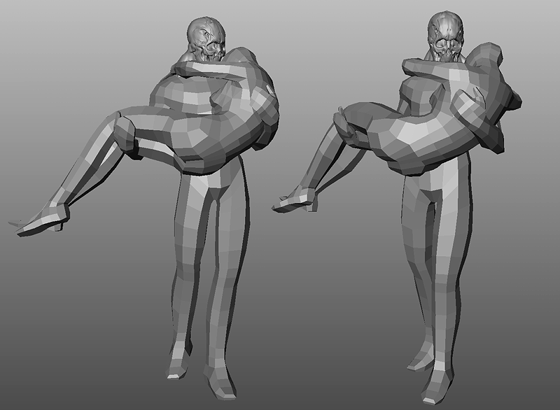
Basically trying to get a rough pose before actual sculpting. I'm glad I have a female and a male starter mesh ha!


Pretty much nothing to show yet but I though I could document the process involved, hence start the wips earlier. My goal is to refine the posed shapes to make the couple more heavy and dynamic -the guy's legs are very weak atm for instance-, then collapse everything, merge the two bodys, retopo a little, and sculpt the thing just like a stone block instead of keeping individual posed figures.
Not really sure if it'll work, we'll see!
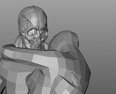
Le head
Basically trying to get a rough pose before actual sculpting. I'm glad I have a female and a male starter mesh ha!


Pretty much nothing to show yet but I though I could document the process involved, hence start the wips earlier. My goal is to refine the posed shapes to make the couple more heavy and dynamic -the guy's legs are very weak atm for instance-, then collapse everything, merge the two bodys, retopo a little, and sculpt the thing just like a stone block instead of keeping individual posed figures.
Not really sure if it'll work, we'll see!
Le head

Replies
i dont know if a skull theme is that awesome but i bet you can make the end resolt look really sexy.
his legs, they may look a bit weak but that gives the total a more sensual look instead of some terminator carrying a girl
go for it poir!
btw, did you recieve my last PM?
looking good, interested to see how this one turns out man!
Now on with the real sculpting. It's interesting how different it feels from the usual symetry-driven sculpts. Pus the intertwined bodies make the usual tposed refs useless... Time to watch some more porn I guess!
YAY!
i love it so far man!
Could be a whole interesting discussion focused around that, but either way it's looking cool Pior!
Neo_God: True, but in doing so isn't he also bypassing the whole possibility that everything will end up looking too static and technical?
Could be a whole interesting discussion focused around that, but either way it's looking cool Pior!
[/ QUOTE ]
Yeah, that's also true, that's why I'm really looking foward to seeing the results. I've thought about doing an asymmetrical zb sculpt to see what would happen, but never got around to do it. Pior's progress may inspire me to do so, seeing how he's good at that.
Not to say that what you have done is not impressive...it is (especially to a 3d hack like me)! But still...the lowpoly has such potential that it almost seems a waste to exagerate like you have done.
Also (stupid question time!), why not do the male female figures seperately, pose them and then combine (and refine pose)? Was it just to see what it would be like to do the modeling of a single 'block'? Or was it that you started fsking about in your 3d program, this interesting shape came out and you thought: "hmmm...this looks cool!"? It just seems strange from a workflow (and workload!) perspective.
Be sure to check out The Rape of Prosperina. Absolutely insane how he did the flesh.
It's kinda hard to find where to keep rough shapes and where to smooth further. I found out that it's kinda annoying that all the sculpt programs give too much of a smooth feel because of the subdivision technique... I whish we could have dirty, blocky shapes without having to actually sculpt them in with the flatten brush and such.
Anyways! Will study these. Thanks!
i think that sometimes the blocky or sketchy areas look good cuz our minds fill in the detail correctly, but when we actually try and produce it we do it wrong, and the image that "might be correct" is lost...
i like the story it tells, wish there were some roses n stuff around them. maybe build an environment like u did with snake? that looked uber cool
Anyways, you guys are definately hitting the point I whish to wrap this piece around. I like detailled stuff just like the last references posted but I think I like Rodin's work better for it's suggestivness (rw?), like the blocky hand of the Kissers' male figure resting on the female's legs. Quite a challenge to bring accross in digital sculpting since the process is quite hard to deviate from the smooth>details workflow. Time to look into using custom blocky brushes, and a sharp move setting just like Cheese mentionned. I used it a couple of times in the past, it gives interesting results. Maybe a normalmap rocky overlay could add to the look also.
As for the setting, it's planned! Got a few ideas I want to try.
Thanks for the input everyone.
great work so far pior
http://marknewman.deviantart.com/art/Bride-and-Groom-48400771