Home 3D Art Showcase & Critiques

Ph0n0GRAPH

Finally!

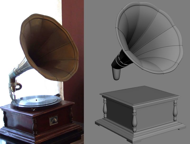
I get to start on a new project. So I'm going to make a phonograph. Although I'm basing most the modeling off of the ref I got here, the model will be a kind of mix and match of a lot of different phonographs I found.

Ultimately though, it's going to be a Victor Phonograph because I've always liked their logo. smile.gif

decal_victrola_1927_lg.jpg

And it Begins!
phonographv1.jpg

Replies

  • CheeseOnToast
    Options
    Offline / Send Message
    CheeseOnToast greentooth
    Nice start man. Lots of great materials to play with on this one, should be fun to texture. A minor crit: the funnel part on your model doesn't taper as elegantly as the ref pic. It's lost a bit of that nice curve from the wide end to the narrow. It might just be the angle of the screengrab that makes it look like that though, so no big deal. I'll be interested to see how you deal with the spec map on the record laugh.gif
  • Joseph Silverman
    Options
    Offline / Send Message
    Joseph Silverman polycounter lvl 17
    Yeah, the back needs that taper, I think. Also, I'd personally widen the 'seams' running along the inside of it, because something so tiny is going to look horrific at all but the highest resolution, and nobody but a phonograph collecting superpurist will notice it's wrong.
  • Vitor
    Options
    Offline / Send Message
    Vitor polycounter lvl 18
    uhhh i thought it was a pornograph, lies!

    shaders will be cool to create for this one laugh.gif
  • The Keen
    Options
    Offline / Send Message
    I'm making record timing on this thing!

    CheeseonToast: Good call. I didn't notice how fat it was back there.

    SupRore: Man, it was a pain to make the seams bigger (I'm sure there was a faster way to do so than how I did it) but I'm glad you said something.

    Vitor: sorry to dissapoint. lawl. I'll have to look into the shaders, never done it before.

    Got a newb question, how many poly's should this be? I'm never sure how many poly's objects deserve these days. Is there some sort of Polygraph laugh.gif that tells us how many polys to give object out there? If so let me know.

    Here's progress:
    phonographv2.jpg

    I'm Considering the high poly finished excluding the crits I'm about to receive *hint hint, wink wink*. Tomorrow I'll start on the low poly.
  • Jesse Moody
    Options
    Offline / Send Message
    Jesse Moody polycounter lvl 17
    damn looks pretty good man.

    As far as polycount goes this is pretty round in the cone area and you don't want to lose that sweet detail, but the table can be pretty optimized.

    Rough estimate i would say 750-1300 tris. Maybe more but I would try to keep it in that range.
  • cursedDice
    Options
    Offline / Send Message
    Great update! That should produce a nice normal map.

    As for how many polygons your low polygon object should be? For that I would say 200-400 polies on the conservative side and 600-800 if you wanted to really round out the corners and the cylinders. Just my estimates though. crazy.gif
  • Steve Schulze
    Options
    Offline / Send Message
    Steve Schulze polycounter lvl 18
    Whats the difference between a phonograph and a gramophone?

    Looks nice. If you're sticking close to your photoreference, the bracket that holds the cone and stylus is a bit on the thick side.
  • The Keen
    Options
    Offline / Send Message
    Got the Low Poly done. Clocks in at 1,050 tris. Had a hard time trying to make things look round with the budget I had so any critiques would be awesome.

    Edit: Jackablade, I wasn't staying true to the ref pic, I was using several sources.

    phonographv3.jpg
  • Thegodzero
    Options
    Offline / Send Message
    Thegodzero polycounter lvl 18
    You should make the low poly a little bit bigger than the hi and use alpha to get the round edge of the hi poly. It will look better in the end.
  • Steve Schulze
    Options
    Offline / Send Message
    Steve Schulze polycounter lvl 18
    You could probably afford to get rid of some of the finer lathed details on the corner pieces and let the normal map take care of them. You could use the extra polys to round out the larger curvy bits.

    Agreed on the alphaed cone top too.
  • Jesse Moody
    Options
    Offline / Send Message
    Jesse Moody polycounter lvl 17
    yeah the record could probably be just a plane with alpha on it and you could use those tris on the cone.
  • The Keen
    Options
    Offline / Send Message
    Thanks guys, I'll try to fix those problems.

    Also, wouldn't making an alpha on the rim make the file size larger? That's what I was told on a previous project of mine....
  • Jesse Moody
    Options
    Offline / Send Message
    Jesse Moody polycounter lvl 17
    yeah the shader would be larger. So either use the tris or the shader. Honestly probably better to use the tris if you can.
  • CheeseOnToast
    Options
    Offline / Send Message
    CheeseOnToast greentooth
    Does the funnel part have an interior and exterior? Or are you just going to use double-sided polys for it? You might run into some lighting weirdness if you do the latter.
  • Ott
    Options
    Offline / Send Message
    Ott polycounter lvl 13
    Alpha planes or double sided textures would be a bigger performance hit than adding a ton more triangles. If you can avoid using either you are doing better than simply adding a little more geometry.
  • Joseph Silverman
    Options
    Offline / Send Message
    Joseph Silverman polycounter lvl 17
    I wouldn't make the record an alpha plane, it'll look a lot better with lighting on it with 3d form in the lowpoly and careful use of normals/smoothing groups. Definitely agree about the main body of it though, smooth it out with alpha like tgz said. Anyway, looking awesome. smile.gif
  • The Keen
    Options
    Offline / Send Message
    Alright, I decided to go with building more geometry instead of doing the alpha, for one, the funnel has an interior and exterior, and two, when I was making my gun (The Kriss) everyone suggested modeling the details instead of alpha.

    I've been running into some problems with the funnel, it's a weird shape so I'm struggling with making the normal map look right. I don't know what I'm doing wrong. The cage is covering completely over the highpoly and it's not distorted. Max gives me somewhat decent results but still getting weird artifacts. Can anyone help?

    funnel-1.jpg
  • Jesse Moody
    Options
    Offline / Send Message
    Jesse Moody polycounter lvl 17
    honestly it looks like some ray casts are being missed in max 9. They usually show up red or look like holes. Changes are the parts that look odd aren't all the way inside of the cage.
  • commander_keen
    Options
    Offline / Send Message
    commander_keen polycounter lvl 18
    The low poly model in that area is a single plane. max bake is probably casting to the reverse side of the high poly in the problem areas. Also im thinking seeing both sides of a face with normal maps would cause shading errors.
  • The Keen
    Options
    Offline / Send Message
    No actually the model isn't just a plane, it had to sides to it. The two sides are very close together near the peak of the funnel though, could that be a problem still?
  • ghost-d
    Options
    Offline / Send Message
    ghost-d polycounter lvl 17
    Did you try to turn it off and on again? smile.gif

    Sorry, couldn´t resist to use that IT Crowd line... I´m havin´ the same problem. Really pissing me off. Good luck.
  • Jesse Moody
    Options
    Offline / Send Message
    Jesse Moody polycounter lvl 17
    probably because the two edges are too close together and the ray caster is getting confused as to what goes to what to be honest.

    I wouldn't have them buffer down into the hard sharp edge though. That just wont look right.
  • The Keen
    Options
    Offline / Send Message
    Well after trying to tweak the cage and trying different ideas, I finally decided to just fix the normal in photoshop. The inside of the funnel is the only part that's giving me trouble, everything else is working fine.

    Here's progress, Diffuse (base textures, a lot more to do) and Normal:

    Normal: http://i65.photobucket.com/albums/h201/VeryKeen/normal-1.jpg
    Diffuse: http://i65.photobucket.com/albums/h201/VeryKeen/unwrap.jpg
    Phonographv4.jpg
  • The Keen
    Options
    Offline / Send Message
    MOAR!!!

    phonographv5.jpg
    Any Critiques? Almost considering the diffuse done. Working on spec next.
  • Joseph Silverman
    Options
    Offline / Send Message
    Joseph Silverman polycounter lvl 17
    Go much darker with the diffuse, the really bronzey/goldish look is gonna come from a pretty wide spec adding depth and brightness to it.
  • Illusions
    Options
    Offline / Send Message
    Illusions polycounter lvl 18
    It might be the lighting, but the bands on the horn/cone(?) look like they are indented instead of raised. I'd give a good double check to the normal map.
  • Tulkamir
    Options
    Offline / Send Message
    Tulkamir polycounter lvl 18
    Looking great man.

    The one thing that's bothering me right now though is that the texture on the speaker or whatever the funnely shaped thinger is called looks very papery. Seems to me that it should feel more solid and like metal.

    Lookin good though man. smile.gif
  • Sayanora
    Options
    Offline / Send Message
    Sayanora polycounter lvl 11
    Keen, this is a pretty cool piece, but I think you should take another look at your reference and adjust your high accordingly. Namely the area I've pointed out your in ref. I just think you could better define this area.

    phonographv_lipadjust.jpg

    One other thing, I really think you should add at least 1 more division to represent the curvyness on the interior. Your low would catch your high much better I think.

    Keep it up smile.gif
  • The Keen
    Options
    Offline / Send Message
    Man oh man sayonara, what do I have to do to get you to change your avatar? Seriously man, that's gross. I looked at it with nothing to say but,"why? WHY!?!" And then I threw up......Appreciate the advice though, I'll see what I can do.

    Also thanks everyone else. Great feedback, going to try and tackle all of it today.
  • The Keen
    Options
    Offline / Send Message
    Here's my model with spec. I still don't totally understand how color specs work, but I just messed around with the colors till I got something I like. It's weird though, the funnel actually showed color, but when I try to add color to the wood, nothing changes.

    If you can take a look at my spec and give me some pointers I would absolutely love that.

    Spec: http://i65.photobucket.com/albums/h201/VeryKeen/spec-2.jpg
    Diffuse: http://i65.photobucket.com/albums/h201/VeryKeen/unwrap-1.jpg
    phonographv6.jpg
  • The Keen
  • breakneck
    Options
    Offline / Send Message
    breakneck polycounter lvl 13
    phonographv1.jpg

    the orginal ref. picture has a really cool pattern on the metal piece that holds the horn up, I think adding that into it either by normal map or texture or whatever would really add some intrests. You know, complete the overall elegant feel of the piece. Thats the only part that i feel is lacking attention.
  • vahl
    Options
    Offline / Send Message
    vahl polycounter lvl 18
    yeah you removed the most interesting part of that object, that's what makes it unique, everything else is subtle and you have that big fat horn base on the model that throws everything out.
    even the part where the copper connects is more detailed and interesting on the ref, why didn't reproduce this ?

    the copper needs more spec too there's very little spec on the inside because it's backlit, but you can see a lot on the back part of it, also add irregularities at the bottom of the inside part, where it goes inside the horn, that area catches dirt and moisture so it should be a tad dirtier.

    the wood id waxed, thus shiny, yours is not, add dust in the inner parts borders, those are harder to clean so will accumulate dust more easily than the rest
  • The Keen
    Options
    Offline / Send Message
    Thanks for the feedback. that's what the question mark at the end of finished was for haha.

    Got a question though. How do I get the wood to look shiny? I made the spec bright blue and it doesn't seem to even show mildly.

    Colored spec still doesn't make much sense to me, any tips?
  • CheeseOnToast
    Options
    Offline / Send Message
    CheeseOnToast greentooth
    Coloured spec is fairly straightforward for the most part. If you want an unsaturated highlight that tends towards white, your spec colour should be the opposite colour from the diffuse. That's why people often use a blueish/purple as their spec for flesh tones. Invert a flesh colour in Photoshop, and you'll get a grey/blue.

    If you want a saturated highlight (metal is a good example of when you'll want this), then make your spec a similar colour to the diffuse. So gold, for example, might have a browny/yellow diffuse with a lighter yellow spec.

    Pure greyscale spec will create a highlight that will take on the colour of the lightsource very noticably. Best used for plastics and the like.

    There's more to it that this, but experience and a bit of experimentation goes a long way.

    I think the reason your spec isn't really showing on the big flat areas is because of the gloss value you're using. I'm not a Max user, but look in the shader for something like "gloss", "exponent" or "cosine power", and play with different values. Basically, you might have bright highlights just now, but they are so tight and focused that you'll only see them on edges and curves. A lower gloss value will make the highlights much broader, and probably more visible on flat areas. Here's what I mean on the high poly version you sent me.

    glossValues.jpg
  • yeluis
    Options
    Offline / Send Message
    yeluis polycounter lvl 17
    Thats looking Damn Sexy!! break the spec with some subtle scratches and that babe will be ROcKIN!
  • The Keen
    Options
    Offline / Send Message
    Thanks cheese and yeluis. Jesse Moody also helped me out a bunch clearing up some things up on spec. Here's what I got:

    phonographv8.jpg
  • Jesse Moody
    Options
    Offline / Send Message
    Jesse Moody polycounter lvl 17
    Dang dude thats looking a lot better now. Glad what I helped you out with earlier made it look better.
Sign In or Register to comment.