Large Environment Prop - Street Building
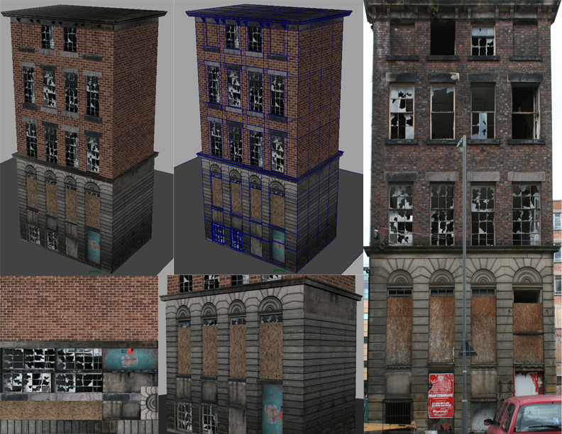
Hi guys, just wanted to share an environment prop I started yesterday. I am still working on the textures, normal, ao, etc. I was just searching through some reference and found a building I liked and started working away. Any suggestions are much appreciated. I've picked up some more free time from work so you'll see some more posts from me. Here is the reference image and screen cap.

Maya wont allow me to use mental ray on my machine as it has become out of date but I am going to try to get some results from xNormal or CrazyBump. I will be using this prop in a level that I have been working on inside of the Hammer editor for Counter-Strike Source.
Texture: 1 1024x1024 Diffuse
There are still a lot of things that I want to change with the texture. Such as the glass being bright and there are some wires need to be edited out in the windows. I'll post the size of the other maps once I have generated them. Let me know if you guys want to see anything else. What is the best way to show this in my portfolio if I am using it as a blocking prop in a level? There will be nothing on the backside just the front and the sides once I am finished.
Thanks guys,
-J
Replies
I'd also think about giving it some character, right now it's just photo-ref on some basic geometry. I'd add some air conditioners to the top of the building or in the windows.
Does the building a reason for being? Kind of like Adam's article, you need to actually give it a story. Put it on a street block throw some trash and debris around, light poles telephone or electrical wires, newspaper bins, bus stops, throw a fire escape on there and or a billboard on the top of the building or painted on teh side... etc what ever you want to draw you into the 'atmosphere' of this peice.. good start.. keep up the work. Make it your own..
Also make note of 'scale' where's the doors to enter the building? Where's the drainage?
Make sure your grafitti fits to the scale of the building 6-8 feet off the ground etc..
Those extra polys on the side are going to be gone right now. I should have dealt with it earlier but i was getting lazy.
Very nice use of texture. Didn't waste any space.
Maybe some greenery growing out of the cracks in places would look nice. I see a little at the top of your reference pic.