Home 3D Art Showcase & Critiques

Portfolio Environment: Koln 1945

1
polycounter lvl 17
Offline / Send Message
pliang polycounter lvl 17
Koln1945.jpg

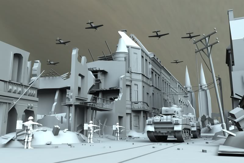
So I've been working on a new portfolio since I left EA Black Box for a little while now, mostly building it. I had a little issue with my comp so this work done to date took about two weeks plus one week for UVing. This is what I have so far....its been UV'd and I started texturing it already.

I also plan to have the final renders presented in this camera perspective once its done.

Test render made with Mental Ray.


I will keep this thread updated as I go with closeups of the objects of course.

Thanks

Replies

  • pliang
    Options
    Offline / Send Message
    pliang polycounter lvl 17
    A few closeup renders of the objects in the scene....

    P51 Mustang
    P51Mustang.jpg


    Sherman M1A3 Tank
    ShermanTank2.jpg

    Wires ShermanWire2.jpg


    ShermanTank1.jpg

    ShermanWire1.jpg

    ShermanWireCloseUp.jpg

    Ranger

    RangerFront.jpg

    RangerFrontWire.jpg

    M1A1RifleWire.jpg


    Sorry about the crap load of images but that's how much I built since then.
  • Neox
    Options
    Offline / Send Message
    Neox veteran polycounter
    Is this the dome in the background?
    If so, its totally off wink.gif
    Another thing is, if this is cologne in 1945 there wouldn't be that many buildings, colognes old city was destroyed by nearly 90%

    otherwise, nice work, i'm not a big fan of this character but i like the tank and environment smile.gif
  • pliang
    Options
    Offline / Send Message
    pliang polycounter lvl 17
    you're right, the city was pretty much bust back then but I built this one off a photo I found which helped a lot.

    I will update this with textures in progress as I go.
  • peppi
    Options
    Offline / Send Message
    peppi polycounter lvl 18
    Cool project. The cathedral doesn't look like the real one though, it should also look a lot more dominant from ground level. Here's some random WW2 Cologne reference..

    http://www.anicursor.com/colpicwar.html
    http://www.anicursor.com/colpicwar2.html
    http://www.koelnarchiv-lambertin.de/gallery1.htm
  • adam
    Options
    Offline / Send Message
    adam polycounter lvl 19
    Probably your best work yet Peter... show some wires of the entire scene.
  • pliang
    Options
    Offline / Send Message
    pliang polycounter lvl 17
    Ok, so I forgot to show the wires for the scene itself...the cathedral remake was a little dense so I added some closeup shots too.

    The reason I'm making it all higher density's mainly for the mental ray rendering and lighting approach I'm aiming at.

    My alpha planes ended up a little blurry.

    KolnCathedral.jpg

    KolnCathedralWire.jpg

    KolnCloseUpWire.jpg
    CathedralCloseUpWire.jpg
  • hessi
    Options
    Offline / Send Message
    the church looks completly wrong. each subpart got wrong scaling and the architecture is not correct. i strongly recommend doing more research. probably you should better be using a billboard instead of a cheap model.
  • Joao Sapiro
    Options
    Offline / Send Message
    Joao Sapiro sublime tool
    hessi , you should see "la sagrada familia" in barcelona, the structure is almost like that, except that ontop of the main gate has like 4 tall towers :

    Barcelona_sagradafamilia6.jpg
    Barcelona_sagradafamilia2.jpg

    just incase you want some ref smile.gif
  • hessi
    Options
    Offline / Send Message
    he said he was modeling the "Kölner Dom" and if you compare with google search results... well, you see it does not match up. the sub parts he used to build the towers and the main ship got really heavily mismatching proportions.
  • Joao Sapiro
    Options
    Offline / Send Message
    Joao Sapiro sublime tool
    your right, i didnt read that . sorry.
  • m1ND
    Options
    Offline / Send Message
    Weren't you a tester at Blackbox?

    If your going for environments, I would scrap the character all together.

    Unless you plan on doing far more work on it, I think it will bring your environment down.

    What you have now for the character just isn't all that strong of a model. It might confuse potential employers. Especially if your applying for an environment job.

    And personally I don't believe in showing models on your demo reel - just because you "did them". If they aren't your best work, don't put them on. It's better to show less material that is really strong than a bunch of good and bad mixed together.

    Good luck Peter.

    m1ND
  • Mark Dygert
    Options
    Offline / Send Message
    So much stuff, wow.

    Vehicles:
    - Do the planes need to be that high poly if you'll only see them flying over head I bet you could trim down the poly count if they are to be actual in game models used for real time? I guess if your aim is to combine a bunch of portfolio pieces into one and show individual shots of each prop/character then I would leave them alone. But if all this is being made to be an accurate in game shot, I say optimize em.
    - For any plane flying I would do a simple flat animated 2 sided poly instead of modeling propellers. Save the smooth propellers and nice canopy detail for the planes parked on the ground =)
    - The tank is hot stuff all around, beautiful work. I would add another tank just coming on screen to the left so you can show off some of that nice tread work, you spent quite a bit of time on. It would also help frame the shot and use up some of that dead space in the street.

    Soldier:
    - The shape of the foot doesn't appear to be based off of any actual combat boots of that time. I STRONGLY recommend you check out some ref because from the shin down is a big part of what sets the WW2 GI apart from the other soldiers.
    - Decided on what type of soldiers they are, paratrooper, Army, Marines? Dig up some accurate ref and rework what you have. Also push what you have into a few different classes so your squad isn't made up of all Sargents heh.
    - Gravity, model gravity into the clothing. Model the effects the straps have on clothing. When you don't do this models look like they are filled full of hot air or in a vacuum. WW2 isn't known for big space battles but who knows what really happened...

    M1 Carbine:
    - Dig up some M1 Carbine ref, I'm pretty sure they didn't have two humps on top? I could be wrong...
    - The strap width is all over the place. I would delete all but one side of the strap and "shell" it so you get a nice equal thickness. If you changed the width to compensate for any perspective loss I think you got it backwards? You want parts farthest away from the player to be bigger/thicker so they hold their intended shape better.
    - The bevel looks inconsistent and odd.
    - I would imagine quite a few pieces could be broken off the main mesh and floated, saving yourself quite a few polys.

    Really nice work so far! Keep at it!
  • Sage
    Options
    Offline / Send Message
    Sage polycounter lvl 19
    I have not seen this thread in awhile, and the first thought that came to my mind is that it looks great. I hope you finish it.

    Alex
  • pliang
    Options
    Offline / Send Message
    pliang polycounter lvl 17
    It's been a month but I actually finished one - two weeks ago...had some unexpected problems with re-endering so I'm just trying to fix those nitpicks before I finish it off.

    Before I can pull through and update the scene I have a few renders to put up...its just closeups of what I did.

    I'm not planning to use those placeholder BGs, once the problems fixed I will post new shots with the scene.

    Sherman Tank:

    1813229870_c32e08b9ea.jpg

    Sherman Front

    1813229874_cc78e1bc2a.jpg


    Kind of a piss poor lighting on the sides...I'm gonna have to fix the texture some other time as it looks like styrofoam...but in my scene they're quite far away form the viewer.
    1813229872_b0b44bee3d.jpg
  • Pedro Amorim
    Options
    Offline / Send Message
    oh
    that tank is looking hot! smile.gif
  • pliang
    Options
    Offline / Send Message
    pliang polycounter lvl 17
    So I managed to convert my file formats in order to speed up the rendering to an hour at most but for some reason I lost a lot of the lighting in the scene so would adding a few point lights in the distance bring it out or other ways around that? I am using final gather still but clearly I'm not using it properly.

    If this keeps on I might consider switching back to maya software with a new lighting setup....

    DowntownKoln.jpg
  • Joao Sapiro
    Options
    Offline / Send Message
    Joao Sapiro sublime tool
    damn that tank texture is awesome, i would recomend importing it to bf2 engine ? using battle at karkhand ( or something ) settings ? would be awesome to see this in bf2 instead of using renders etc :P
  • soulstice
    Options
    Offline / Send Message
    soulstice polycounter lvl 9
    This is coming along very nicely. =) Love how busy the scene looks, really draws my attention to the whole piece.
  • pliang
    Options
    Offline / Send Message
    pliang polycounter lvl 17
    Thanks for compliments, but I still have a bit to fix including the sky, some parts of the ground too as they're kind of killing the depth and details in the scene.

    I'm thinking of putting a wrecked car or something relevant on the cornet for foregrounds too.
  • rybeck
    Options
    Offline / Send Message
    love the texture on tank...
    mind to show some texture maps? Or tell us what type of maps you used?
  • krayzie777
    Options
    Offline / Send Message
    Looking very good! how long has this taken you to do?
  • Sage
    Options
    Offline / Send Message
    Sage polycounter lvl 19
    Looks great, man keep it up, love the tank.

    Alex
  • Matroskin
    Options
    Offline / Send Message
    Matroskin polycounter lvl 11
    hehe, awesome job, tank is neat wink.gif Good idea to add a crashed Messerschmidt in that ruined building. Curious to see how the evolved ambiance will come out wink.gif
  • konstruct
    Options
    Offline / Send Message
    konstruct polycounter lvl 18
    looks bad ass, -it might benefit from some fires here and there so you could add some red/orange color accents to the scene.

    Also, try and flex that sky out a bit more and make it scream with some rich orange and yellows that are both really bright, and some contrasting darks.
  • adam
    Options
    Offline / Send Message
    adam polycounter lvl 19
    Peter - WTF! This is awesome! You need to start thinking about lighting next. When you squint everything is the same colour that is not the sky.

    How about some higher angled shots to the scene as whole? (wireframes)
  • neolith
    Options
    Offline / Send Message
    neolith polycounter lvl 18
    The flightpath of the airplanes seems to be aligned parallel to the direction of the ground assets like the street and the buildings. A noticeable difference would be more interesting to look at.
  • pliang
    Options
    Offline / Send Message
    pliang polycounter lvl 17
    Koln1945-1.jpg

    A little minor edit to the sky...sorry if I didn't update early last week, was actually planning on my next scene and all.

    For this scene I'm thinking of going back into it later on and add more to it by rendering it with some ambient occlusion and a finished car wreckage to the side of the scene for foreground. And perhaps fixing the light...

    Vehicle I'd like to use...once battered that is.

    VW Kubelwagen
    Kubelwagen.jpg

    or a Tiger(One) Tank
    Tiger2.jpg


    And the wires...

    Koln_Wire.jpg
  • pliang
    Options
    Offline / Send Message
    pliang polycounter lvl 17
    @ Adam - Yeah it would be better to show more than just a glamor shot in the same perspective but I'm considering going with this shot that I had planned with.

    But on my next project I will definitely keep that basic in mind...show off some skyline as well.
  • marshmonkey
    Options
    Offline / Send Message
    wow, thats looking great! I can't wait to see what the final renders are gonna look like. I think you will have to do a couple angles at least to show off all the detail you have put in there.
  • pliang
    Options
    Offline / Send Message
    pliang polycounter lvl 17
    What I'd like to add on this weekend while putting my new project on hold...

    1. Perhaps edit the skybox.
    2. Add smoke trail on the planes.
    3. A little distance fog.
    4. Throw some more lights
    5. Add in the battered vehicle for foreground.
    6. Lastly after those little fixes and looks better...get a new job.
  • Matroskin
    Options
    Offline / Send Message
    Matroskin polycounter lvl 11
    hey, great environment!

    The sky looks too over exposed though.

    That is really complex and elaborated scene man; however, I guess it would be cool to have ur characters/vehicles be more visible against buildings. Now they all blend together. In CoD4 they added slight falloff shader to character contours btw wink.gif Some better feel of depth at the end would be great as well.
    Keep it up!
  • adam
    Options
    Offline / Send Message
    adam polycounter lvl 19
    Peter, this piece needs some major attention spent on its lighting. When blurred, the major contrast is between the sky and the piece it self. There's no proper colour contrast between any of the objects within the scene which is washing the whole thing out. I honestly thought it was a full-bright render and had to actually search for some shadows.

    You mentioned some depth fog, which may help, but you may want to consider some stylized lighting: Pick a time of day, and exaggerate it a bit. Or, if you're not one to exaggerate and would like to stick to 'as real as possible', pick a time thats in the early to late afternoon and have some of those buildings cast longer shadows onto the streets and other buildings. You may want to offset the shadow colour with some secondary light sources (rubble fire, search lights, etc)
  • Xaltar
    Options
    Offline / Send Message
    Xaltar polycounter lvl 17
    Looking awesome. My only real crit is that it could use more large shadows. Based on your sybox the light is comming from behind the buildings yet the buildings are the same illumination as the rest of the scene. Darken the streed and the building faces and thow in some reflective elements to the scene to give it a touch more reality.

    A very messy paintover on the shadow front.

    shadowcb8.jpg

    Awesome work
  • Sage
    Options
    Offline / Send Message
    Sage polycounter lvl 19
    Great work man, looks great, except for the lighting issues Adam mentioned.

    If you can make it have the contrast Xaltar did in his paint over it would be awesome. Xaltar love the paint over.

    Alex
  • adam
    Options
    Offline / Send Message
    adam polycounter lvl 19
    Even the contrast in the paint over isn't enough. There's still 0 shadow information.
  • Mark Dygert
    Options
    Offline / Send Message
    Looking great pliang!

    I agree with Brome, you need more colors. The sky looks just before sunset but none of the stock sunset colors are coming out to play?

    As long as we are doing paint over suggestions for lighting and effects here, are mine.
    Koln1945.jpg
  • Joao Sapiro
    Options
    Offline / Send Message
    Joao Sapiro sublime tool
    yeah needs more color and less contrasty stuff, looks too muddy the whole image, but its WAR and it usually is like that . Id suggest looking at band of brothers and saving private ryan , they have asesome color depending on the situations.
  • hawken
    Options
    Offline / Send Message
    hawken polycounter lvl 19
    VIG FTW

    spot on, at sun rise and sun set, you're gonna get some lovely shadows from the buildings behind the camera.

    really impressive texturing work, for vigs lighting you could make a simple silhouette and place it behind the camera, with 80% alpha on the darker lower part, gaussian blur the skyline and then stick a light behind it pointing at your scene.
  • pliang
    Options
    Offline / Send Message
    pliang polycounter lvl 17
    @ Hawken: I'm not quite sure what you meant...I'm still having issues setting up the lighting.

    The one I had setup in Maya was using an environment map with final gather plus two point lights placed in the mid and background with ray trace shadows on...

    If any one can point out an article or explain a little more about how I can change the setup and offset the shadow colors it'd help speeding up the process.
  • Mark Dygert
    Options
    Offline / Send Message
    What Hawken is getting at, is that you have a light in the background behind the camera, its casting light into the scene and since you don't have any buildings behind the camera it is flooding the scene with light. He is suggesting a quick mock up of some buildings behind the camera to help fake their shadows. The sun appears to be setting behind the scene, yet the lighting is mostly coming from behind the camera, very weird and slightly awkward.

    Whenever possible you want to avoid lights that cast light at the same viewing angle of your camera, it hides shadows behind the objects and you lose shadow detail like what is happening currently. Think of it this way, if you shine a flash light in someones face you hardly see any shadows (and they get pissed). If you have them hold it up under their chin they get all creepy and weird looking (and they giggle and make funny faces). You're shinning the lights right in the face of your scene, its angry and it wants you to stop. Moving your lights to more dramatic angles and using a blocked out silhouette to cast shadows of buildings that should be there, will help quite a bit. Adjusting your lights colors so they are different will help.

    You need to stop thinking of lighting as an after thought its not "make a light, oh this area is dark I'll copy my light here. There I'm done". It's mood, its an extra layer of detail for you to exploit, its the final step you take that sells the scene.

    Remember the things that are off camera and try to imagine how they will effect your scene while you're building it. It's hard to do when you've been so focused what is inside the viewing angle of the camera. It's hard habit to break
    "I'm not going to model the whole city when I only want to render out one street!"
    Sure, that makes sense, saving yourself time and heartache, I get it. But that doesn't mean you need to forsake the elements that are off camera that will EFFECT your scene.

    For example you could build a broken window (or copy one from the scene) and put it just in front of the camera as if you are looking out of it. Now your view is framed, the shadow on the street is from the building you're standing in and the viewer feels like they are in the scene and they have some kind of roll to play. Is your viewer an orphan watching the allies march forward? Is the viewer an enemy soldier hiding? Good paintings like good renders put people in the scene in some way.

    preach preach preach... bla bla bla... more deaf ears.
  • Panupat
    Options
    Offline / Send Message
    Panupat polycounter lvl 15
    That sky totally gave your piece a huge boost. It's looking great.
  • adam
    Options
    Offline / Send Message
    adam polycounter lvl 19
    All paint-overs are nice in this thread, but there's still no obvious instances of shadows, except under the tanks, which is driving me bonkers about this piece. I like Vig's lighting the most, but even then I hope Peter creates this and ends up with interesting shadows.
  • Xaltar
    Options
    Offline / Send Message
    Xaltar polycounter lvl 17
    Vig dun made me proud lol Perfect smile.gif
  • John Warner
    Options
    Offline / Send Message
    John Warner polycounter lvl 18
    starting to look good. it seems to be very monotone/monocrome. i have no point of interest.. nothing is grabbing my attention. furthermore, it's flat.
    it would be nice to get some area of contrast.. also, more contrasty lighting all around might serve. i think this is great, but on a surface level, to me at least, it looks like a bit of a jumble.
  • pliang
    Options
    Offline / Send Message
    pliang polycounter lvl 17
    Thanks for the in depth explanation...NOW I get it when they mentioned "silhouette".

    The add ons to help break up the flooding lights' a great idea...it'll help me setup up a little but better next time.

    Wish me luck...
  • pliang
    Options
    Offline / Send Message
    pliang polycounter lvl 17
    Koln1945-2.jpg

    Added a vehicle on the foreground.
  • smedjeback
    Options
    Offline / Send Message
    smedjeback polycounter lvl 13
  • Xaltar
    Options
    Offline / Send Message
    Xaltar polycounter lvl 17
    Now you're cooking with gas, nice stuff. Now try add some glinting bits, broken glass bare metal and loads of other things in the scene could benefit from a little glint wink.gifBare in mind that this is fairly recent distruction, a lot of support beams would still be shiny at the breaks and the glass from those buildings would be scattered on the ground and possibly reflecting some the light. The lighting looks quite good now, just add a few finishing touches and you will have a knockout piece wink.gif
  • hessi
    Options
    Offline / Send Message
    "wilkommen" should be written as "willkommen" with two 'l's

    the cathedral is still not changed. the lighting isn't very realistic imo.
    the electricity pole is covering the cathedral which isnt a that good image compositing. the whole image lacks blue colors. a better environment lighting would change that. add stronger blue ambient colors and not so yellowish sunlight. give the viewer the opportunity to see where the light comes from. atm this is a monotone yellow something.
  • iflingpoo
    Options
    Offline / Send Message
    iflingpoo polycounter lvl 18
    hey been following this thread for awhile now

    looks awesome man, but i agree with hessi, the lighting still needs alot of work.. it still seems really scattered where the eye should goto, what kind of lighting setup are you using?

    at the moment the piece leads the eye right to the top of that broken building because there seems to be a hotspot there, but doesnt really make sense since it seems the sun is behind the building, maybe try moving the sun pointing towards the scene rather than behind everything. then the stuff in the foreground would be lit up alot better and contrast more with the stuff goin on in the bg

    have a look at some call of duty screen shots and see how the lighting is done in there

    might i suggest some distance fog? it'll add some depth

    anywas just a couple thoughts , hope it makes sense. keep goin this thing is lookin hot!
1
Sign In or Register to comment.