The BRAWL² Tournament Challenge has been announced!
It starts May 12, and ends Oct 17. Let's see what you got!
https://polycount.com/discussion/237047/the-brawl²-tournament
It starts May 12, and ends Oct 17. Let's see what you got!
https://polycount.com/discussion/237047/the-brawl²-tournament
UE2 environment with crashed vessel
Hi everyone,
I want to share current stuff that I work on right now. That is my first environment for UE2, so any C&Cs r greatly appreciated
It was started as an entry for CgTalk game art challenge "Space Western", but I wanted to expand this and make it explorable inside some game engine. And so I abandoned the challenge and decided to work on it as long as I wil need to until I am satisfied with th result.
Basicly, it`s a kind of crashed space vessel, abndoned long-long ago. Beneath it I got a hut that was built by someone out there probaly because it is good shady place
Here is a concept sketch:

here r wires of meshes that r done outside of UE:


I am currently at the stage of doing terrain and lights setup. I did a simple light rig composed of one sunlight, global ambient light and two spots for subtle bouncing light simulation on vessel`s bottom. I thought it was it, but I guess I`ll have to go with dome set to replace ambient light, cause I want to get some global illumination effect
Here r screengrabs from UE:


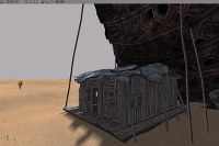
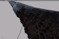
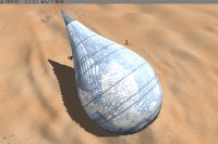
edit: cube map is not final, just something to make a reflective shader work properly :P
I want to share current stuff that I work on right now. That is my first environment for UE2, so any C&Cs r greatly appreciated

It was started as an entry for CgTalk game art challenge "Space Western", but I wanted to expand this and make it explorable inside some game engine. And so I abandoned the challenge and decided to work on it as long as I wil need to until I am satisfied with th result.
Basicly, it`s a kind of crashed space vessel, abndoned long-long ago. Beneath it I got a hut that was built by someone out there probaly because it is good shady place

Here is a concept sketch:

here r wires of meshes that r done outside of UE:


I am currently at the stage of doing terrain and lights setup. I did a simple light rig composed of one sunlight, global ambient light and two spots for subtle bouncing light simulation on vessel`s bottom. I thought it was it, but I guess I`ll have to go with dome set to replace ambient light, cause I want to get some global illumination effect

Here r screengrabs from UE:


edit: cube map is not final, just something to make a reflective shader work properly :P
Replies
yes, the ground actualy is not intended to be a sand, but a rocky dry soil (like in US canyons), but I probably should adjus my texture
Supports r actually metal rails (probably not enough evident on screens, sry for that). They don`t actually support the whole mass, they r "just in case", so that some parts wouldn`t fall on the hut, but i`ll maybe put more of them. However, in terms of their solidity, that is intentional. I wanted to obtain wierd contrast, like Salvador Dali does.
thanks for comments, I will work more on details.
I mean farming soil would give this
http://www.supermanhomepage.com/images/superman-lives/set3.jpg
imagine what hard rocky soil would do
Well, here is some update.
Here I continued working on relief (I`ve atually redone it so that it looks less sandy desert but more South American). Also some plants and rocks start to appear. But I want to make small rocks a bit more sharp. There will be also bigger rocks around the place and a bit actually inside the "gameplay" area.
I also redid the lightning which is now done with dome light to achieve some more GI look. However, UE2 seems to be not the best thing to do that
and btw, no more thin planks supporting the vessel:) If it gives impressions different from mine I prefer not to use it. I want to be sure that the picture is equally clear to everyone!
Advancing with terrain. Adding texture layers, adjusting plants etc. I added large rocks around to isolate accessible area. Also some rocks r added in the middle to make the "rock circle" less artifically looking. And eventually I started adding some smaller rocks in front of vessel as if they were pushed during the crush.
However, I am still not 100% sure about large rocks. To me sometimes they appear whether being too repetitive whetehr reveliong too much the initial box that I srtarted them from. But still they don`t make me unhappy, so I am not really sure what to do with them
Sky and BG image that u may see behind is just a rough setup, I will work on it a bit later.
Looking good though
I like the way the ship's colour blends with the sky, too. And you added the, erm, impact trail? in the ground, like the ship really did crash land and push a wedge of dirt which is left behind it (missed that in the first screens).
I agree with notman...a little dirt in the cracks would be good, but be carefull not to overdo it. Would you mind posting wires of the larger rockchunks? I'm curious how you handled the highpolys...photoshop or max geometry?
Oh, and one more thing the rocks and bushes could use a little more differentiation in color so that everything doesn't look so monotone.. If you're looking for a monotone look, you should still add some other colors in there to break up and add some contrast to help with visual recognition.
MacD, yes, there is an impact trail. I will add a bit more stones and suff in font of the vessel though. Sry, this time I forgot about wires, but I will add them later on.
For now I re-worked damaged parts of the vessel. Now there r a bit more distortions and details added to edges, new layer with opactity, some cracks etc. also i added some junk on hut`s roof.
Moreover, I am puting some detached part on the ground behind the vessel to add more connection with the ground (on later screens though).
Thanks again for all helpful suggestions guys, I did a good choice to post my work here
Here is some update.
Fortunately UE2 appears to support vertex color blending of texture layers, so I added dust to the hut and vessel`s interior as u guys suggested. Unfortunately i cant add it to reflective or transparent surfaces cause engine does not supoort mixing there
I also added slight color variation to bushes, and forgot about small rocks, dam
Reflection is still temporary cause surrounding is not yet done.
Ah, and of course distant environment now in the scene.
MacD , here r some wires from editor. Poly clipping is not yet setup, so i will optimise later on. however, I did one mistake at the beginning. My Terrain could be 1/4 of actual resolution, but it is due to lack of knowledge at the start:(
But still it seems to ru smoothly, but could be better. That is my price of triel and error...
Crits:
- The structure pattern inside the ship is very weird and "unrealistic". From a distance it holds up great and looks like there is more inside the ship, almost like you pulled the skin off a building. But in the close up shot it looks like dense, weaved basket pattern. Very thick, and doesn't really match what you see at a distance. It seems unnecessarily dense and uninteresting. Part of what would draw me to explore this object is the broken ship parts, when I get the close up view its a let down =/
- The ground seems really dense. I would rather see those polys used for more interesting details.
- The scrub brush looks like it's defuse is one color and the only thing defining it is the opacity mask. Which makes it just a noisy mess when its as dense as it is. If the only thing defining it is the silhouette, packing a bunch of it together will only destroy the silhouette of each bush.
- The ground seems really dense. I would rather see those polys used for more interesting details.
[/ QUOTE ]
He already mentioned this, man.
[ QUOTE ]
Terrain could be 1/4 of actual resolution, but it is due to lack of knowledge at the start:(
[/ QUOTE ]
It's getting there, man. Still doesn't feel quite hot there, yet. Maybe some saturation in the color of your sunlight, or just making it more intense.
I agree about bushes and i will tweak the texture. It actually has some gradient beside just plain color, but since it is noticable, I think i gotta change it
Thanks
What concerns the ship, I also try not to do forever and find balance between time and result. I wanted to show heavyness of the insides. Some appearance as a bee nest was also the goal. After all aircraft structure is similar to basket
The trick about terrain is that the resolution defines its dimentions as well. At the beginning i just didnt know that one can define lower resolution and then scale up the whole terrain (which is done NOT by a simple scale tool obviously), but all that stuf is barried somewhere in so non-artist-friendly manner that if u dont get the explanation on a specific aspect u wont even know about that
Xenobond , yeah, I probably need to go for more saturation.
thanks again guys.
If anything, how about making the impact trail a bit darker/burned? I realise that the impact probably was long ago but I think it would emphasize the story behind it, even though it might not be totally realistic.
Any chance of getting to fly around ingame?
Yes, this project is intended to be available for download so that u can run around on ur own. Unreal runtime engine is free for download from Unreal Dev Network website, so it shoul not be a problem for no one.
I will probably adjust the trail since I already got severl people saying similar thing that it might be deeper or rougher or anyhow more evident.
Seriously doing this kind of stuff is invaluable, make another one!
After all the C&Cs I`ve had here what I currently came up with.
Terrain was redone and optimised (5 times tri count drop in camera view!). This made shadows more ugly and decorations less precise but still I think it was worh it;)
I added ruined mine entrance to make player spawn location more logic:
The hut has got a ramp and some furniture as well as voulme lights:
I worked on adding more variations and saturation to terrain, stones and shrubs. However, in-game colors appear to be a bit more saturated then in windows or on screengrabs. Also far objects r desaturated a bit by distance fog. But I think I will stop with these colors:
Aslo the impact trail is more rough and burned, plus some more rocks alongside.
Eventually it should be done next wek or in two weeks. I need to optimize rendering (that wont be much though), add detail grayscale textures, some sounds and upload it for u
Thanks for all ur helpful suggestions!
The only qualm I have any more is the inside of the house is too bare. Give it a few planes with transparency layers of trash and possibly some sand that blew inside the house. Make it feel like it hasn't been tidied up in a while.
...but man, great work! Keep it up.
and thx for the link you sended me on UE3.
Second what johny suggested.
Anything to break up the desert more and add some interest.
Yep, I will add some larger greener bushes as well as some more grass/dust on the floor; good points.
Meanwhile here r some objects for the interior plus some ligths work:
and the corn bag, but I am not completely happy with it yet
wizo, good to hear from u after a while. I just dint get well the lowering of metal value. U mean, u suggest make it less reflective?
The table looks like its a custom texture? So he might be able to paint/bake some lighting into the defuse, same with the other props. If the floor is a fully unwrapped texture all to itself you could paint the shadows right into it as well as create wear patterns in high traffic areas.
Lets dig into the floor.
- The gaps between the floor boards is almost perfect like brick work. The bricks in a brick wall are defined by the grout. By this I mean you can have a solid brick color as a background and when you add the grey grout the bricks are defined. This is not how you want to approach a wood floor like this. Floors have dirt and air nothing defining as grout. Wood expands, shrinks, warps and curls as it gets older leading to uneven lines between boards. It's the broken lines in in a floor like this that help sell it as wood. It looks like you painted straight brown 2px lines on a wood texture to get the boards. Given how wood ages this is pretty unlikely.
- You can paint that minor unevenness into the defuse texture and maybe help it along with bump. It's a dying art in the industry today and a highly valued skill... wink wink...
- The wood grain pattern on most of the boards carries over to the boards around it. Making the floor more like brick work
- How was the floor laid down? I don't see any nails. Nails create pressure points and as the boards warp, shrink and crack the nails play a big roll in how that damage is played out. Modern interlocking flooring doesn't seem appropriate in a shack... and you're missing out on some chances for details that really help sell the floor.
- Put more colors into the wood. As wood ages it changes color. It's good that you desaturated the wood, quite a few people get that wrong and paint wood a bright yellow/brown color, thank you for not doing that
But different wood cut at different times, exposed to different elements ages differently. All the wood in the scene is the same. Toss some purple around, orange, different shades of green, draw out some light yellows and tans play with the saturation. If you can, treat the areas of the texture that would be effected by different things, separately. Such as the wood exposed to light would age differently then the wood in a darker, more moist area. That is tricky if you use tiles but not impossible.
It's all shaping up very nicely! Keep plugging away its looking great!
That texture sketch is very helpful Vig, I used as a base for updated floor texture;) Btw, different aging is now done by adding dust overlay to exterior patches of wooden floor.
Unfortunately floor (and walls) is tileable texture, so no AO baked in it
Anyways, here is waht i worked on this weekend.
Globally: crash trace more deep, large, it has small hills along the edges:
More stuff: jars, tool box, bucket and old water pump:
And here is general overview of updated interior:
Yes, I am using vertex colors; however, before, when I was trying to add kinda of AO to an empty hut interior, it wasnt visible due to not very bight lighting inside, so eventually i abandoned that idea to fake AO for already shaded areas. The problem is in a wierd way how UE2 mixes its own vertex color from lights with existing veretx colors of the mesh.
But since I got more lights inside the hut now I might try vertex color AO again
now good news
1) landscape got more variation with addition of kaktuses, second type of shrubs and by increasing plants' saturations globally. I also added kinda huge flying cities/ships to the sky zone along with some dust particle effect that they produce. I decided to add a small improvised landing spot as well. It will have a couple fuel tanks on the side:
2) crash trail got more rocks and junk along it:
Voila, that's it for now. Hope u like it, C&Cs r welcome
a couple things you should do...make a couple new deco layers on your terrain with some rock meshes... make it especially heavy along the crash path, as something like that would have thrown rocks EVERYWHERE.
make a cubemap into an enviornmental map and combine it with the diffuse shader for your spaceship outer hull... you can mask the specularity slot with a texture i believe. that will make the spaceship look more interesting.
I think your sky should be set in the evening.. desert skies are usually look great with a combination of warm colors.
You could compliment this by having an area of cooler coolers eminating from the ship, perhaps alien life forms or lightning bug type things?
just some thoughts.
haha you can even make a tumbleweed emitter so they bounce along the the desert floor! that would be really cool.
vahl, Johny , I partially agree, but I guess I will leave it like that for now. First, I got issues with projectors that cast projection in both directions, there is less control over them as well
Virtuosic, thanks for C&Cs. Since meshes that r in deco layer r lit uniformly (no volume shading), I cant use big meshes, otherwise they will look plain and awkward;) Some more individually placed big stones could be fine, but I will see if they r worth more polys in my scene, cause it's rather heavy now
Good idea about evening time! Maybe I will do second lightning set for that later, I'd love to
pliang, AdamBrome , yep, I agree, I got more roughness for crash trail with some distortion layer and a couple more meshes plus far-far mountains in my BG. Canyon landscapes in my reference have BG complexity pretty much like this, so I guess to end up with my current BG.
Here r BGs and the trail:
just a small crit.. are those brown plate like things sposed to be broken rock? they look a bit .. smoooth around the edges? i'd imagine if something crashed through one of those rock formations it'd be more jagged?
just curious do u have a sun direction? might be cool to have a low set sun , will give u some wicked shadows castin from the rock formations you have
Yes, I see those rocks somehow too smooth as well. I just wanted them to be rather re-usable and fit into different places. They have sharp edges though, but apparently smoothing groups rounded them a bit.
And yes, I got different low sun setup
Thanks everyone for ur C&Cs, and also feel free to post "postmortem" ones if u want, I'll take everything into consideration for my future works.
This was my first exp. with UE2 which I was learning while doing this environment, which wasn't going very easy so many thing were redone, f%&ed up and sometimes improved, lol.
Eventually I have made a second lighting setup for an alternative ambiance that I end up liking more
Anyways, it is possible to play both levels for ANYONE.
There is no gameplay, nothing happens, it is just a setting.
Ok, here r 4 easy steps how to run in those levels:
1) Get UnrealEngine2RuntimeDemo form this official source:
http://udn.epicgames.com/Files/UE2/Runtime/UE2Runtime-22262002_Demo.exe
Install it
2) Get my stuff from here:
http://194.44.185.57/dergachov/downloads/SpaceWestern_CrashedVessel.zip
Unzip.
3) Copy/Move content from each folder that is in my pack into a respective folder of UE2 that u have just installed. For example, files from "Maps" folder go into "Maps" folder within UE2 on ur machine, etc.
4) Launch UE2Runtime and you will see both maps to select in the main menu. There will be some default UE2 maps, so my levels won't be alone
Note: default graphical options r pretty low, so u might go there before and adjust them for a bit more fancy look.
That's all.
I've made some ambient music so u might also turn on the sound.
Also I've recorded a realtime footage. If u can't get the stuff working with UE2, u r welcome to check the short video(R-Click > save as)
and here r some closing screngrabs:
original idea:
and a second variation: