The BRAWL² Tournament Challenge has been announced!
It starts May 12, and ends Sept 12. Let's see what you got!
https://polycount.com/discussion/237047/the-brawl²-tournament
It starts May 12, and ends Sept 12. Let's see what you got!
https://polycount.com/discussion/237047/the-brawl²-tournament
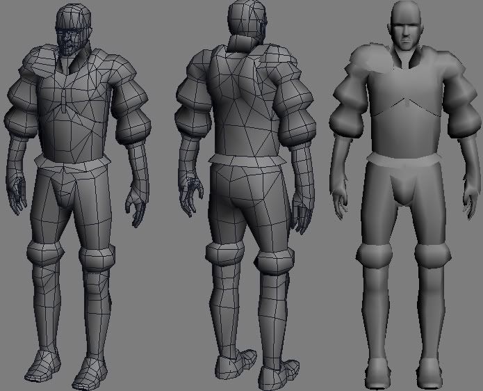
Mythic Warrior
Started a new model yesterday. The concept is from Warhammer online. I think I'm ready for unwrapping the u.v.'s. Im trying to keep under 2500 tris and hes currently sitting at 2476, so i have a few tris to add in if necessary. Does anyone see anything to improve on before i go to unwrap it?

Concept art : http://mythicmktg.fileburst.com/war/us/media/images/conceptArt/0607_CAt_53.jpg
Im trying to put together a strong portfolio to try and land an internship this summer and I'm hoping i could make it into mythic, do you think its more impressive if i painted all my own textures or if i sourced some textures from the concept. I'm guessing my portfolio should have a mixture of both.
Replies
Concept art : http://mythicmktg.fileburst.com/war/us/media/images/conceptArt/0607_CAt_53.jpg
[/ QUOTE ] I think that the silhouette looks alright but some of the meshflow confuses me. Mainly how his midsection or elbows bend. Also check this out. My Warhammer thread. I have some good crits on texturing that you could also listen to. I used concept art as a reference but never as a cut and paste in photoshop. Using art as a reference is good practice, but not cut and paste if that's what you meant. While something I understood that advice given to me was from Mythic employees.
but
...the shoulders needs to be bigger, looks kinda detached right now. The upper chest should be bigger, put the concept in the back and set the material to transparency that helps a lot. If you want to make him animate able you should make more loops in the hips/legs area. The hands looking strange, try to put the fingers more close to each other, the outer small finger seams out of place now. The kneecaps are bit too low. You could save some polys of the lower arms and the foots, because the dont do much.
I worked on the shoulder, made the chest bigger, pulled the fingers closer together, raised the knee slightly. Thanks for all the help everyone. Suppore, im guessing you meant shoulder when you said elbow but i could be wrong, should i change any of the geometry at the elbow? Also could anyone tell me some specifics of where the meshflow is having problems. Do you think the shoulder is made right now or should i try again?
Suppore, im guessing you meant shoulder when you said elbow but i could be wrong, should i change any of the geometry at the elbow?
[/ QUOTE ]
Meant armpit, sorry.
any crits, i know its still pretty early.
If its armor metal, looks to painted on, if its leather........it looks to painted on, also can you please post a side view of the hand/sleeve thing to et a better idea?
The sleeve thing looks good but I cant say 100 % since I cant see whats on the side of it, wrinkes in it look nice
Its always good to make sure your base is as close to perfect as you're happy with before you move on to texturing because I find it a bitch to go back and change things. Heres a little piccy of what I mean.
hope that helps with your metal.