New environment, needs some crits...(Update 9/24)
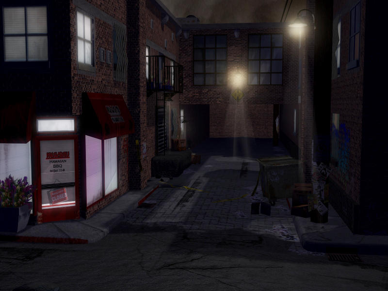
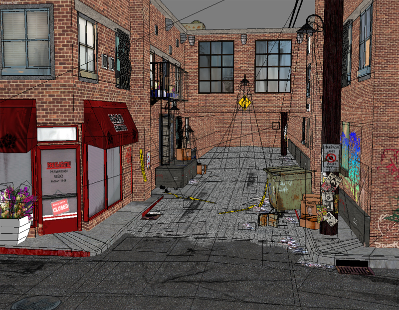
Hey all, I have a serious lack of next-gen environments and modern urban settings in my portfolio. So, I gathered up a bunch of reference, picked out the elements I liked, and ended-up with this street scene. I'm at that point where I've been staring at it for so long, that I could use some crits...or 30. Anyway, I'll leave this in your capable hands, you've never lead me wrong, so thanks in advance. I'm off to sacrifice a virgin to the Polycount gods...
3DS Max, 10,050 polys


3DS Max, 10,050 polys


Replies
friend ;D
The brick work isn't even the same scale all around.
the sidewalks have different levels of detail, they could easily be two prefabs one of two blocks, and one corner. That way you can drop in the sidewalk and stretch it out to the length you want with preserve UV's on.
Think first what you can do to make things move faster in the long run.
I'll give a paint over tonight or friday to help you out.
TGZ:As far as the scale of the bricks goes, I was messing with some geometry and must have messed up the UVs when I did it so...whoops, fixed now. The sidewalk is actually modular, but I guess it must not be evident. The other issues you brought up, am def working on, but if you want to do a paintover, that'd be awesome.
Thanks for the crits, everyone, much appreciated.
Update::
Get rid of the beam of light.
The colors of lights is very important in setting the mood, having the light coming from the sky grey isn't so cool, try a blue tint.
Redo the sidewalk geo and textures and the street tile stuff. Let the normal map do most the work.
For this scene make it look like it just rained that way you can show of the normals and give it more pop. the varied spec on all the objects should make for a very sexy scene.
Just a few ideas to get you going in a better direction. Hope that helps.
Not perfect but it conveys what i was trying to say. I dunno bake in some Ao to soften the harshness
Hmm looks like your images are pretty dark than usual. Maybe your monitor is not well calibrated
Johny: I agree with you big time, but right now I have pieces that demonstrate good diffuse work, but I'm lacking in anything that has normal/spec/emissive shown. Just trying to round out the portfolio a bit to cover more bases.
Dekard: Yeah, you're right about the scale, but I think it's the scale of the planter, it's a bit on the massive side. I used a 6 ft biped while I was building it for scale, and from what I could tell from my ref the sidewalks were the right size. Then again, everything is subject to change, so I'll take a second look.
TGZ: Yeah, the lighting is pretty much killing all of the time I put into making normal/spec maps for everything, I actually have a blue tint, but it's not showing up. Because I've done so much diffuse reliant work in the past, I guess I'm getting used to the balance between detail in the normal and detail in the diffuse, so I'll re-do those maps with your crits in mind. And yes, the comments are helping, and the rainy idea sounds like what I was trying to do in the first place, so good one.
I actually do have just about everything normal/spec and some emissive mapped. I've looked at the normal mapped objects on their own, and they are working and making a difference, it's my lighting that's killing it. When I light it like a daytime scene, everything is apparent.
What it boils down to is I'm going to scrap my lighting and start over, which is what I will do when I get back from doing laundry.
Thanks again everyone for the crits, update later tonight.
you need to use specular maps, and preferably normalmaps. It won't look real otherwise. The reason why it still looks a bit odd is because nothing is really reflecting the light, they are rather getting the colour of it. Everything reflects light, its just a question of how much. :P
Overall, i think you have a great start, you can finnish it up if you add the extra texture touch!
[/ QUOTE ]
Haha oh wow, this is a fucking hilarious post. You can tell from his renders he is using those maps. But damn, talk about a silly premise, you need normals and spec or else it wont look real!!! hahahaha
http://www.zombiezodiac.com/rob/ped/vanc/PICT0102.jpg
http://www.zombiezodiac.com/rob/ped/archives/vancouver/chinatown_and_japantown.html
http://blog.lib.umn.edu/carls064/freealonzo/100_0236.jpg
http://www.flickr.com/photos/100wordminimum/257946027/
http://100wordminimum.org/images/catwalk.jpg
Those should help more than a paintover.
Excuse me for being retarded, i hope that you find it in your heart to forgive me...
Before you start to consider how you want your lighting to looked I'd set up your cameras for the final composition.
This is something I do early on when I work on my portfolio scenes and it helps a lot. From there you can look at the scene overall and decide where you'd like your shadows to be casted, which assets you'd like to pull out to the viewers focus and which are better left as accents.
For this scene in particular I think you could do one of two angles: One down low, ground level, from just infront of the store and looking to the right of the alley. Or, one from way high up, looking down as if its a person looking down from a roof top. Or do both.
Either way, I'd worry about final composition over lighting. That's just me, and I tend to do personal work for the final shot and not the overally look of the scene.
I am having monitor calibration issues, I've sent this to a few people and they said it was not too dark, but on my monitor, it looks horribly dark. Does it look too dark/too bright to you? Feedback esp. on this front would be awesome so I can fix the problem.
I also broke-up my tiling brick texture with a decorative brick section.
Tinman: Tweaked my attenuation, falls off gradually as it should now.
Adam: I added some cameras from the angles you suggested, and tried to tweak things accordingly. Renders to follow..
EQ: I did AO passes this time, so hopefully it's getting the desired effect.
Thanks again everyone for the crits, always appreciated.
Things are coming together, but overall I feel you're holding yourself back. Maybe it's lack or reference or understanding the quality level at which game art should be at this day in age. I only say this because (and I don't mean to be rude, but) 10 years ago I was working on maps that appeared similar to this. That said, I suggest finding a nice lighting scheme that shows off everything in a manner you're comfortable with and move on.
That said, let's me present you with a better target to shoot for.
Look at all of Stefan Morrell's work. Sure, a lot is high detail, but he does a ton of game art too.
http://stefan-morrell.cgsociety.org/gallery/399743/
Again, this isn't game art, but hey, your work isn't in a game either
http://forums.cgsociety.org/showthread.php?f=121&t=347502
Here are a few more examples. I'm confident anything I've shown here could be recreated almost exactly in U3 engine, and this is what you have to compete against.
http://forums.cgsociety.org/showthread.php?f=121&t=226057
http://forums.cgsociety.org/showthread.php?f=121&t=193791
http://forums.cgsociety.org/showthread.php?f=121&t=188583
Don't be discouraged; be inspired to push your limits.
Thanks for the links, I actually have Stefan's portfolio linked as a favorite, awesome stuff. I guess it's probably not a good idea to try to present everything with 3 point lighting/standard 3DS lighting. I guess part of me always felt like going beyond that was cheating...don't ask me why. Thanks.
I shall return...
The window lights seem a tad bright though. Try some variation in their intensity, so they don't stand out as much.
Crits:
We're looking at an alleyway from the street, normally city streets are lit. So adding some lights that filter in from "off camera" will help create the illusion that you are standing in the street.
- The glow is a bit strong for my tastes, I personally feel the bloom effect is great in small doses. In the real world you'll only get that rich of a glow when it is really humid.
- Ledges and trim need highlights to help define shapes and floors to the buildings. Also the street is wet so you would expect to see some of those same wet shinny highlights in other places. Spec maps might need some adjusting?
- It might be a nifty effect to hint at a sidewalk? It will give a horiz action line running across the scene and help frame the shot (instead of fading into darkness)
- Speaking of darkness, normally when you do night scenes you want to light the area around the viewer/player to act as if their eyes are adjusting to the darkness, kind of a crappy form of night vision. Things get darker the farther way they are. So I think the street by the camera needs more light.
- Cities also suffer from light pollution which means the ambient light levels are going to be higher even on a dark night. So I think the street by the camera needs more light.
- Shrink your renders down to thumbnail size and check out what the major blocks of color and light are doing, you can also squint at the full size version. When I do that I see some really bright Sporadic spots and the rest is dark and kind of muddy.
you always give awesome crits and stuff.
i take my hat to you sir!
Vig - That paintover rocks. It makes everything really pop. I like that thumbnail technique for seeing the lighting.
I love what Vig's done with the piece...
Now my only real comment would be that the entire piece is really the focus point right now. There's no real area that seems to be the place I am suppose to look at, ya know? If I had to choose I'd say that the store front is where my eye is going, but its not the most interesting part of the piece (to me, thats the background). You've done a great job in showing that this is an alley way, and a fairly unkempt one at that.
But (!!!) you may want to take it a bit further and create a specific prop, or a set of specific props, and tell a small story in your scene. Perhaps some old Police Tape that's now just a few strands, and blowing in the wind while still attached to the pole on the right.
Once you've done that, (or decided to not do it*) you can do another light pass and voila - awesomeness!
*This is a really good piece, so consider my elaboration on story telling a minor suggestion.
Thanks everyone for the comments...again. I'm doing some lighting tweaks right now(in accordance with said crazy crit), so I should have an update in the next hour or so.
Funny you mention police tape, Adam, there are actually 2 strands of police tape in the scene; one hanging on the dumpster and one lying on the ground. I also have some flower pot fragments below the nearest fire escape with the ladder down, and a blood stain somewhere. Think I might have to highlight that a bit more next pass. Updates soon, thanks!
Anyhoo..update, tried my best to follow everyone's crits. If you have any more, I think I might have it in me to do one more tweak. Thanks!
Looks great.
Edit: I also think the window lights are way too bright but didnt change em in my paintover.
Here is my paintover
I think brian hit the nail on the head regarding some light colour variation and perhaps it can give you an idea about some subtle colour correction to your scene to help reinforce the atmosphere ...
Keep it up mate !
Thanks for the paintover, Bryan, I'll definitely be keeping that in mind this next pass, and thanks to everyone else for the comments.
I'll be posting an update asap. I love Polycount.