The BRAWL² Tournament Challenge has been announced!
It starts May 12, and ends Oct 17. Let's see what you got!
https://polycount.com/discussion/237047/the-brawl²-tournament
It starts May 12, and ends Oct 17. Let's see what you got!
https://polycount.com/discussion/237047/the-brawl²-tournament
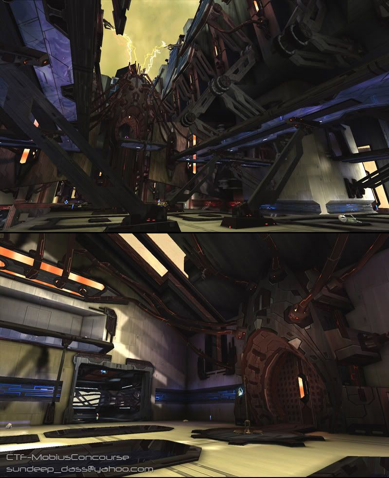
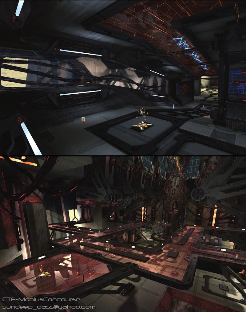
UT2004 Map: CTF-MobiusConcourse (updated)
Here's some new screenshots with changes as suggested by you guys. I tweaked the lighting and added some subtle fog to help with the busy-ness. I also made some minor tweaks to some of the static meshes:
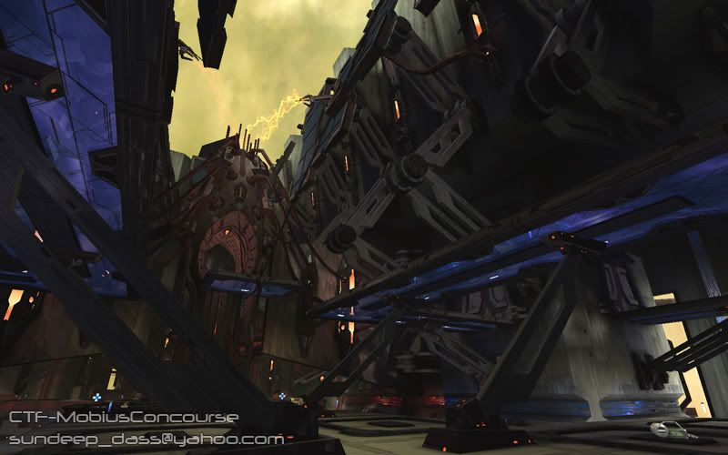
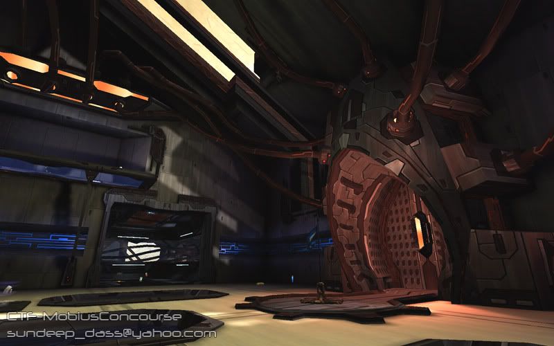
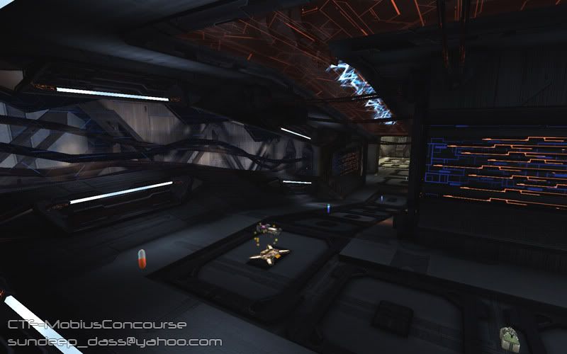
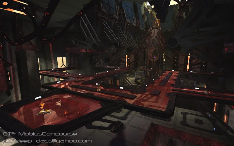
And the old pics for comparison:
There are more screens and stuff at my website:
http://www.sunny-d.com/mobiusconcourse.htm
I'm still tweaking some things so it's not quite ready for release. If anyone wants to test out a beta version, send me a PM and I'll give you a link to the latest build.


And the old pics for comparison:


There are more screens and stuff at my website:
http://www.sunny-d.com/mobiusconcourse.htm
I'm still tweaking some things so it's not quite ready for release. If anyone wants to test out a beta version, send me a PM and I'll give you a link to the latest build.
Replies
You have some interesting meshes, although very classic scifi stuff, but damn that stuff is busy, detail everywhere, no lead, mainly due to the lighting which is very uniform, colors are too "shy" AND saturated at the same time, detail is not constant (loads of very detailed meshes on top of a very simple bsp wall and simple texture.
I'd suggest you to gove more identity to the lighting, more strenght, spread the detail a little more on the bsp (use modular meshes) while trying to keep the view as clean as possible (not superclean, of course but you know what I mean, scale is really fucked up in ut2004, so huge meshes like that will completely overhelm the tiny characters, the uniform and monochromatic lighting doesn't help at all, everything seems to look the same.
the building heioght seems to be the same all the time too, which may be boring, you want to push that a little more, create variation to create more dramatic scenery (if you saw the necris level thing with the vehicles - and since you seem quite hyped about ut3 I'm pretty sure you did- you will know what I mean.
so far, to me, it looks like a technically well achieved ut2004 level, but lacking a lot of identity to stand out of the MASSIVE crowd of existing high quality levels made for UT2004.
I'd be happy to have a go at the map itself to better see that, give more in depth crits (that central room you have on your site seems even busier than the shots you posted here, which is a bit scary gameplay-wise). I'm also curious to play it, see how the gameplay works in there.
keep it up man
Nice to see some of your stuff dude
Im gonna gree with vahl on the ligthing,it does look very flat and I think it could be pushed much much further. a chance to make soemthing thats good to kick arse arwsome here.
good luck dude!
John
also, mind if we see some pictures of the objects themselves?
My main crit would be that some of the textures seem a little flat, and lack detail. Otherwise, stunning looking.
How are framerates?
A few things to give the eye a pathway to follow. My first paintover actually.
Excellent work!
IronHawk - thanks for the paintover, I went ahead and applied a lot of your changes.
Irritant - I built the map on my almost 3 year old laptop (Pentium M 1.8, 2 gigs of ram, geforce go 6600) and I get acceptable framerates. It can bog down for me in the center area with multiple guys on screen. That said I wouldn't recommend downloading it if you run on low - medium low settings.
flaagan, $!nz - thanks!
bounchfx - there's pictures of some of individual objects on my website, check the link in the first post. When it's officially released I'll post the download links here.