Kommander Sorscha **9/22/07 Update**
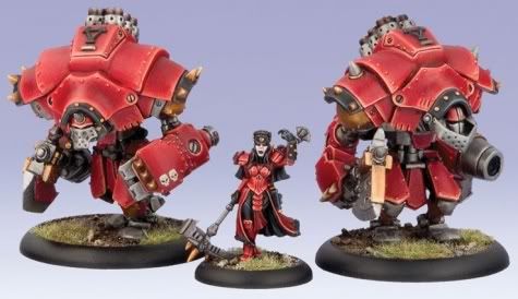
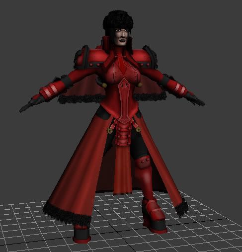
Hey y'all. Here is Sorscha from Warmachines (high fives to vig and seforin) and she will complete the battlegroup. I still have a long way to go, so some ripping apart would be appreciated before I get much deeper. Thanks much, players. Oh, and her spear and pistol is on the way.
Here are the original minis:
And here's the WIP:
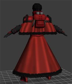
Here are the original minis:

And here's the WIP:


Replies
ok first off Wires, need to see them, and what texture size is the sheet, post some flats
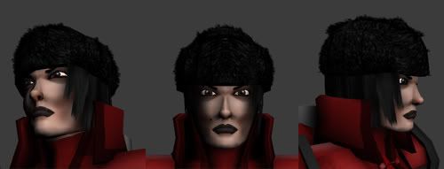
Based off what I see, one the nose, the base to it pinches ALOT like she always has a triangle to a certain degree., her hair matches to close to her hat, and even though its black on black the the hair needs more of a sheen to it, more white highlights so it stands out, now her eyes look a bit wide, but I need to see more closer pictures of the face to conferm this or not
boobs are a bit big, but I like big boobys so no big deal.
the texturing work is amazingly done, but what texture sheet and if its hitting 1024 you need to add in metal effects to the backpack and the arm area.
ok I think im out of what to talk about, post up those things NAOW!!!!!!!
Looking good just do what seforin said and you should be on the right track.
Wires! For some ridiculous reason I thought no one would care about those old things. I'll poet 'em as soon as I get home tonight.
I'm definitely trying to iron out her nose area more. I can't stand looking at the dark polys near her nose, so thanks for re-confirming the uglyness.
Hellz yeah, the boobs are big. I wouldn't have it any other way. haha! If it ends up looking ridiculous when this thing is done, i'll crank 'em down a few cups.
I'm glad you like the texturing work, thanks for the kind words.
$!nz, when I didn't do that, it looked terrible. I'm glad you noticed.
Sorscha:
She's good but needs some work. (Sorry Sef had to say it heh)
What to work on:
- Her body proportions are a touch off, I blame the mini, they are always off to some degree. I would lengthen her legs which would give her a touch more sex appeal that she has in the art and I would feel less like a pedophile hehe.
- Face texture. It looks too much like the paint job on a miniature and less like the other art. The miniature can be good ref, but when doing the face I would look to another source, one that didn't have to be painted with a microscope heh. When shading the face try to stay away from black, instead use darker shades of her flesh tone. I would push more pink, blue and purple into the dark areas rather than black.
Flesh painting tutorials:
http://www.idigitalemotion.com/tutorials/guest/skin_tone/skintone.html
http://www.gfxartist.com/features/tutorials/14030
http://www.gfxartist.com/features/tutorials/14033
http://www.furiae.com/index.php?view=gallery
- Personally I like the Epic Version of Sorscha If I was doing the model, I might try to mix the two by taking the straps from the parka and using them to replace her normal delicate cloth cape or just turn the parka design into a shorter cape. But thats all personal taste.
- I think you should tone down the black areas and mix them with more brown leather parts to help contrast some of the different pieces. Also think of the black areas more as dark grey or dark blue instead of pure black. If you start with a lighter base color you can paint shadows and highlights instead of just highlights.
- Her hat has a "fuzzy all over look" to it. While Ushanka do have quite a bit of fuzz to them, she's missing out on the classic Russian hat look. The distinctive flaps are not recognizable on the hat. I think if you changed the hat to be a mix of leather and fuzz you could separate out the flap shapes. I would also urge you to add the Kahdor symbol to the front of her hat.
- Where's the gold trim? Kahdor colors are Red, Black, Brown and Gold. Adding in gold trim would frame out some of the pieces nicely and give her more of a regal feeling.
Quick recap:
- More brown leather to contrast the back.
- More Gold trim.
- Fleshify the face but keep her a frigid bitch by using light pink, light purple.
- Make her hat a signature Ushanka by making the flaps distinctive.
First of all, thanks for the kind words, i'm really glad you like the 'jacks, being a Warmachine man yourself.
I completely hear you on the proportions. I've been trying to find a middle ground between the sleek and sexy proportions of the art and the bulky, exaggerated look of the miniature. Obviously it's turning out a little strange, as we have a large breasted, stumpy Sorscha with big feet and a big head. Hahaha! I'll definitely massage the proportions and lengthen her legs. Sorry you experienced momentary pedophilianism.
I still need a LOT of work in the flesh painting department, so thanks for pointing it out and thanks for the links. Those tutorials look fantastic and that should help me out a whole bunch.
The epic version is pretty sweet...I fancy the original more, so I probably won't change THIS one, but I can see myself doing a variant once this is wrapped up.
Okay, will do on the black. Good stuff.
The ushunka (didn't know they were called that, thanks) has been...problematic. But i'll definitely try ro re-define it, cuz you're right. It's a bit uniform. And the Khador symbol I completely spaced. My bad.
Gold, eh? Will do. It's not on the mini, which is what i'm basing my colors off of, but it absolutely will not hurt. Actually, that should end up looking great.
Again, you rule. Thanks much.
i wanted to chip in that for your cloak texture, adding smaller light waves in the fabric that cut across the large ones and pointed to pinch or snag points will make them look more involved and interesting. it's real quick and works well.
*high fives so hard your mustache explodes into butterflies*
yea looking at it this way you definetly need to make the eyes less wide, and bring the brow of your nose a bit wider so it dosent pinch so much
Wheres them texture flats son? How im suppose to ass rape , er critic , if I cant see your texture sheets :P
also what size map(s) did you use?
personally, i would have just grabbed that poly and given it unique space, but this works.
it's a shame her mouth is welded, given all those loops for animation.
her face seems awfully shadowed - hard to tell from the angles, but i think she's got a bit of a weasle-face going on... far too triangular [when looked down from the top] need to bring the verts forward for a more human shape.
Not to mention you seem to have a lot of unnecessary triangles near the nose and lip in general. Cleaning those up may fix the shadowy areas. Also the bridge of the nose is weird because it disappears near the non existent eyebrow ridge. Pull the top part of the bridge out and define the eyebrow ridge and that will probably get rid of the weasel look as state above.
The mouth is welded only for the time being. I'm not sure why I did that, but I have every intention of adding teethie teeth and a tongue.
Weasel face made me laugh.
Seforin - I haven't posted the flats yet cuz i'm not even close to done with the texture. But I will as soon as i'm done. Or...pre-critique done. You know what i'm saying.
You've done some, but it just still seems very 'im a plastic model'. I could be wrong, I'm tired. So ignore if no one agrees. Your 2d work has soooo much more character, try to translate that?
BUT! I say "partially" because knowing me, if I ever have a choice between exaggerated proportions and realistic proportions, I will most likely go exaggerated, like in my 2d shit. Thanks so much for the compliment by the way.
Sorry about the long-winded response.
Nose still is very pinched, hats looking a bit better than before, do you have any spec on this or all hand painted?
Seforin - I haven't posted the flats yet cuz i'm not even close to done with the texture. But I will as soon as i'm done. Or...pre-critique done. You know what i'm saying.
[/ QUOTE ]
You will have all relevant texture information when i'm done. Now slow your roll.
Wait... I should probably ask if this is based off an anime? if so, then ignore what I said, they only apply if it is meant for a more realistic venue
Sectaurs - Typically the miniatures in those games have exaggerated proportions cuz they're so small, you know? I based the model of those proportions, which is why certain features are larger than usual. But i'm still massaging. Hopefully it'll turn out attractive.
Things to think about changing:
position of her head:
- Tilt her head forward to help her default posture to be more in line with the character. Chin to chest = don't screw with me. Chin to sky = innocence and care bears. Adjust her eyes to almost look out here eyebrows. It will help hit a few key emotions you want to nail with this character.
Face flesh tones:
- Without a doubt facial painting is one of THE hardest things to nail.
- She has very dirty tanned olive skin, with deep shadows. She's basically from some place where its too cold to go outside much less go tanning. Pastey purply skin, with hints of warmer colors to show she isn't undead heh.
- Revisit the her facial flesh color pallet, add some pink highlights, some purplish undertones.
- Think about using a dark purple for the lips instead of black, you'll still get that dark gothy feel, but it will give you more colors to play with, more highlight and shadows colors and her lip color won't be the same as your shadow color, which is confusing. A tiny strip of highlight really helps bring out the pout in the lower lip, it helps sell the spec. 6-12pixels give so much detail, mood, and emotion.
Mini Vs accurate facial Anatomy:
- If they could have put more accurate facial anatomy in the mini they would have, but its hard to carve proper cheekbones with a toothpick. You are not constrained by those tools (you have a whole new set to worry about heh)
- You can still keep the mini feel with a nice DOF blur after rendering. It's crazy how even everyday normal things can come off looking mini.
- You need to increase her attractiveness by going for more real world anatomy of the face. The dark shadows cutting across her cheeks, going from her nostrils to her ears need to be lightened.
That line needs to be broken up by the muscles and flesh that fill those areas out, right now it is a dark visual line separating her face into two halves, breaking the flow.
- Even if people don't realize it, they expect to see those landmark muscles. Highlights and subtle skin tonal changes need to be placed where the bones come closest to the surface, and reverse for areas that are more fleshy.
- Some of the land mark muscles around the lips need to be massaged into existence. They will help bring out that ice queen pout.
- Take some cues from Russian super models like Katja Shchekina.
Eyes:
- Have the upper eyelid cut the pupil in half. leaving you a little white space between the bottom and of the pupil and the lower eyelid. The eyes say so much about what a person is thinking and feeling they give off visual cues as to what they are about to do to you. Contempt, anger, scorn, malice are all emotions you want to bring out in this characters the eyes can help quite a bit, use them to their fullest potential, don't dismiss them as spheres with a painted iris.
Nose:
- Make the tip of her nose less bulbus, it needs harder edges. The nose overall needs to be less noticeable. It is very common for comic book artists (and some plastic surgeons) to almost omit a nose from a pretty face. The theory goes "the sleeker the beak the hotter the chick". Because her nose is rounded and lacks the hard edges, she looses some of that sex appeal.
- Because the bridge turns into a crease instead of a bridge, she looses more sex appeal.
- A sexy nose would have sharper edges, an upturn and make less of a shadow. I think you should check out some comic ref, it might help you construct and paint better female noses. J Scott Campbell does a pretty decent job of stereotypical female faces, but he is very minimalist when it comes to noses. Check out the lines he does use and how they impact what you think is there.
Strengthen the bridge of her nose, right now it is almost disappearing. Know that the skull forms half the bridge of the nose and cartilage forms the rest giving most people a bump and at the very least giving most people a flat plane that the flesh of the cheeks attaches too. Think of the cheeks not as separate pieces of flesh seperated by a nose, but think of them as a blindfold that gets stretched over a bump in the face. What you have is more of a crease, or wrinkle where the two halves of the face meet.
Misc bits:
- The manly jaw line needs to go, her chin needs to be less defined and more pointy same goes for her cheekbones.
- The gold bits need to be less orange and more gold metal with metal specular highlights.
For everyone with ADHD or people who can't read monster posts without their eye bleeding, I put everything above condensed into a paintover...
*high fives Vig so hard his other hand shatters from jealousy*
incoming crawlers!
I will have to agree with Vig all around on what he said in his last post. When I look at the model i don't see that much flare or personality. It is all in the face though like most people have been saying. It is very blank and needs some more massaging and tweeking. The body looks nice, and I am really looking forward to seeing the weapons on here, which I think will help out. I really enjoyed your warjacks though and of course all of your amazing 2d work that you have done.
I am sure if you just follow Vig it will turn out wonderful.
I worked at Humongous Entertainment, I know (or rather knew) Rhett Mathis, it was his brain child and side project, one hell of a nice guy. I made a map that was 1 day shy of going in the game =/
[/brag]
what where we talking about? oh yeah Sorscha, jeeze I'm long posted...
Thanks, The Real Live Motz. I appreciate the feedback. I'm crunching right now, so I might not get back on Sorscha for a few days. But with all the feedback I can't wait.
Flat: 1024x1024 Diffuse and Alpha (alpha is minimal, not posting it.
Annnndddd this one was just for some some quick fun:
Thanks again, y'all!
For everyone with ADHD or people who can't read monster posts without their eye bleeding, I put everything above condensed into a paintover...
[/ QUOTE ]
First, I laughed so hard when I read it. Then, I read the whole thing..
Anyway, I think this turned out great, however, I think you could push the diffuse further. You should be able to add more colours to her face without breaking the goth-look, yes?
And yeh, give her a normalmap! We're in 2007 for crying out loud
overall, she turned out well, though overall i think you're relying too heavily on an ao bake to do the work for you - this is especially noticeable on the face. hardly any brush strokes there at all.
if you're not planning a spec map, I'd go back in and pick out some highlights in all the metal parts. as they stand, they're all sharing the same matte look, which makes it hard to distinguish between differing materials.
you've got a great base, you just need that last pass on it to make it shine.
with the lighting you've gone for, it just doesn't sit well without the spec coming off the mesh.