The BRAWL² Tournament Challenge has been announced!
It starts May 12, and ends Oct 17. Let's see what you got!
https://polycount.com/discussion/237047/the-brawl²-tournament
It starts May 12, and ends Oct 17. Let's see what you got!
https://polycount.com/discussion/237047/the-brawl²-tournament
jgarland's Progress Thread [Image Heavy]
For the accompanying text with this latest update, please look to the bottom of the page. All other posts are merely for archival purposes.
The purpose of this thread is to have somewhere to dump all my works-in-progress, while tracking my progression, much like Spacemonkey's or Dom's threads. It's nice to be able to look back at old work, and laugh, or maybe even cry.
I'd like to get feedback from all of you as I post, because any help from you will only help me to get better. Don't hold back, for I await your burning criticism.

First, I'm going to do what everybody says not to do: show my old work first. It's more of a starting point than anything, to show where I was six months ago, and where I am today as I make this post.

Embarassing, I know... but, we're moving on.
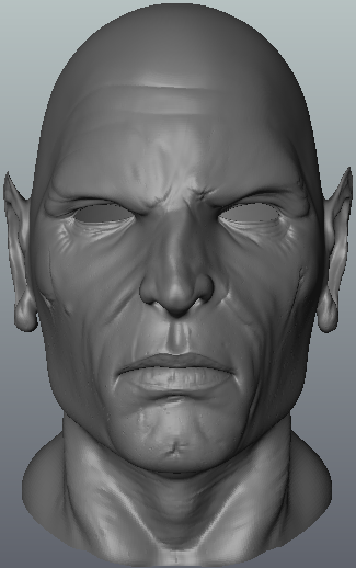
The vampire bust that I've been working on for far too long is... almost finished. I have to add eyes, and his fangs, as he currently looks more like an emaciated transvestite than a vampire. I eventually plan to finish baking a normal map and texturing a low-poly mesh as well.

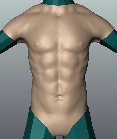
Just some practice in Mudbox with Arsh's "baseman." I've been making a conscious effort to improve my knowledge of anatomy, and watching lots of porn for "reference, too."
 Took about an hour or two. I definitely need to work on my speed.
That's all for now, folks. I'll hopefully update this regularly, and if I don't, make sure to send me a message for a good kick in the pants. Thanks for looking.

Replies
Not much to show this time around, but I figured something was better than nothing. I just finished doing the arms and tweaking the torso. I've been busy with school, so I don't have as much time to work on these kinds of things, but I've got a character on the way, so keep watching.
I've been busy with other things (like getting my license
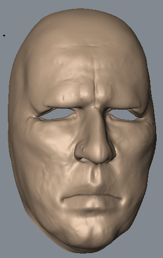
I realize that there's quite a bit of geometry, and that the face is a bit detailed for a base. This stems from my laziness, as the head is actually ripped from an earlier project. It's not a big deal since most of my human characters start with a generic base mesh anyway. Any creatures will get their own.
Feedback is always appreciated, and thanks again for looking.
Anyway, I started working on this last night, and I'm quite happy with how it's turning out. I wanted to do something that showed a bit more expression than any of my previous work, so I tried to go for a surprised and slightly disgruntled look. He's still a work-in-progress, so any comments are appreciated.
The ears are basically untouched, and I need to make them stick out a bit more. I'm also going to add a hairline, and maybe some wind-swept hair so it looks like he's being blown around. Teeth are being worked on in Max right now, but box modeling is a slow process. I'm going to use Mudbox to create the gums.
I think I'm done with this sculpt, but I'd like to find a better lighting setup. The way this is presented right now doesn't really show it off very well. Any tips you can offer are definitely appreciated.
Edit: I've decided to remove the bust that was here. It was a steaming pile, and I don't need it stinking up my thread.
It's not very interesting, but it's the first digital painting I've done in ages. I needed some practice, so I decided on still-life. I think it turned out quite well, for two hours of work or so.
I haven't gotten around to scanning in my drawings yet, but I should do that soon, so keep watching.
Here's the painting I've been working on for for a day or two. Any criticisms are appreciated, but keep in mind that I'm still working on a lot of it, and it isn't quite close to finished yet. And I'll fix the leg.
This was actually an assigned to me in my high school art class. We had to pick a social issue, and describe it without using words or acronyms (it was meant to be a symbolism project). I chose the fact that the media can greatly influence our lives, sometimes negatively (even video games).
The eventual goal for this piece is to have my character in a white room, with a dentist-looking chair in the background. He'll be wearing some sort of futuristic brainwashing helmet, and will have monitors with pictures of corporate logos and whatnot behind him.
Edit: I entirely forgot about the new sketchbook forum. This thread will move over there and I'll just let this die off eventually.