The BRAWL² Tournament Challenge has been announced!
It starts May 12, and ends Oct 17. Let's see what you got!
https://polycount.com/discussion/237047/the-brawl²-tournament
It starts May 12, and ends Oct 17. Let's see what you got!
https://polycount.com/discussion/237047/the-brawl²-tournament
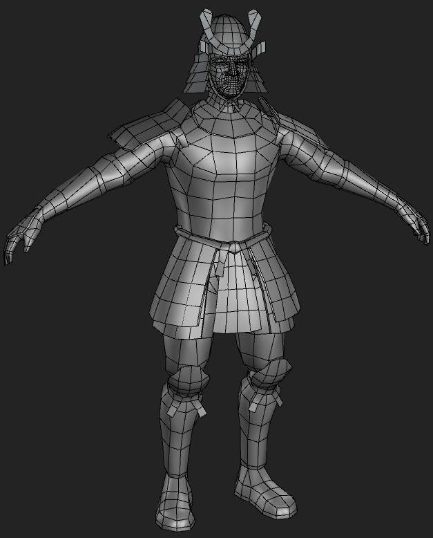
Samurai Warrior (heavy image content)
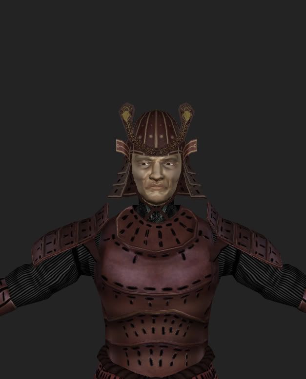
Hey guys, been kinda busy with school lately but here is my progress on the latest model.
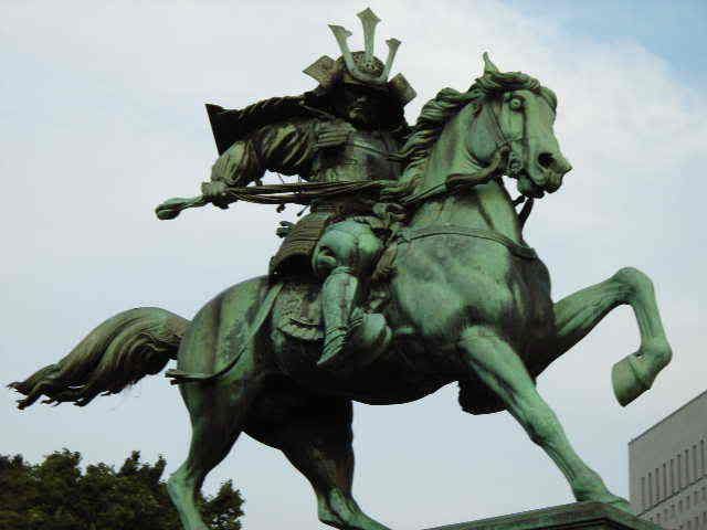
Its a samurai inspired by this awesome statue
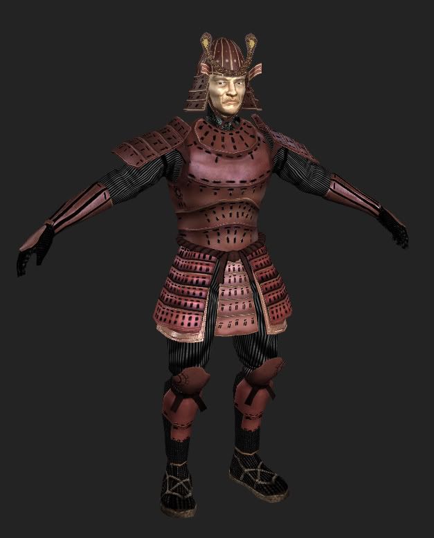
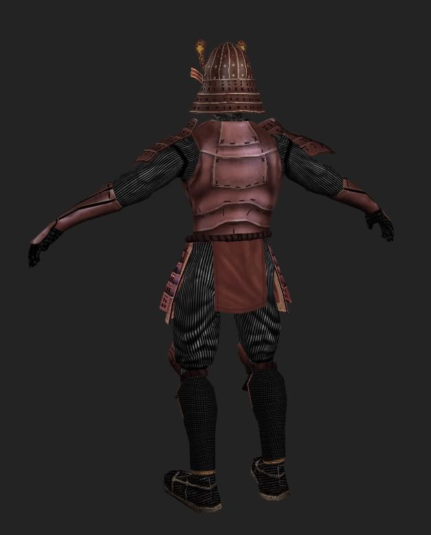
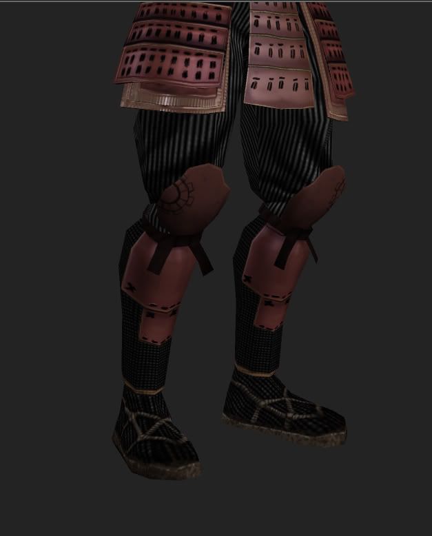
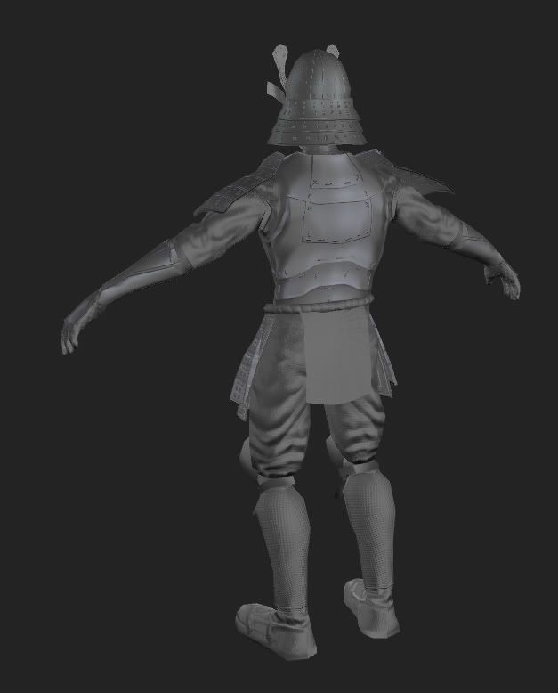
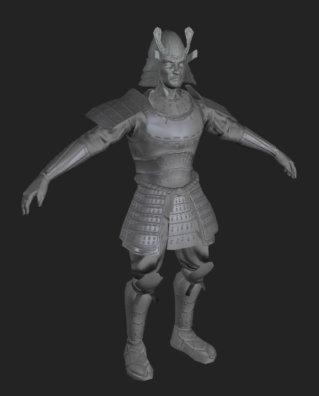
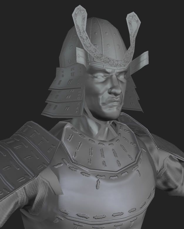
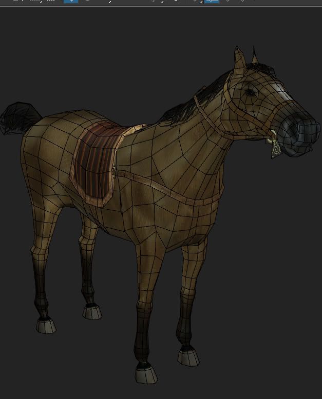
So this guy is supposed to be mounted on a horse, I already do have a horse but its still in developmental stage. looks a little like this...
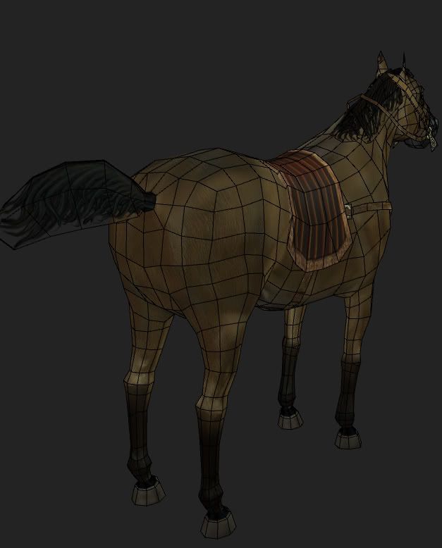
I am planning to upload it into Roboblitz and test out the paralax mapping and shadows in there. Anyways thats that. Enjoy!
Its a samurai inspired by this awesome statue


So this guy is supposed to be mounted on a horse, I already do have a horse but its still in developmental stage. looks a little like this...


I am planning to upload it into Roboblitz and test out the paralax mapping and shadows in there. Anyways thats that. Enjoy!

Replies
Dave
otherwise, it's nicely done!
Be careful not to skimp out on the horse. You really don't want an Everquest II horse. Yours is obviously better than this, but there's room for improvement I think. The ears are a little strange, and the bulk of the head and body seems too great for the spindly legs perhaps, but that might be an FOV thing?
You'll struggle to come close to the strong, dynamic look to the horse in that statue without emphasizing its musculature a lot more, and that will be *very* hard without a real normal map.
Snowfly- I guess when I decided to make this character I picked the statue reference as only the way I wanted the characters final pose to be. I followed another reference source when modeling the actual samurai and horse, thats the reason why the stylized look(predominantly on the horse) didnt come through...My reasoning was that I didnt want it to look like a statue, I wanted it to be an actual living creature.
Daz-Thanks for the comment man, youre like an idol to me. Yeah the face didnt come through as I wanted it, I did go with Mudbox but I rendered the normal map the old school way with a cage. As you can see I'm pretty much a work in progress but getting better(IMO) thanks again guys.
Spark
Hey there's nothing wrong with using the cage! That's actually my preferred method :P
Overall it's looking so-so. i agree with everyone's comments on here. I think you should try and work in some more detail in that armor as well