Samaritan Revolver!
After getting a 360 and wasting a good 4 months of my life away, I got back to work and finished up an old project.
What I Don't Like about this Piece:
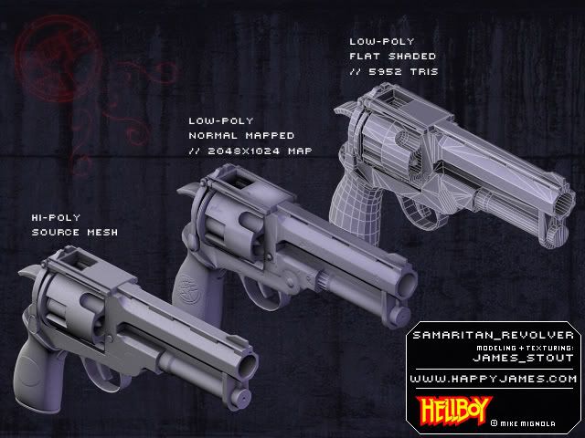
-I should have mirrored the normal map. Didn't know a good method at the time. Will certainly give it a shot next project.
-Realtime Rendering. The thing looked pretty decent inside Source, but I'm still having a hard time getting it to look good inside of Max's viewports. Definately has to do with my lowpoly geometry and normal map.
- It's not made of win.
Hellboy's revolver, The Samaritan. Made the movie version, coz it makes a 'little' more sense that the hilarious, yet awesome comic version. Learned a lot doing this thing, and could spend another week tweaking it, but I'm gonna move on and make something a lot more pretty-like.
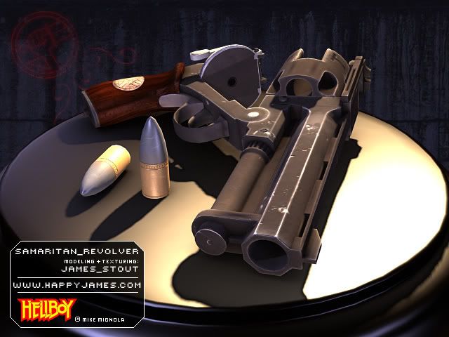
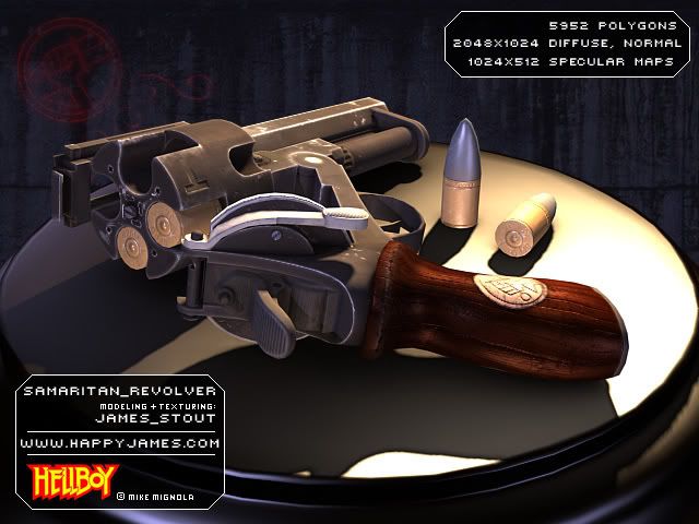
Many more pictures of the gun, including a 360 Turntable Render on my hilariously shitty website!
www.HappyJames.com
Thanks for any comments and criticism! I like my criticism like my sex, with coffee beans and a sock.
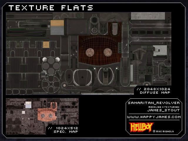
(Oh, and I'll post higher res shots of the texture work soon.)
What I Don't Like about this Piece:
-I should have mirrored the normal map. Didn't know a good method at the time. Will certainly give it a shot next project.
-Realtime Rendering. The thing looked pretty decent inside Source, but I'm still having a hard time getting it to look good inside of Max's viewports. Definately has to do with my lowpoly geometry and normal map.
- It's not made of win.
Hellboy's revolver, The Samaritan. Made the movie version, coz it makes a 'little' more sense that the hilarious, yet awesome comic version. Learned a lot doing this thing, and could spend another week tweaking it, but I'm gonna move on and make something a lot more pretty-like.


Many more pictures of the gun, including a 360 Turntable Render on my hilariously shitty website!
www.HappyJames.com
Thanks for any comments and criticism! I like my criticism like my sex, with coffee beans and a sock.
(Oh, and I'll post higher res shots of the texture work soon.)
Replies
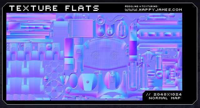
How did you go about the smoothing groups on the low? Is it all in 1 smoothing group? Just out of curiosity, how many polygons is the high? In the millions? Can we see flats?
I'm doing something similar with a 1911, so I'm just looking for some pointers
SHINY
SHINY
NeoShroomish:
Yep. It's all on one smoothing group, though I'm not sure if that's the proper route to take anymore when dealing with a lot of 90 degree angles on a model. When generating the normal map, I ran into a lot of issues that gave me what looked like nasty Per-Vertex lighting. Had to add a few bevels and re-project to get the intended look. High poly is pretty high poly. : ) I'll get the polycount for it later today when I'm at home, and I'll post the full sized texture flats for you too. And yeah... Should be shinier... When deciding on your low poly layout, pay attention to how Pior had his edgeloops set up on his gun for Snake. Some loops may seem redundant, but they're actually necessary for the normal map to project, and behave properly. Lesson learned, though.
Johny:
Thanks for the crits! You're right about the scratches. Quasar pointed it out to me at one point in time, and all I did was grumble and change them a little bit. Those Darkest of Days weapons are a great example, specially on that rifle that Gauss posted a few days earlier, seeing as the barrel has the same shape. People want it shinier, so yeah, I guess the spec could use some love. I'm gonna spend more time on my next endeavor's spec, seeing as it what gives the piece it's final *pop*. (Specially if the goddamn thing is metal.) Good pointers!
Thanks again to everyone else for the comments and crits!
Quasar:
You flatter me, Mr. Butt. : ) You and I both know, there's no angry like mangry.
http://www.sideshowtoy.com/cgi-bin/category.cgi?category=hellboy_props&item=8911