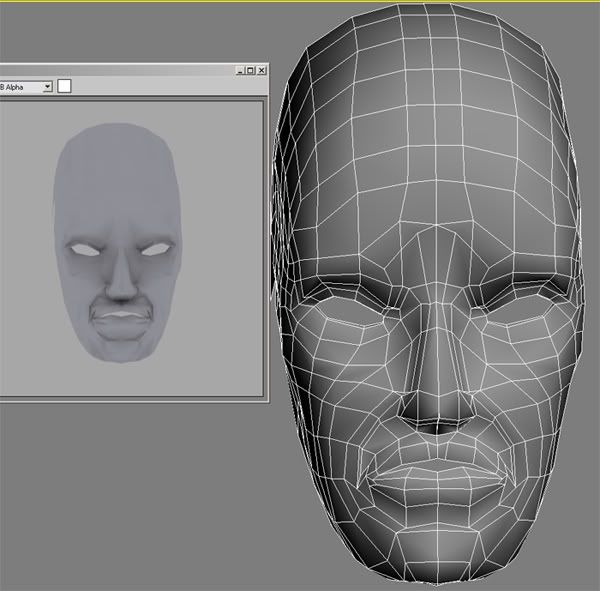
New to 3D and boards =)
Hey guys, I'm an art student who is going to be learning 3D in my upcoming term. So recently I've been reading some tutorials online and decided to take a dive into creating my first model. So here it is.
As you can see the model looks a bit weird in the render, I'm not really sure why there is weird shading around the eye sockets and mouth. Hopefully someone can point out my ignorance on this subject, as I'm still trying to absorb everything. Thanks!

As you can see the model looks a bit weird in the render, I'm not really sure why there is weird shading around the eye sockets and mouth. Hopefully someone can point out my ignorance on this subject, as I'm still trying to absorb everything. Thanks!


Replies
Also, you have a lot of horrid edges. The bridge of the nose between the eyes for example, what you have made there is two faces that do not resemble a square or rectangle. You can't have faces like that, it helps in causing awkward shadings. Every face is actually divided into two triangles, and in your case, it just so happens the line dividing the two "triangles" goes intobetween the bottom right and top left vertice
However, if thta wasn't the case, there would be an edge going from the bottom left to the top right vertice, causing it to break the surface of the mesh, causing an ugly shade. Along with this, *****NEVER**** everrrrrrrr, have a 5 sided face/poly. They are bad! >:O, and that's what you've created :P. It's ok
So with that said (if you understand it), you can see that the edges around the mouth and everything are stretched extremely and maybe even a few of those errors there. Basically, the mesh you've constructed won't animate well (like the diamonds at the corners of the mouth)
Your lighting/rendering scene might also be causing the shadows, not sure how you have it setup
Besides those issues, not too bad...it's a bit too skinny though
While waiting for some answers I actually took it into Zbrush and tried to play around with it. What a fun program !
***Theres a gap o the side of the face I think I forgot to weld some verts there.
I'll go back and try to build another face now and see if I can avoid those things you've advised me!
Stick with Quads and Tri's, never anything passed a 4 corner poly
With your update, things look a little blocky and chunky
Your chin protrudes out too far, your lips are extremely swollen, and something wrong in the eye/nose area, but not sure what
Hope this helps a bit more
Ya the face is a bit blocky, I kinda exaggerated some of the features.. not really a great sculpter still learning.
Along with this, *****NEVER**** everrrrrrrr, have a 5 sided face/poly. They are bad! >:O
[/ QUOTE ]
I'm curious as to what brings this extreme reaction? In my experience. Five-sided polygons are smoothed the same as tris-- they're best avoided because they can create irregularity in your surface the same as tris and poles, but it's just that, the same as tris and poles. Some quick googling shows zbrush handles them same as any other app and other than some beta versions of mudbox, I'm pretty sure it's the same there, so what's the big deal?
As for avoiding them, circular formations of loops will help this a lot and help get rid of the gridded-ness that's commonly seen when you have more loops than you strictly need to define a shape. Do some experimentation-- it's quite easy to turn a loop 90 or 180 degrees if necessary.