Welcome to my humble website.
Well its taken some time err a year^_^ but I finally have my site up http://www.marcusdublin.com/, stop in relax a bit and take a peek. Im still working out the kinks but the framework is pretty solid, enjoy your visit!

Marcus
Artist - Kaos Studios

Marcus
Artist - Kaos Studios
Replies
Don't put up sections with "Coming Soon", if it's not there don't add it.
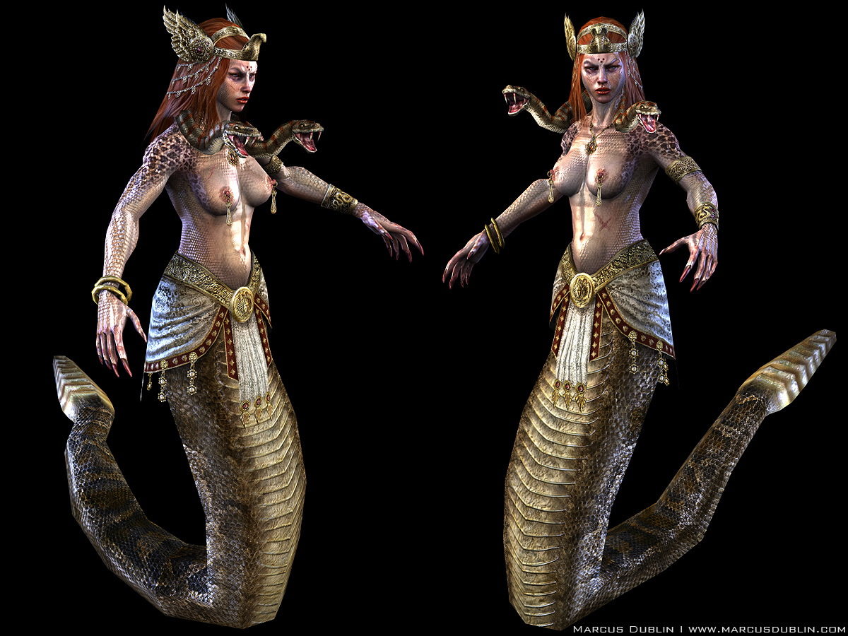
It takes me 4 clicks to get to one piece of artwork. Takes to long. Too many clicks. Intro>Main page>Characters>3D Characters>Medusa... (TOO MANY Hierarchies.)
You have nice work, don't get me wrong. I just think it's too cumbersome to view your work and of course it's only my opinion.
I'm not sure if it's a big deal these days but when you click on a thumbnail and go to the page you look to be loading 4 or so images 1200x900, and most seem to be around 500-600k, that means it's about 2meg or so per page.
Marcus
Artist - Kaos Studios
I can't tell you how often I've been going to your site, hoping for an update. Ever since I first saw Ryzen I've been itching for more from you. I have to say, your work is great. I especially love the creature section! They're familiar, but totally unique. Speaking of the creatures, in the Giant Spider's wires you show what looks to be planes for alpha map spots of hair on the legs, but in the final renders I see no evidence of this. Am I missing something, or were the spots of hair taken out in the final render?
I have to agree with the splash/intro page though. It's not needed. Aside from that, it's fully functional, and serves as a forum for your great work. Now get those weapons and vehicles up! :]
Edit: I just realized that you listed the map types on the top of each page :P So I was right that it was a specular map. By the way, I really like your work but most of the models are too noisy in detail and it makes it almost painful to look at some of them.
Whens the tutorial section going up? Me want to learn
ps. your gamer tag doesn't come up on xblive
I have to agree with the splash/intro page though. It's not needed. Aside from that, it's fully functional, and serves as a forum for your great work. Now get those weapons and vehicles up! :]
Marcus: Yeah for that creature I used alphas for very delicate hair work but since these were rendered in Unreal 3 the hair got lost in the translation. This is mainly due to Unreals use of 1bit alphas, with some clever material work you can fake slightly better results but a 1bit alpha is a 1 bit alpha in the end. If Im up to it I may just do a render in Max for better results.
Zephir62: Hey I noticed that you use 3 maps for your characters and creatures - a diffuse, a normal, and third which I don't know which shader you're using. I thought it was a specular map but then I remembered specular maps only are black and white. So what kind of shader-map is that and what does it do exactly?
Edit: I just realized that you listed the map types on the top of each page :P So I was right that it was a specular map. By the way, I really like your work but most of the models are too noisy in detail and it makes it almost painful to look at some of them.
Marcus: Spec maps are only black and white if you use them in the alphas channel of your texture pretty much, other than that you an make them in all kinds of pretty colors^_^. As for the models being to noisy in detail Im not sure exactly what you mean but I have a feeling you mean the tight grain. One reason I tend to make my stuff as sharp as possible especially for consoles is that people tend to sit on average 4 to 5 ft away from there TV and certain details get lost, blurred and plastic looking. Not to mention your work will be covered by all that cool post processing which is all the rage these days, so I keep things sharp.
Lee3dee: Whens the tutorial section going up? Me want to learn
ps. your gamer tag doesn't come up on xblive
Marcus: The tutorials in the works and is halfway there, I just need to find the time to finish it up. The gamer tag was a dumb typo, its actually Marcus D76, and Ill change it tonight, see you guys on Live!
I have some time this Sunday so Ill make the changes suggested, thanks again everyone!
Marcus
Artist - Kaos Studios
Other then that, its looking good.
As for the work,
I noticed most of your anatomy forms tend to look inflated and balloon-like. This is the most evident in the sea creature and the green dragon pieces, though it doesn't show up nearly as much in your characters. They really lose the sense of any skeletal and muscular structure under the skin. Even that sea monster's dorsal fin looks like it's been eating too many twinkies!
But regardless, it's all pretty solid stuff.
-also, you're a dirty tease for making me think there'd be work in the sections that are coming soon! Get some 2d work up!