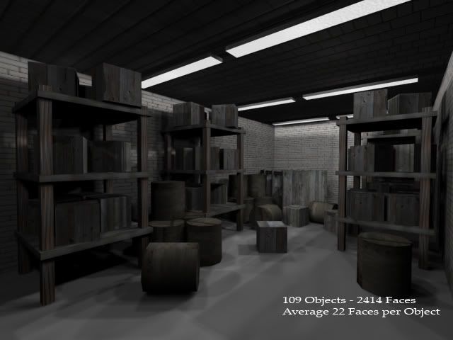
Here are a few indoor scenes I have been working on lately, mostly for school. The first is this indoor warehouse scene:

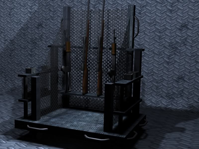
The second is a weapon rack:

I will add more as I complete them, but for the time being, I would like some advice on how to improve.
-Dread_Reaper
Replies
cheers
-Dread_Reaper
The first thing that U should think of are a details. Add more details, 'cos textures atm are a bit boring.
Play more with colors. And then put your hands on light subject and test with various setups, first of course U need to catch an idea what colors and lights U want, then just move,render,move render till U will feel its fine enough. So far lack of detail on textures and light are the biggest minuses. Modelling looks nice, but without wires its hard to say something more.
keep it up
just my opinion
So you're working on getting more textures in the scene besides 3? Boxes and cylinders no longer constitute good clutter since most engines have made the jump to 3D. 22 polys per object, sounds like a waste honestly. With 22 polys you could do quite a lot of things besides boxes and cylinders. I think you have way too many lights in the scene, the shadows are all over the place. Why the double light fixtures when one set would do nicely. You're robbing the scene of shadows and dark areas. Is this a storeroom or a brightly lit office work space? Know your environment and light it appropriately.
Instead of boxes and cylinders think of actual junk that would be down there. Old chairs, a banged up desk, pipes (even tho they are as cliche as boxes and cylinders). How about a nice little caged off area with dangerous looking pipes? How about a furnace, a water heater, a boiler, old computer equipment, server cages, hoses, cables... hello is this thing on? /tap /tap /changes batteries in mic
Hint at a larger area than what the player can explore. If the player is in a tight place and can see everything they will feel safe, confident and cocky. Put them in an area that is has dark areas, and is fairly large they'll feel naked. Your scene straddles the fence, you need to choose. Stereotypical storeroom, like the title suggests, or tight and bright safe area?
2nd image:
Why have sides on the weapon rack if it isn't going to hold weapons? It seems pretty complex for only holding 5-6 weapons. Why isn't there a way to secure the weapons? What do they do when it's bring your kid to work day? It seems portable and it seems like it has a lot of protection for when it gets moved but the weapons are just resting there?
Overall, the walls and floor could use a lot more color variation, dirt, and wear and tear, scratches on the floor where things have been moved in and out, and the ceiling texture appears to be some sort of brick, I'd stick with a stucco/concrete, corrugated metal, ceiling tiles, something like that. Grabbing some ref of warehouses/storerooms will help a lot to give you ideas for details.
You have a good starting point, more dynamic lighting, more/different props, and better textures will push it to the next level. Keep it up!